Customizations
Customizations is where you control the visual identity of your brand across all channels, including colors, typography, buttons, icons, illustrations, layouts, and more. A live preview on the right side of the screen updates as you make changes, so you can see how they look before you publish.
This article explains what components can be customized, for design guidelines, see the Design Guidelines for that specific channel.
Overview
Customizations are organized into sections:
| Section | What's inside |
|---|---|
| General | Colors, typography, buttons, borders, and shadows |
| Assets | Icons, icon fonts, and illustrations |
| Layouts | Menu layouts, product views, modifier groups, and fees |
| Others | Legal pages, gift cards, integrations, and social links |
Note: Selecting Save stores your changes in the Customization Center but does not update the live app. Select Publish to push changes live. Sections with unpublished changes are visually indicated in the sidebar.
Projects and Channels
Global
The Global channel defines the shared design foundation for all other channels. It works as your master brand style. Any channel can inherit its fields from Global or override them with channel-specific settings.
Configure Global first, then refine channel-specific settings as needed. For detailed descriptions of each setting, see the Customization Settings below. Properties work the same way in Global for the sections it supports.
| Section | Settings |
|---|---|
| General | Colors, Typography, Buttons, Borders & Shadows |
| Assets | Food type icon font |
| Layouts | Modifier & combo groups |
| Others | Legal pages |
Web & Mobile App
The Web & Mobile App channel controls the appearance of the web ordering app and the mobile app. This is a single unified project. Customizations apply to both surfaces.
| Section | Settings |
|---|---|
| General | Colors, Typography, Buttons, Borders & Shadows |
| Assets | Basic icons, Food type icon font, Loyalty icons, Basic illustrations, Loyalty illustrations |
| Layouts | Menu header style, Menu item layout, Product detail view, Modifier & combo groups, Fees |
| Others | Gift cards, Header & footer, Apple Sign-In (external configuration), Legal pages |
Kiosk
The Kiosk channel controls the appearance of the in-store self-service kiosk.
| Section | Settings |
|---|---|
| General | Colors, Typography, Buttons, Borders & Shadows |
| Assets | Food type icon font, Loyalty icons, Basic illustrations, Loyalty illustrations |
| Layouts | Modifier & combo groups |
| Others | Integrations |
Connecting Fields to Global
Each setting in a channel's customization sections can be connected to Global or set to a channel-specific value.
A green checkmark next to a setting means it is connected to Global. When you update that setting in Global, all connected channel fields update too. An arrow icon means the setting currently has a channel-specific value; select the arrow to reconnect it to Global.
Channel icons on the right side of each setting show which channels it affects. A solid icon means that channel is connected and will reflect the Global value. A crossed icon means that channel has its own custom value set independently.
Note: Hover over the (i) icon next to any setting for additional guidance on what that field controls.
Customization Sections
This section explains what each setting controls so you know exactly what your customers see after you publish a change.
Colors
Design guidance: Web & Mobile: Colors | Kiosk: Colors
Primary Color
Your main brand color. It flows through the entire app wherever the brand color appears.
Customers see it on:
- Active tab indicators and navigation highlights
- Selected states (radio buttons, checkboxes, filters)
- Links and interactive accents
- The calendar when selecting a date
- Active icon highlights
Background Colors
-
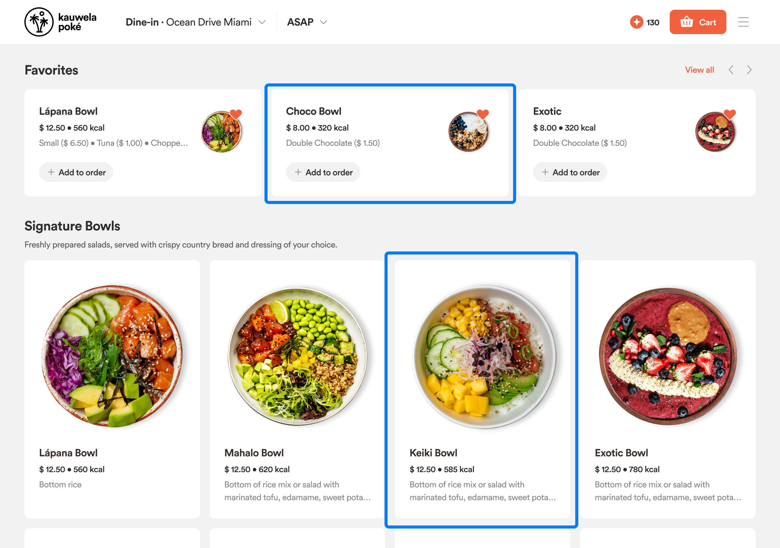
Background Front: The main surface color of the app: page backgrounds, cards, modals, dropdowns, and the sticky checkout bar
-
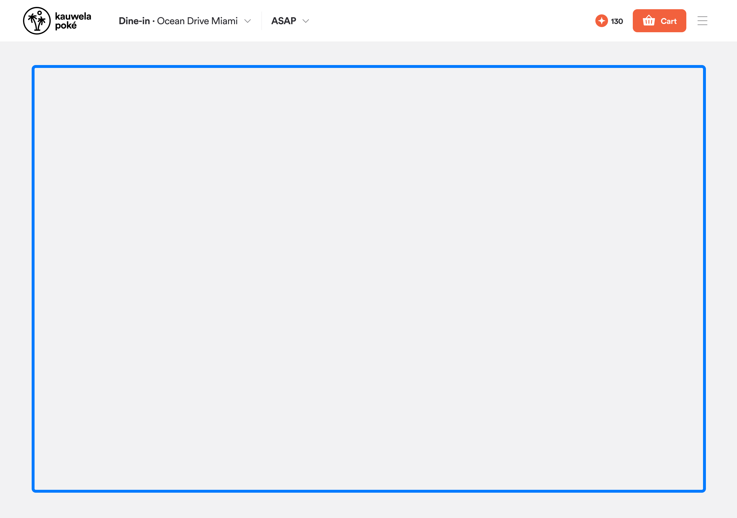
Background Back: Secondary areas that sit behind the main content
-
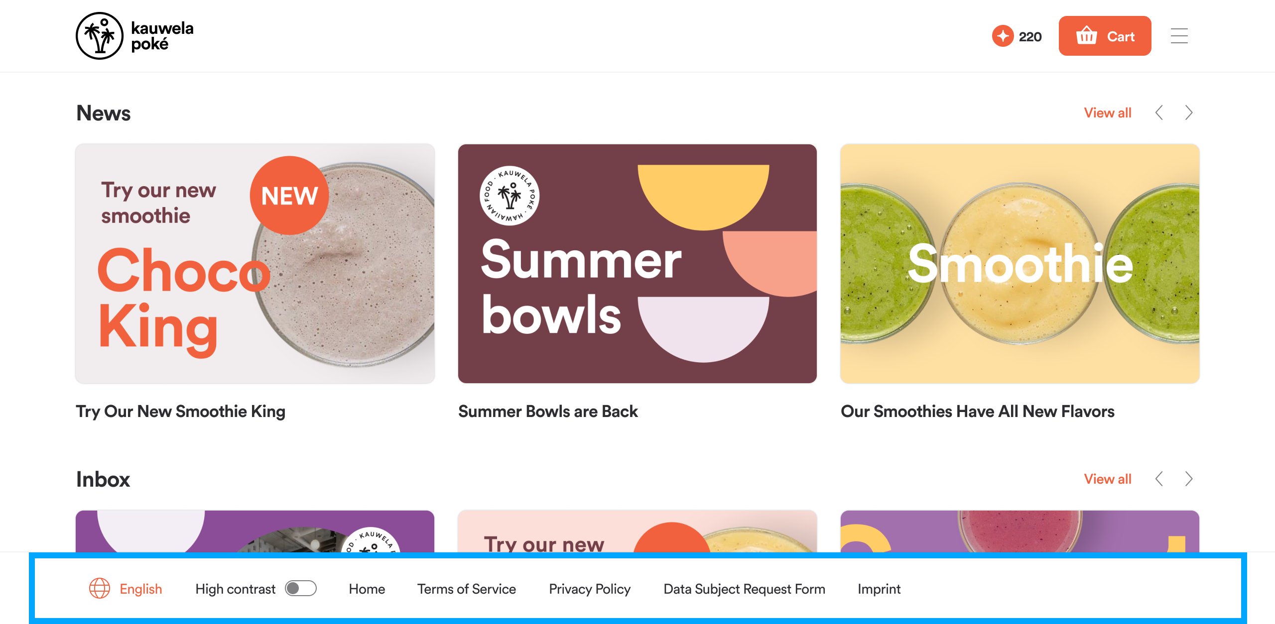
Background Footer: The color of the app footer
-
Background Splash Screen: The initial loading background that appears when a customer opens the mobile app
Tip: To create clear visual depth, make sure Background Front (for cards and modals) slightly contrasts with Background Back (the base surface layer).
State Colors
-
Success: Successful actions, such as an order placed and confirmed
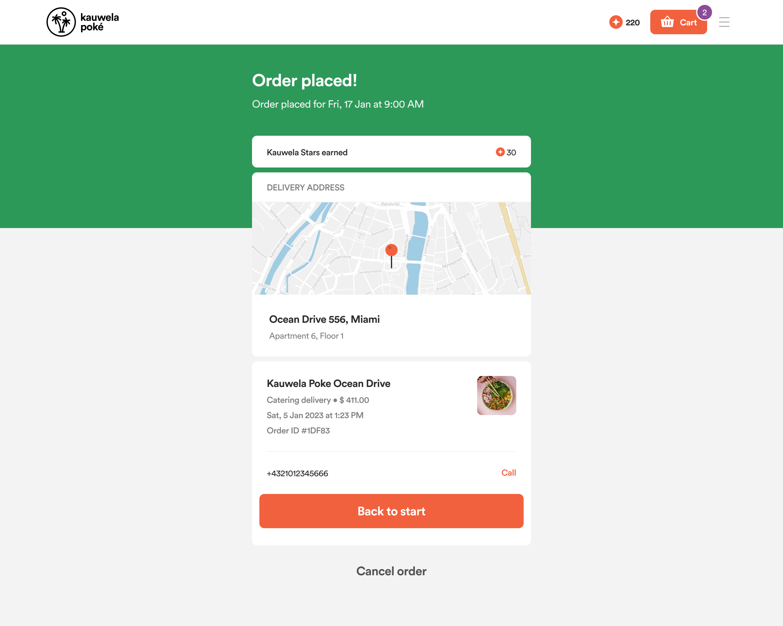
-
Error: Form validation messages, error states, and failed actions
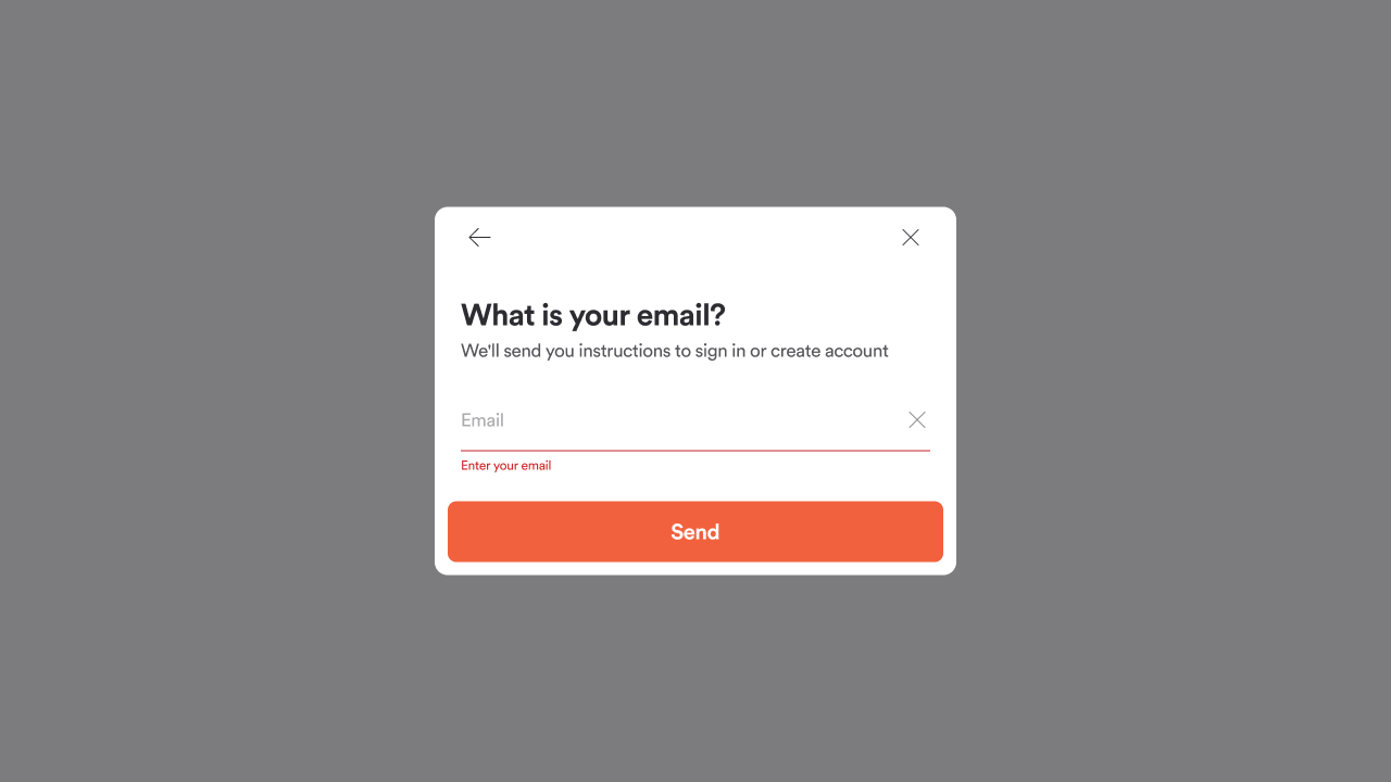
Tip: Match colors to their meaning. Use green for Success and red for Error so customers can quickly spot important alerts.
Icon Colors
-
Icon Active: Icons in their prominent, active state
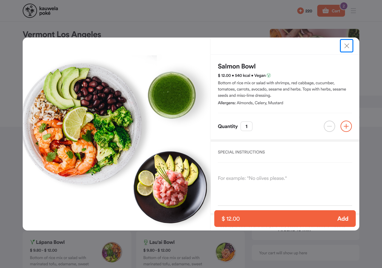
-
Icon Idle: Default icons throughout the app: header, navigation, and modals
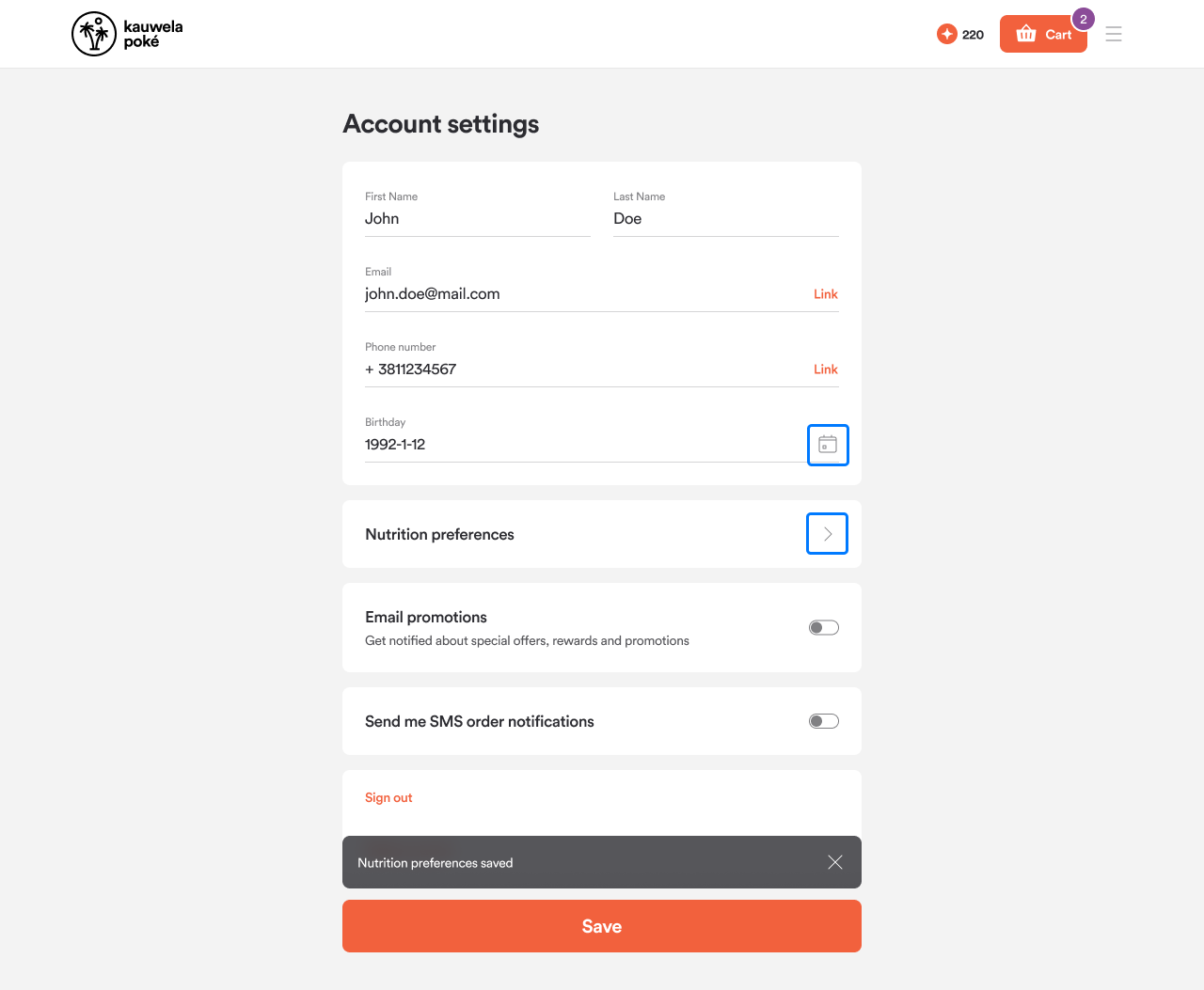
Tip: Choose an icon color that contrasts with your background. Use dark icons on light backgrounds and light icons on dark backgrounds.
Miscellaneous Colors
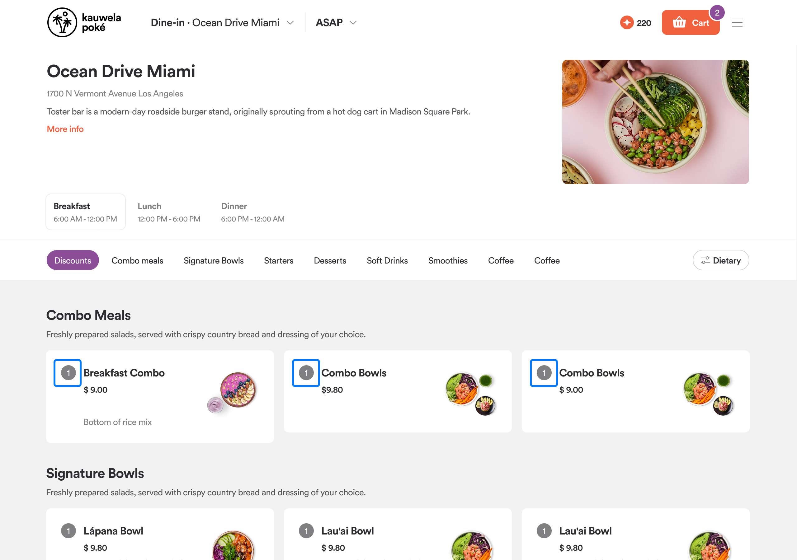
-
Counter: The badge color on menu item cards showing how many units have been added to the cart.
-
Luma: Controls the tint of borders, lines, and tooltips. Other subtle UI colors are automatically generated from this shade by lowering its opacity.
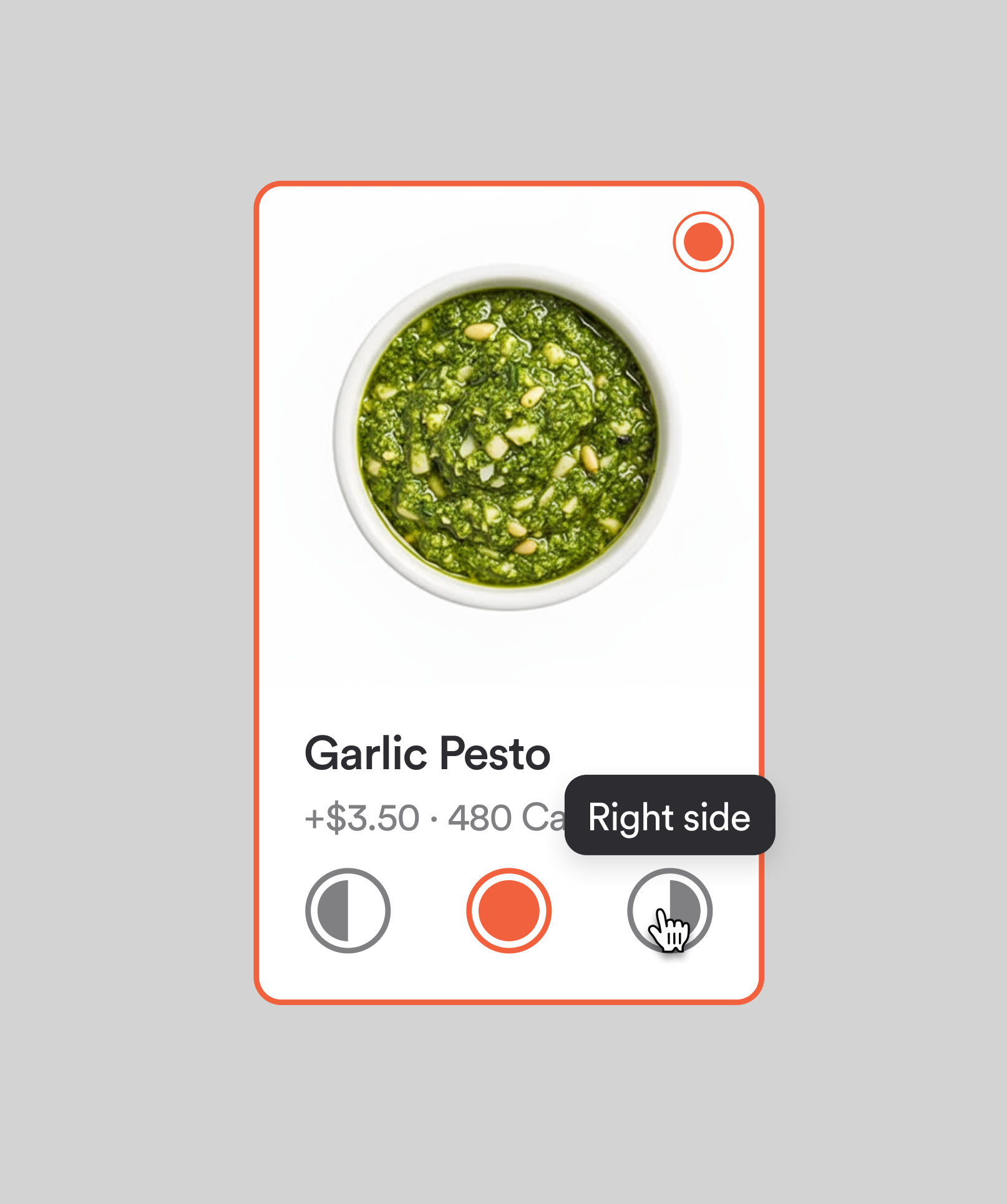
Note: For Luma, choose a very dark color so that even low opacities (such as 6%) remain clearly visible.
Line Colors
Lines divide sections in the interface.
- Default: Lines on light backgrounds
- Passive: Lines on dark backgrounds or when dividing large sections on a page
Typography
Design guidance: Web & Mobile: Typography (Fonts) | Kiosk: Typography (Fonts)
Typography defines how all text looks across your channels: which fonts your customers read, how heavy or light they appear, their color, and whether they display in uppercase or as written.
Your Fonts
Every brand comes with Inter pre-loaded as the default font. You can use it as-is or replace it with your own brand font.
To use a custom font, select Add & manage fonts from any typography field and upload your files.
What to prepare:
- Font files in
.ttfor.otfformat, each under 3 MB - A separate file for each weight you need
- For the Body style specifically, prepare three weights: Regular, Semibold, and Bold. For example, if your brand uses Open Sans, upload Open Sans Regular, Open Sans Semibold, and Open Sans Bold, then map each to the corresponding weight slot.
Once uploaded, your fonts appear in the picker and can be assigned to any typography style.
Note: All fonts within the same style should come from the same font family. Mixing fonts from different families can cause unexpected results and will trigger a warning in the editor.
Note: Font files from the same family sometimes have slightly inconsistent internal naming, which can cause an upload error. If this happens, contact your PAR representative or support team for help.
Typography Controls
| Setting | What it does |
|---|---|
| Font | The typeface for this style; choose from your uploaded fonts or the default Inter |
| Color | The text color |
| Weight | How thick or thin the letters appear; options depend on which font weights you have uploaded |
| Text casing | How text is capitalized: As written, UPPERCASE, or lowercase |
Where to Start
Typography is set in the Global channel and flows through to all channels automatically. Start there to establish your brand's typographic foundation, then fine-tune individual channels only if needed.
Recommended order:
- Upload your brand font files.
- Open Global > General > Typography.
- Set Heading, Title, and Body with your brand font and colors.
- Set Button text to match your button style.
- Publish.
Typography Styles
There are five text styles, each applying to a specific layer of the interface. You configure them independently.
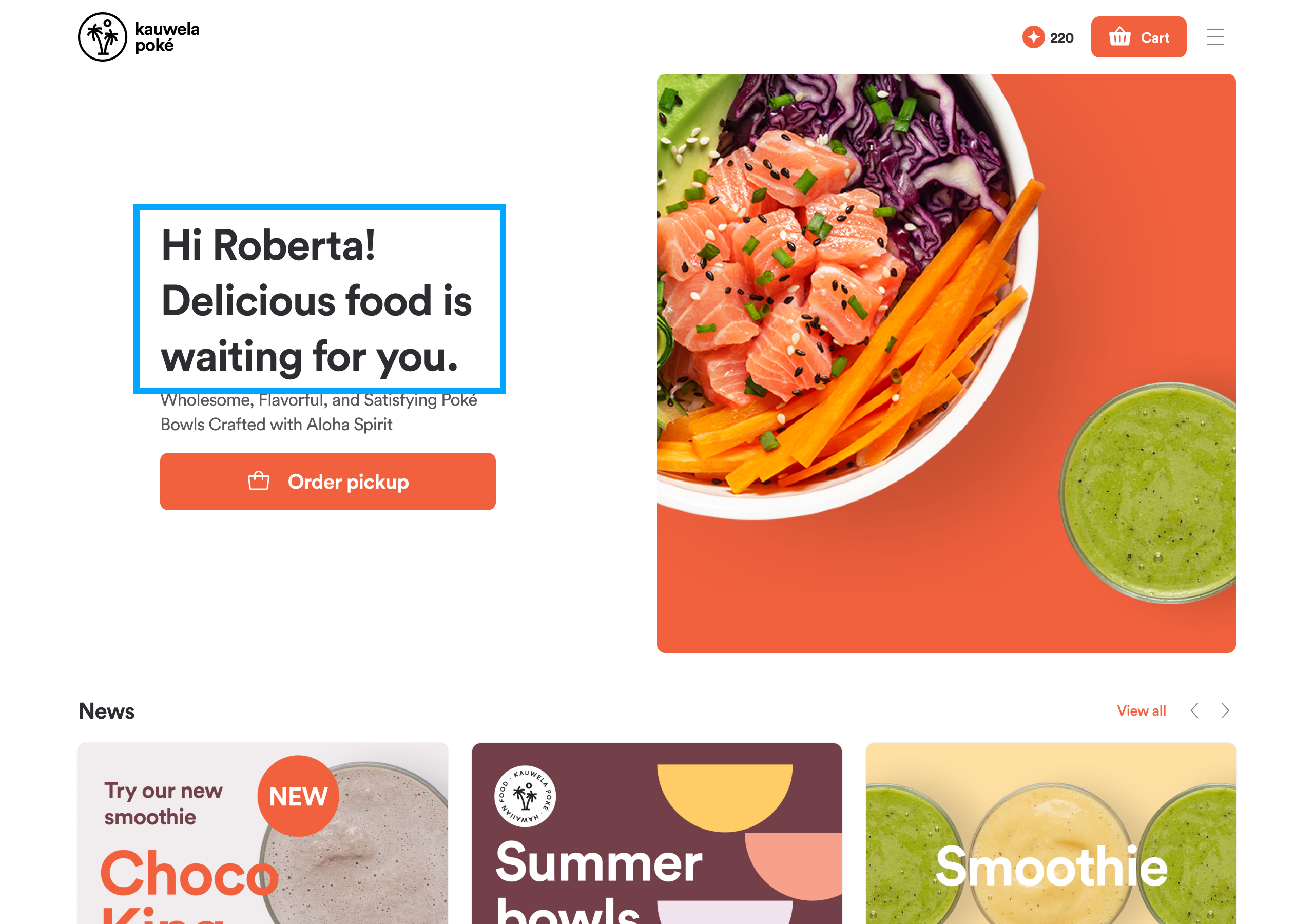
Heading
Your brand's most prominent text. Customers see it on page titles, section headers, and modal titles (all H1 to H3 level text throughout the app).
You can set: Font, color, weight, text casing.
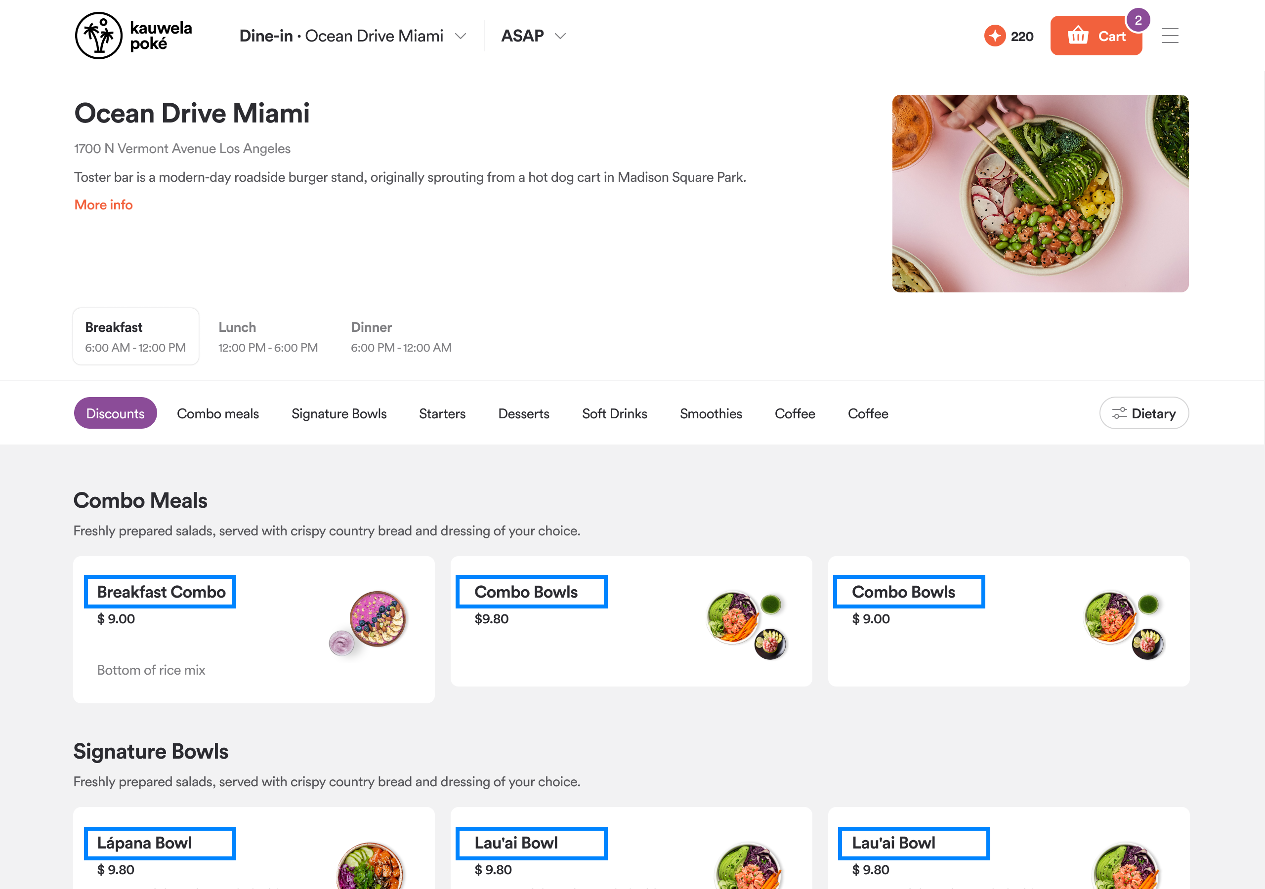
Title
One level below headings. Used for product names and key labels that need to stand out without competing with the main heading.
Customers see it on product names in the detail view, card headings, and prominent section labels.
You can set: Font, color, weight, text casing.
Body
Applied to most of the text your customers actually read: product descriptions, menu item details, form labels, and navigation text.
You can set: Font, color, weight, text casing.
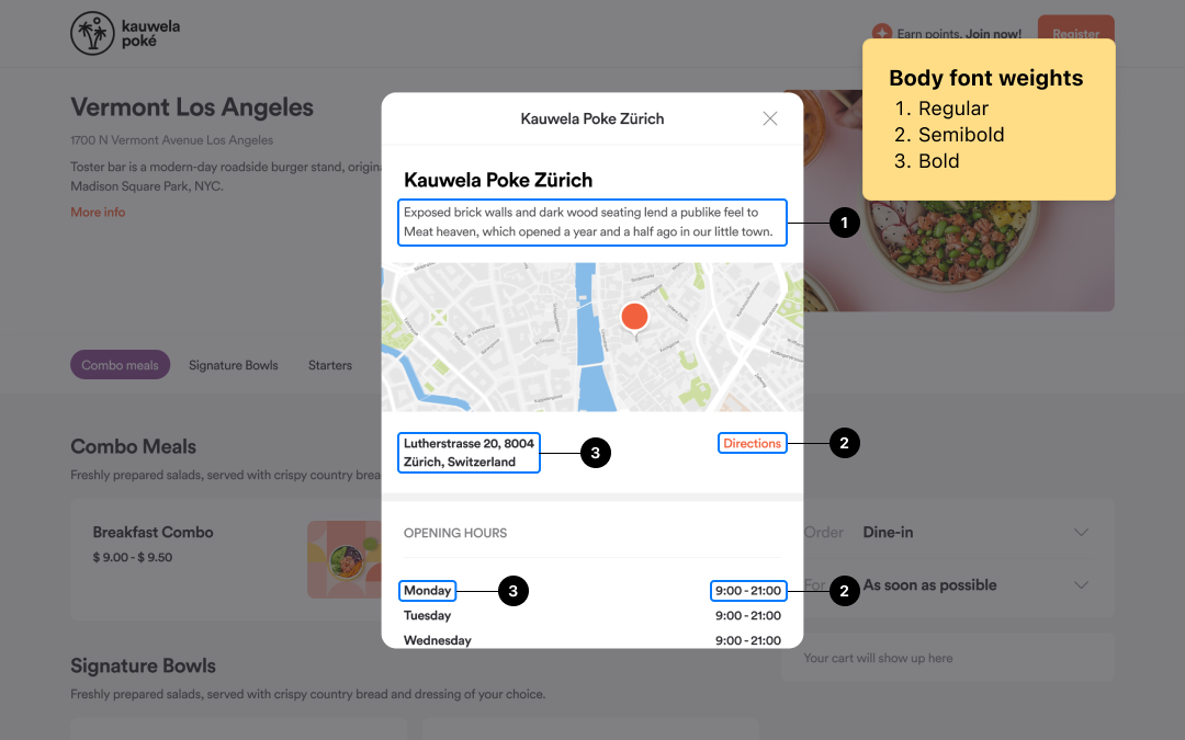
Note: Body color is also used at reduced opacity for secondary and muted text throughout the app (placeholder text, helper labels, and disabled states). These are calculated automatically from your base body color.
Footer
Controls the color of text in the app footer: footer navigation links, copyright notice, and other labels.
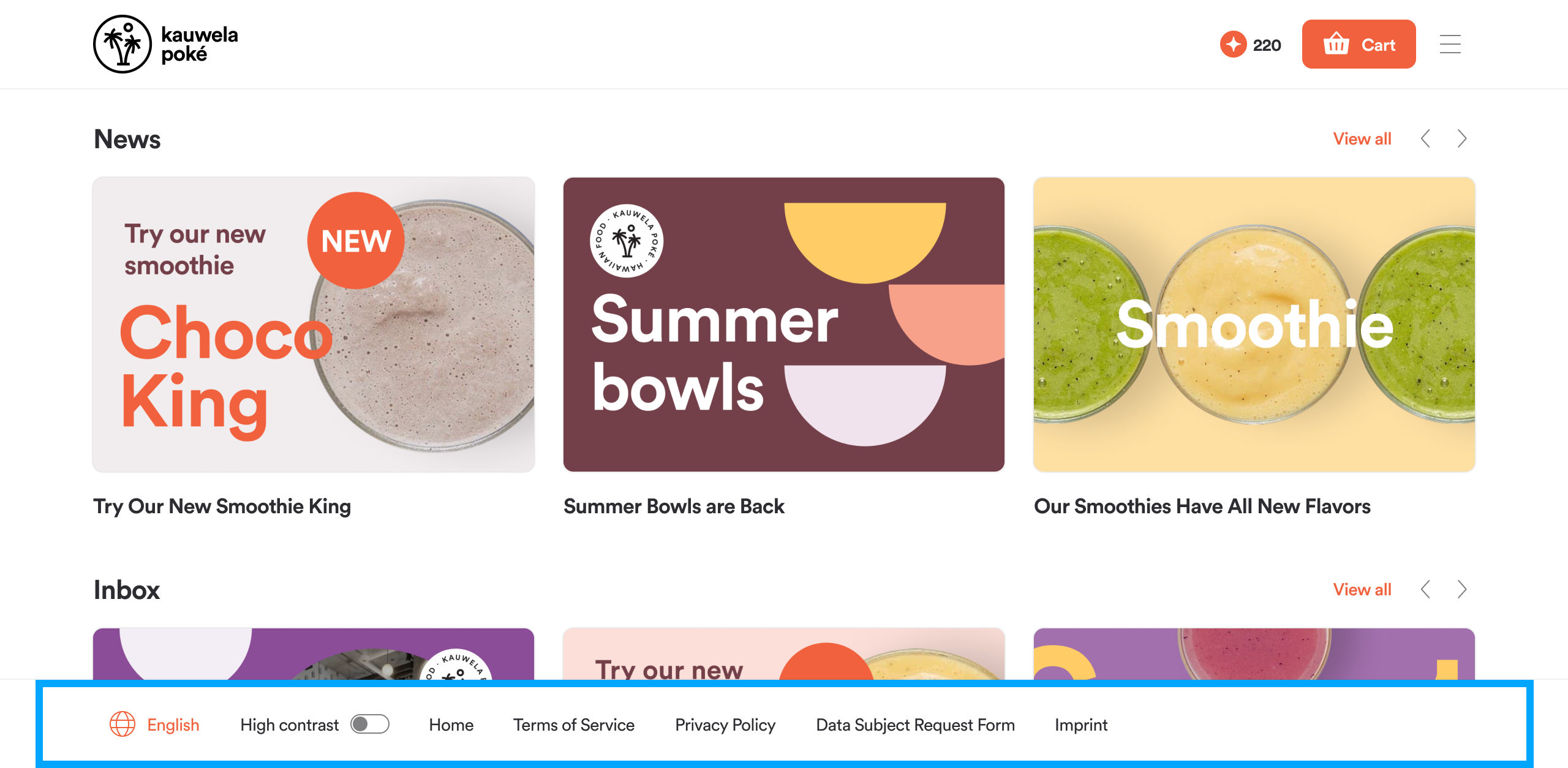
Note: Footer inherits the body font. Only the color is configurable here.
Button Text
Defines how text looks on every button in the app, from "Add to Cart" to "Place Order" to ghost buttons.
You can set: Font, weight, text casing.
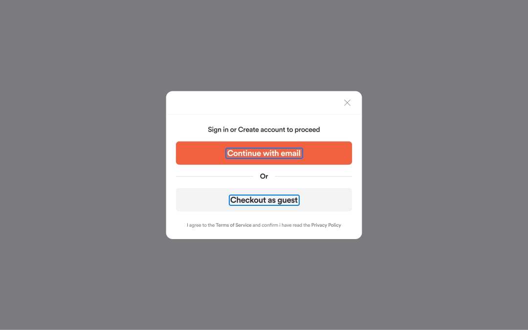
Text Style
Controls the appearance of button labels across all button variants.
| Control | What it does |
|---|---|
| Font family | Typeface used for all button labels |
| Font weight | Thickness of button label text |
| Text transform | UPPERCASE or As typed |
Note: Button label colors (for example, white text on a dark primary button) are set in the Buttons section.
Buttons
Design guidance: Web & Mobile: Buttons | Kiosk: Buttons
All button settings apply globally to every button in the app. Each button variant has its own color settings. All three variants share the same font and border radius settings.
Primary Button
Your main call-to-action style. Appears on Add to Cart, Checkout, Place Order, Log In, Sign Up, and all primary confirmation actions.
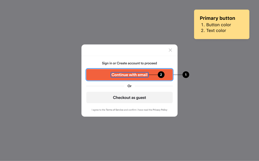
| Control | What it does |
|---|---|
| Button color | Background fill of the primary button |
| Text color | Label color on the primary button |
Secondary Button
Used for supporting or alternative actions, typically alongside a primary button. Appears on Cancel, Go Back, secondary modal actions, and dismiss options in dialogs.
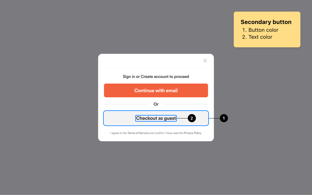
| Control | What it does |
|---|---|
| Button color | Background fill of the secondary button |
| Text color | Label color on the secondary button |
Tertiary Button
The lightest button style. Used for ghost, text-only, or low-emphasis actions. Appears on navigation menu items, category tab active states, header user menu options, and ghost-style actions.
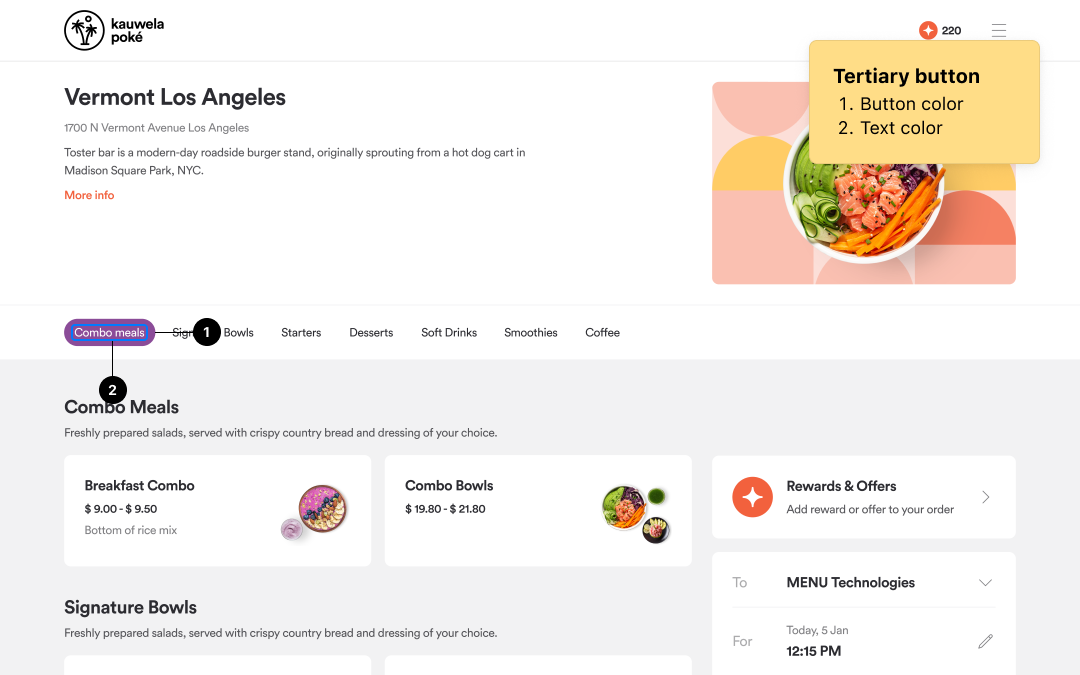
| Control | What it does |
|---|---|
| Button color | Background fill of the tertiary button |
| Text color | Label color on the tertiary button |
Button Border Radius
Two separate radius settings control how rounded buttons appear:
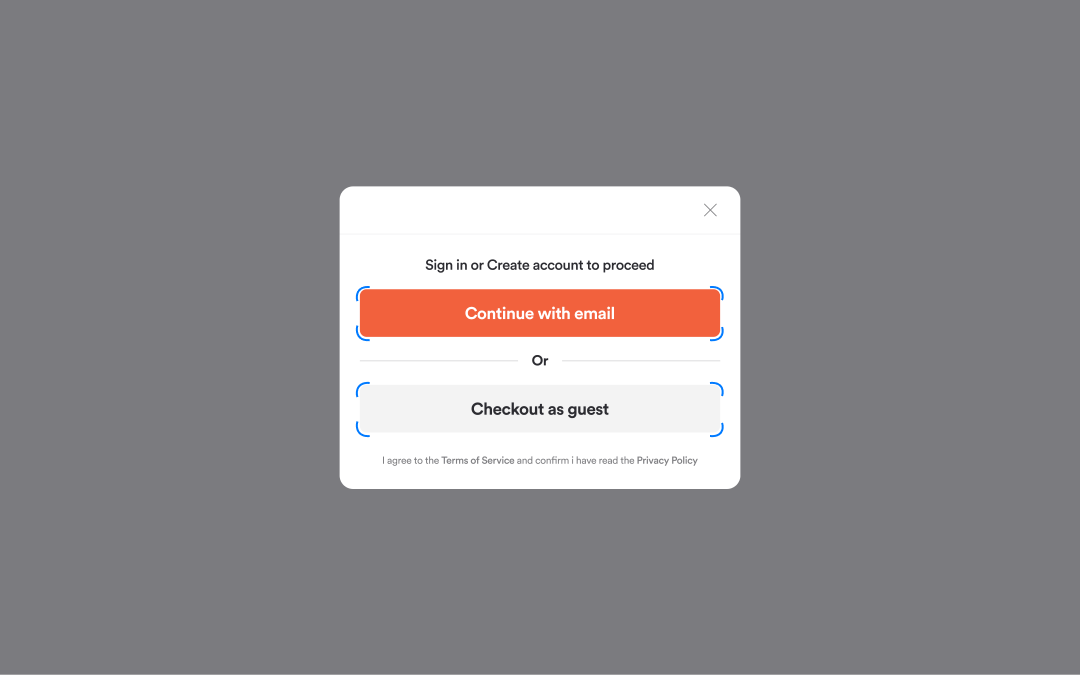
| Setting | Applies to |
|---|---|
| Small (Button radius) | Primary and secondary buttons: Add to Cart, Checkout, Place Order |
| Large (Button radius) | Tertiary and ghost buttons, tip selection chips, menu category navigation pills |
Note: Setting both to 0 gives fully square buttons. Setting them to a large value (such as 100px) gives fully pill-shaped buttons.
Borders and Shadows
Design guidance: Web & Mobile: Borders & Shadows | Kiosk: Borders & Shadows
In addition to button corners, there are four independent radius settings, each applying to a different type of UI element.
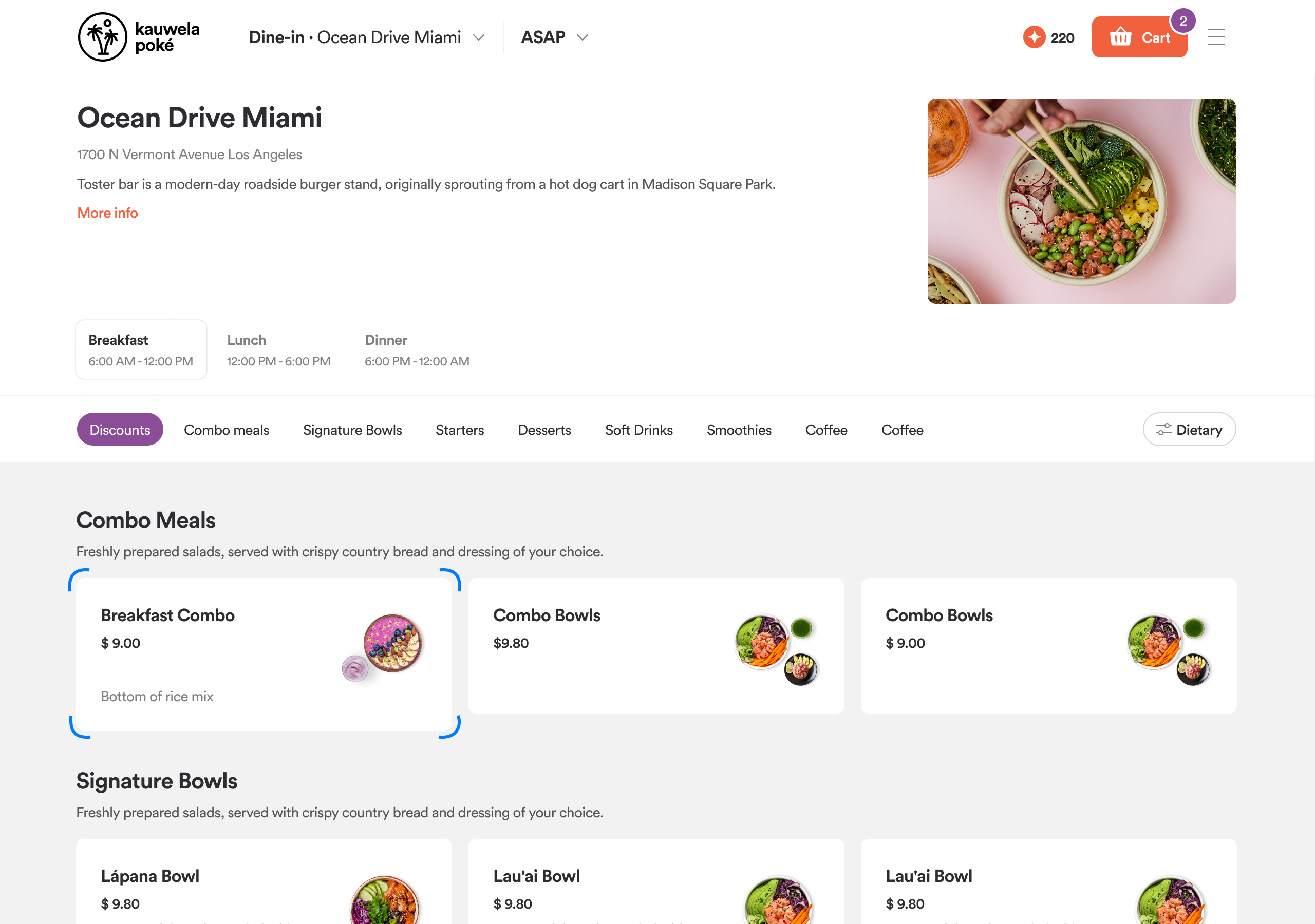
Cards
Controls the rounded corners on all card-shaped elements: product cards in the menu, gift cards, loyalty and points cards, promo and discount cards, the header dropdown panel, checkout summary cards, and dropdown menus.
Modals and Dialogs
Controls the rounded corners on all overlay windows: every popup dialog in the app (authentication, delivery address, product detail, cross-sell suggestions, announcements, and payment screens).
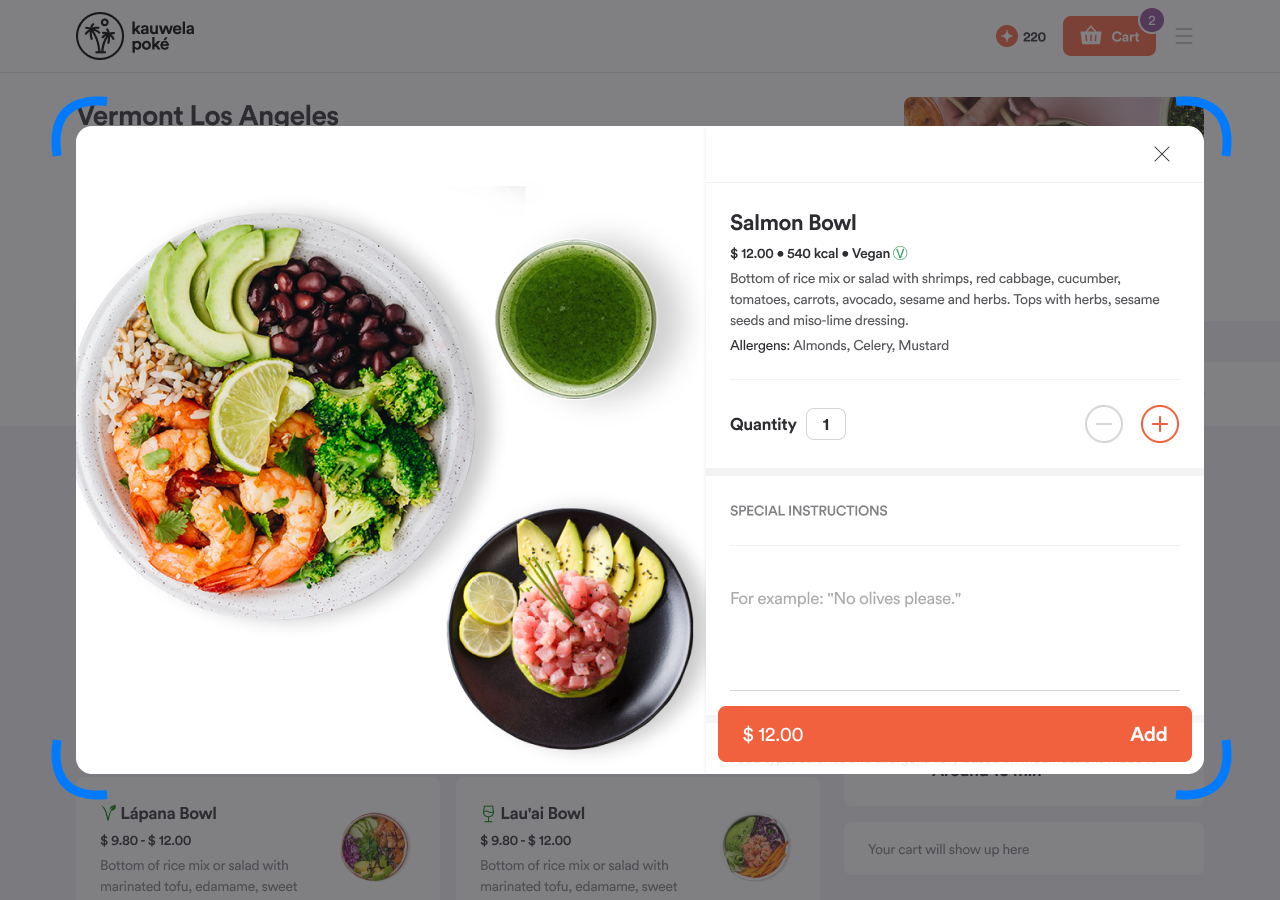
Tip: A higher value gives a softer, more modern feel. Set to 0 for a sharp, bold aesthetic.
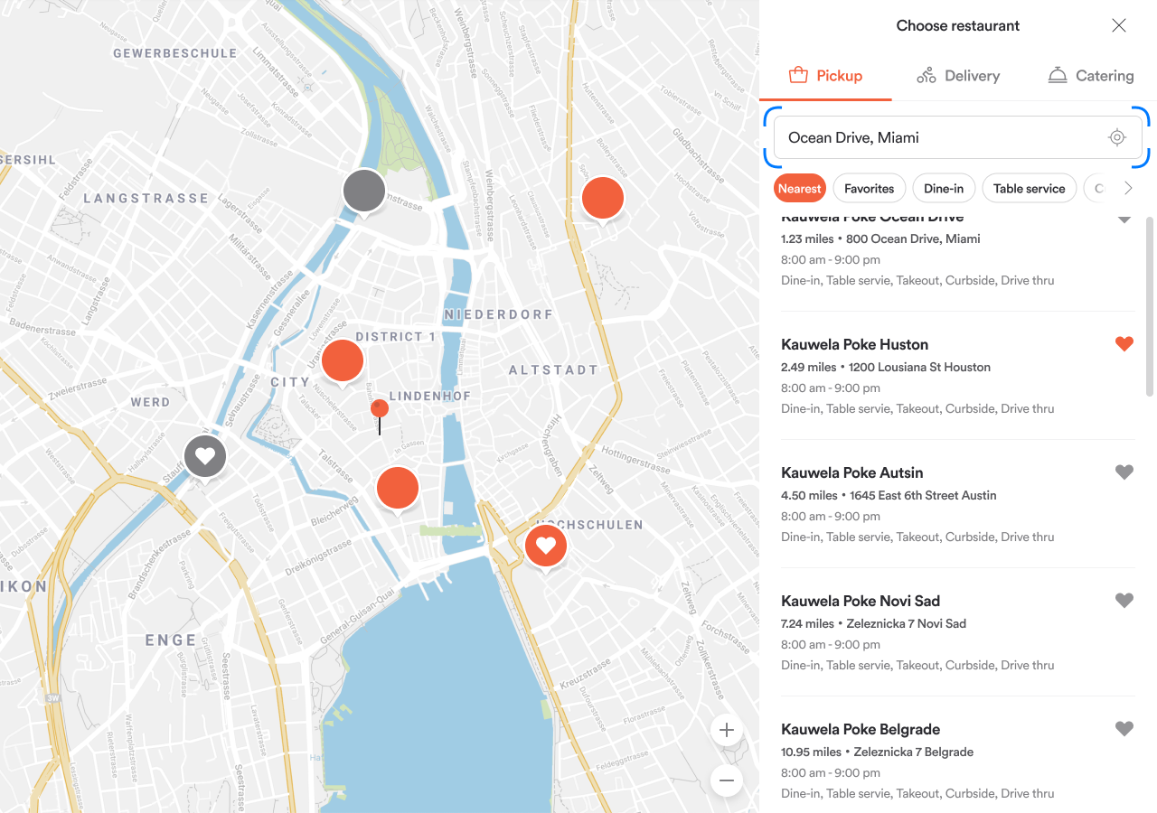
Inputs
Controls the corner rounding of all text input fields: delivery address, search bar, checkout forms, login, and registration fields.
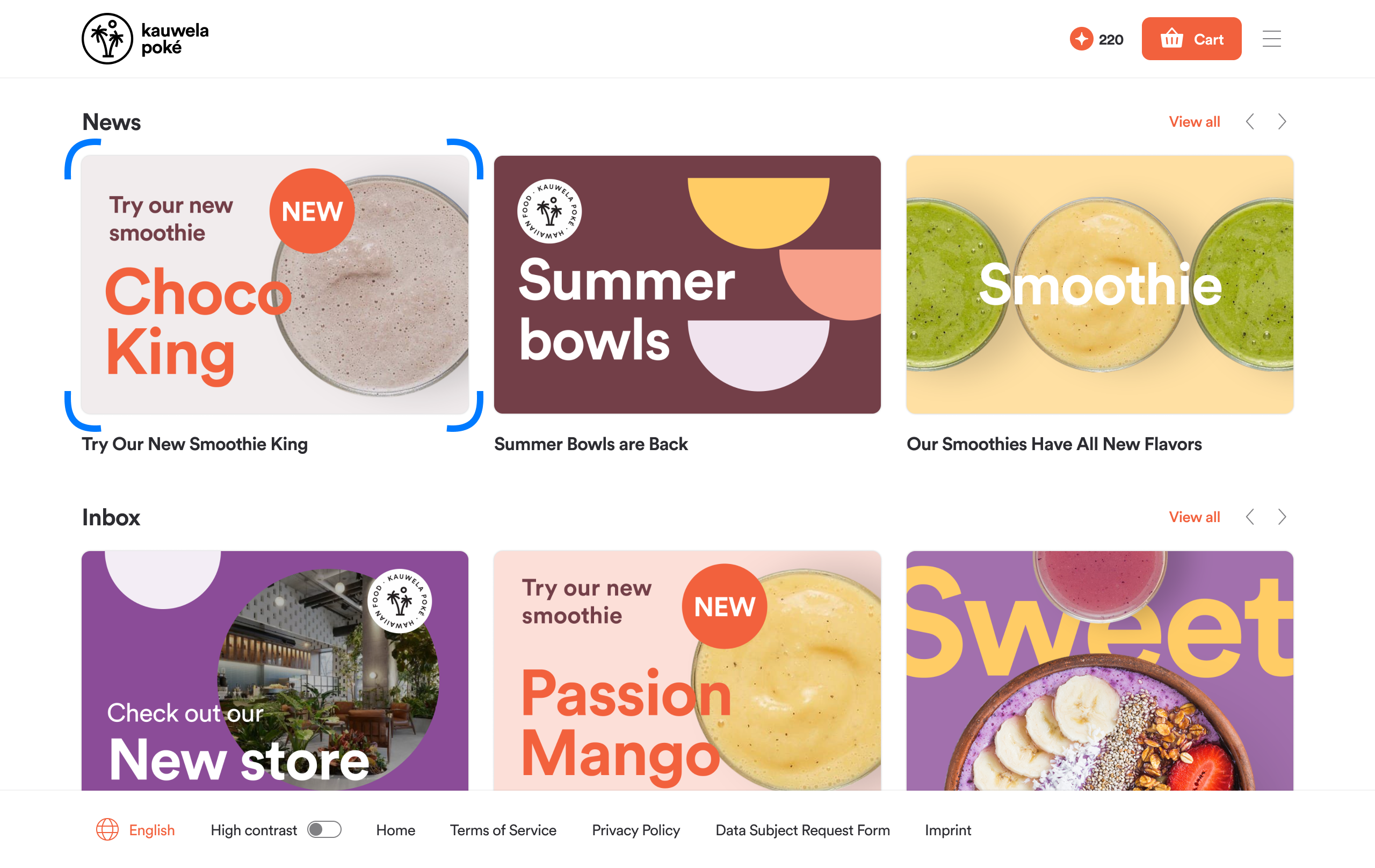
Images
Controls the corner rounding of product photos, news images, home slider images, and category images.
Shadows
Shadows add depth and separation between layers of the interface. Each shadow is configured by offset, blur, spread, and color.
| Setting | What it lifts |
|---|---|
| Short shadow | Cards and smaller elevated elements: product cards, the header dropdown, navigation bar, search results, home slider cards, checkout cards |
| Long shadow | Larger floating panels: the cookie banner, order-type selection cards, and offers tier dropdown |
| Focus shadow | The outline that highlights form fields, filters, and interactive controls when selected or active. Also visible when navigating with keyboard tab navigation. |
Note: Leave shadow settings unchanged. The one exception is the Focus shadow color, which you can adjust to match your brand.
Icons
Design guidance: Web & Mobile: Assets | Web & Mobile: Loyalty | Kiosk: Assets | Kiosk: Loyalty
Tab Bar Icons
The icons in the mobile bottom navigation bar. Each tab has a default (unselected) and selected state icon.
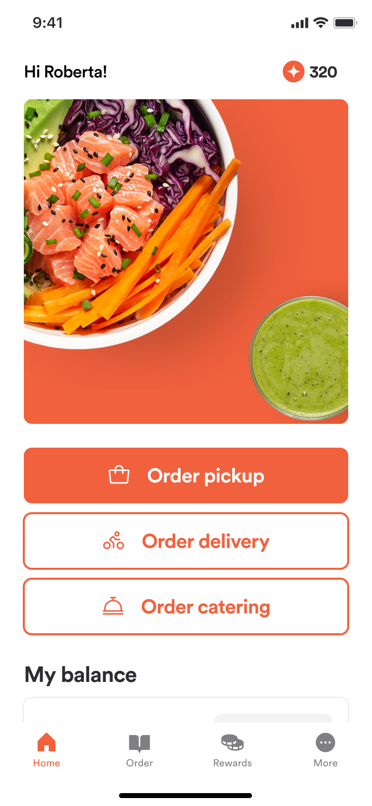
| Tab | Icon slots |
|---|---|
| Home | Home Default / Home Selected |
| Order | Order Default / Order Selected |
| Loyalty | Loyalty Default / Loyalty Selected |
| More | More Default / More Selected |
| My Code | My Code Default / My Code Selected |
If no custom icons are uploaded, the app uses its built-in icons.
Order Type Icons
Icons shown in order-type selection screens (home page, store finder, checkout). Each service method has its own icon:
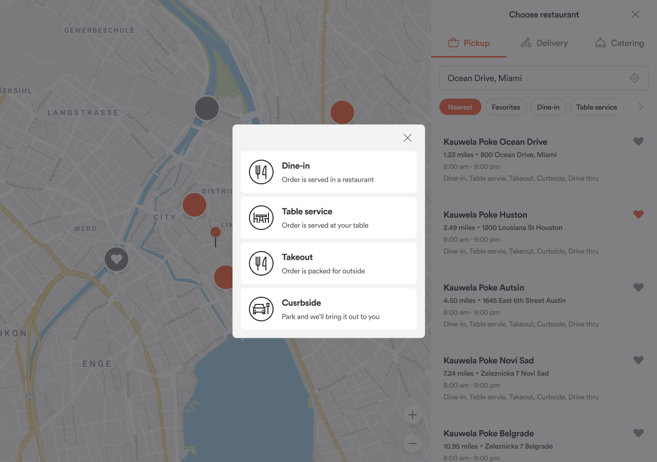
- Delivery
- Takeout
- Dine-in Pickup
- Table Service
- Curbside
- Drive-Thru
- Catering / Catering Pickup
- Foodspot
- In-restaurant
Map Pins
Custom icons used on maps throughout the app:
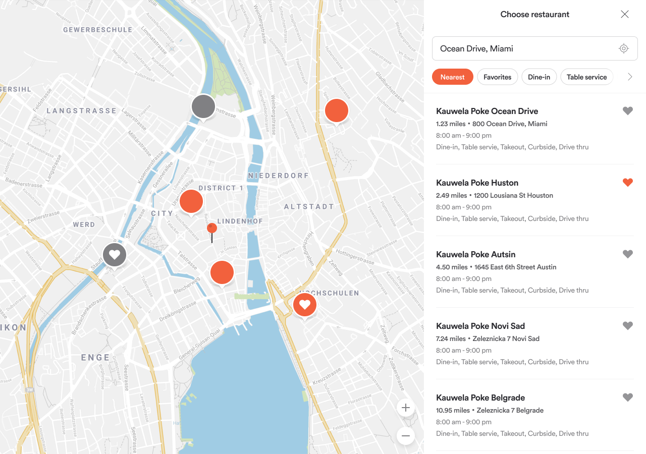
| Icon | Where it appears |
|---|---|
| Store Location (Open) | Open venue marker on store finder and delivery maps |
| Store Location (Closed) | Closed venue marker |
| Delivery Destination | The customer's delivery address pin |
| Favorite Store (Open / Closed) | Venue pin when saved as a favorite |
Favicon
The small icon that appears in the browser tab.
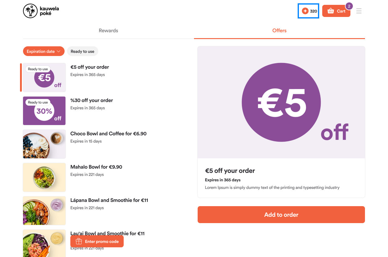
Coin and Rewards Icon
Represents loyalty points throughout the app. Appears in the header loyalty chip, home loyalty card, cart loyalty rows, checkout points status, order status page, and points program details.
Final Tier Icon
Represents the highest level of your loyalty program.
Illustrations
Design guidance: Web & Mobile: Assets | Web & Mobile: Loyalty | Kiosk: Assets | Kiosk: Loyalty
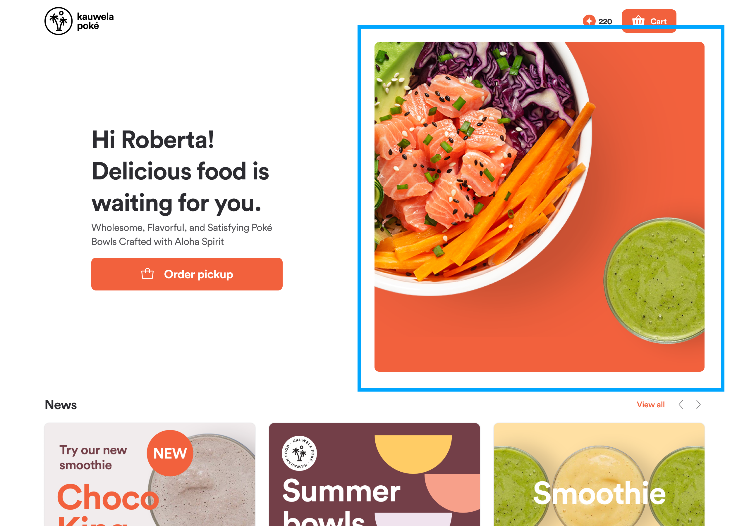
Home Screen Image
The hero image displayed on the home page order cards. This image sets the visual tone of the app's first impression.
Brand Logo
Shown in the header, scan modal, and app install banner. Also used as a fallback during onboarding if no separate splash illustration is uploaded.
Tip: Use a transparent-background file for best results across different background colors.
Splash Screen Logo
Shown during mobile app startup. Use a transparent logo for best results. To change the splash screen background color, go to Colors > Background Splash Screen.
Large Illustrations
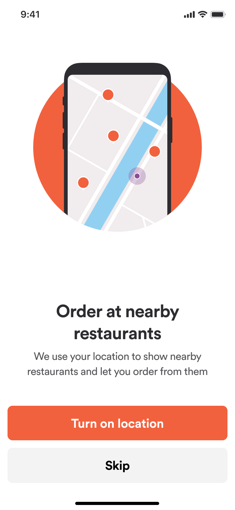
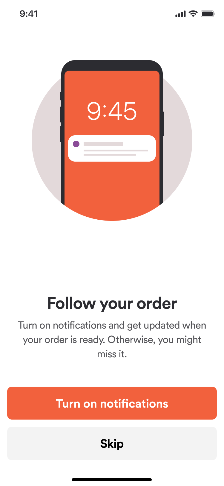
Images shown during the onboarding flow when the app requests permissions:
-
Location permission: When the app requests location access
-
Notifications permission: When the app requests push notification access
Loyalty Card Backgrounds
Background images on the loyalty program card:
-
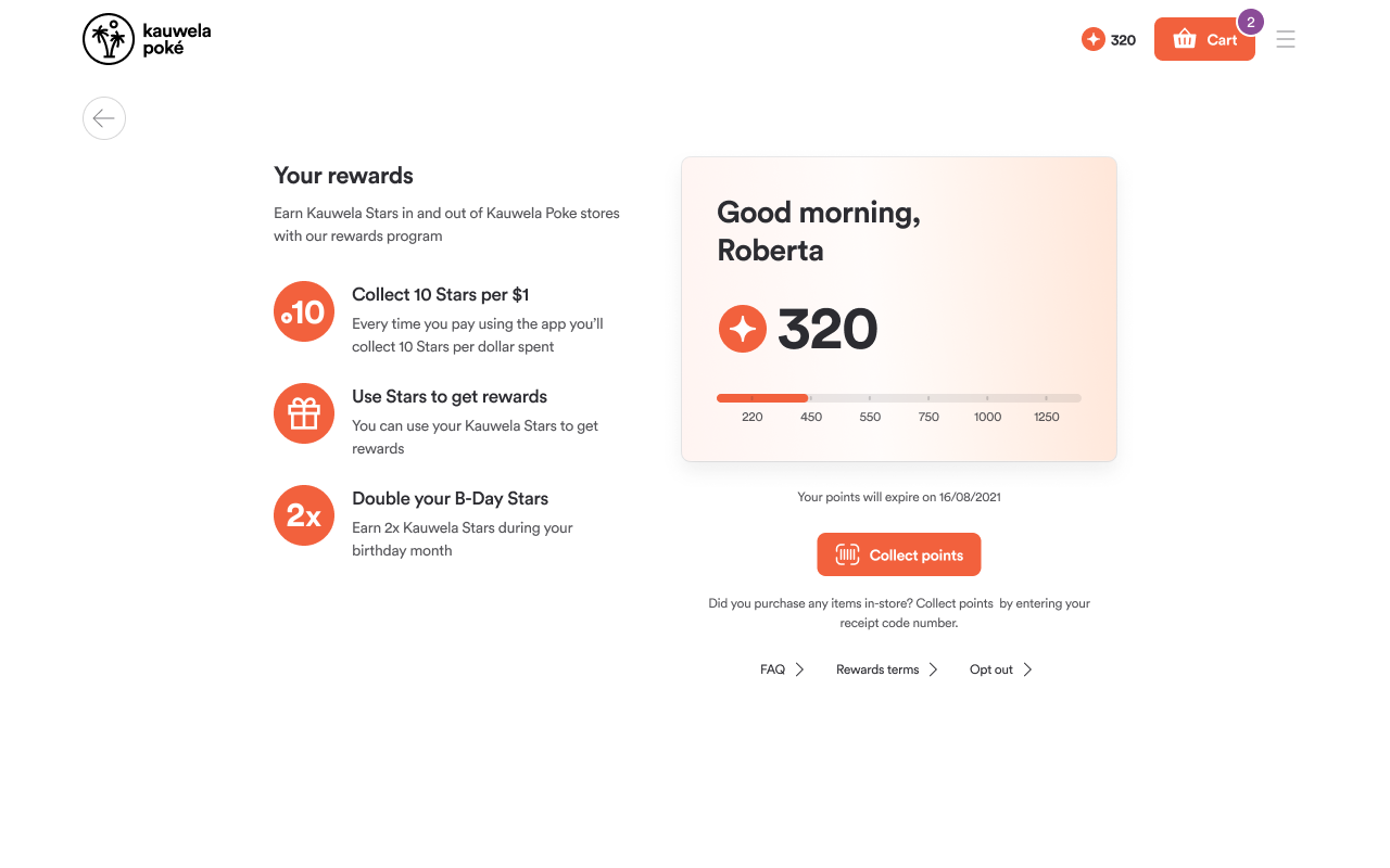
Card Background (Desktop): Loyalty card on the home page and points program page
-
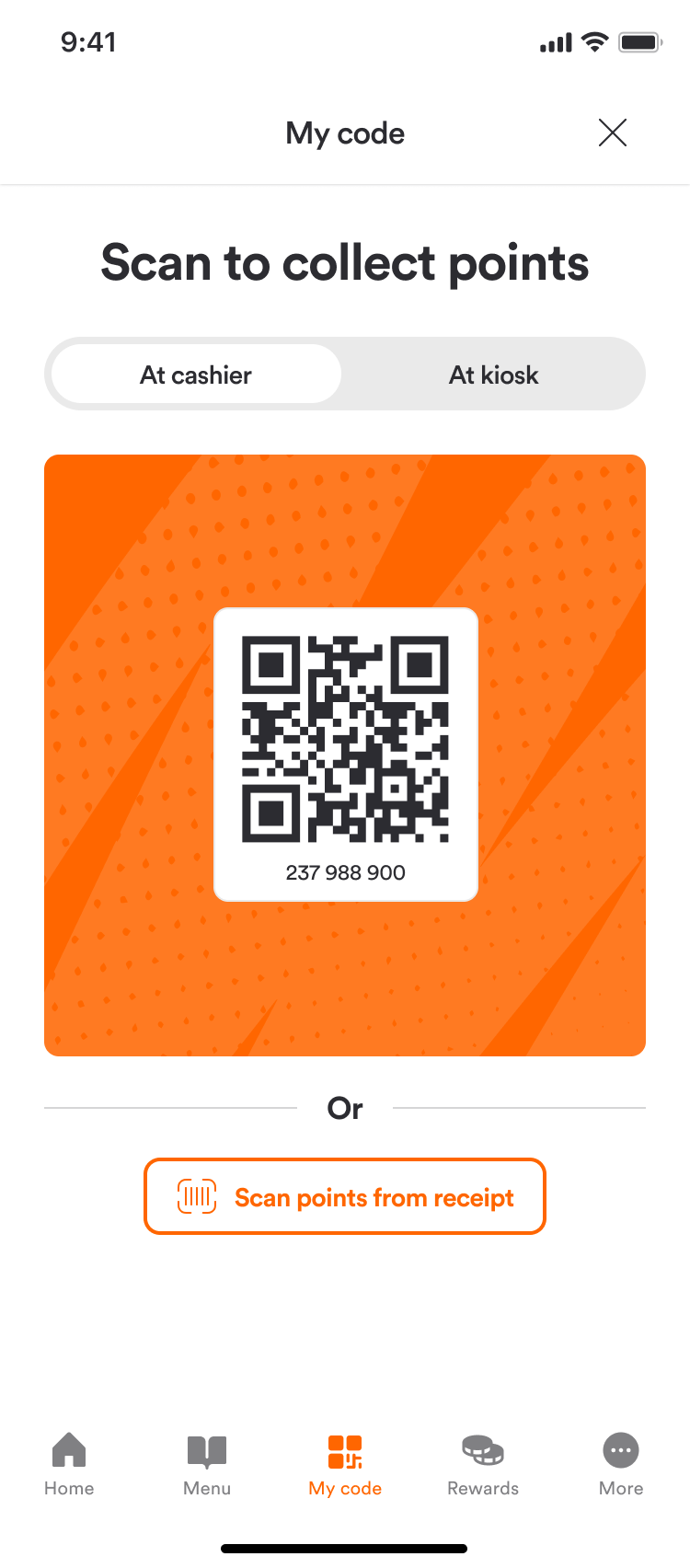
Card Background (Mobile): Loyalty card on order status, loyalty code scan, and rewards panels
Loyalty Program Description Images
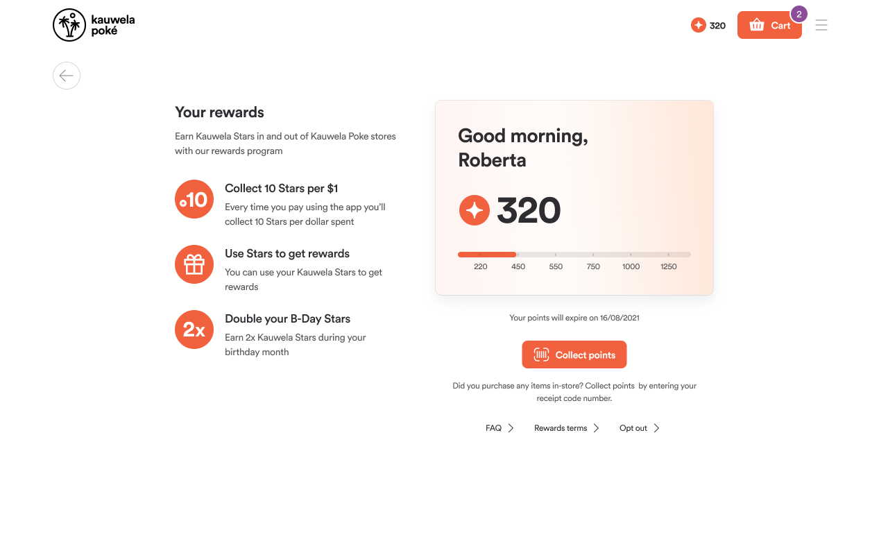
Three illustration slots for the Points Program Information page. One image per value-proposition paragraph explaining your loyalty program benefits.
Menu
Menu Header Style
Controls what appears at the top of the ordering page, above category navigation.
-
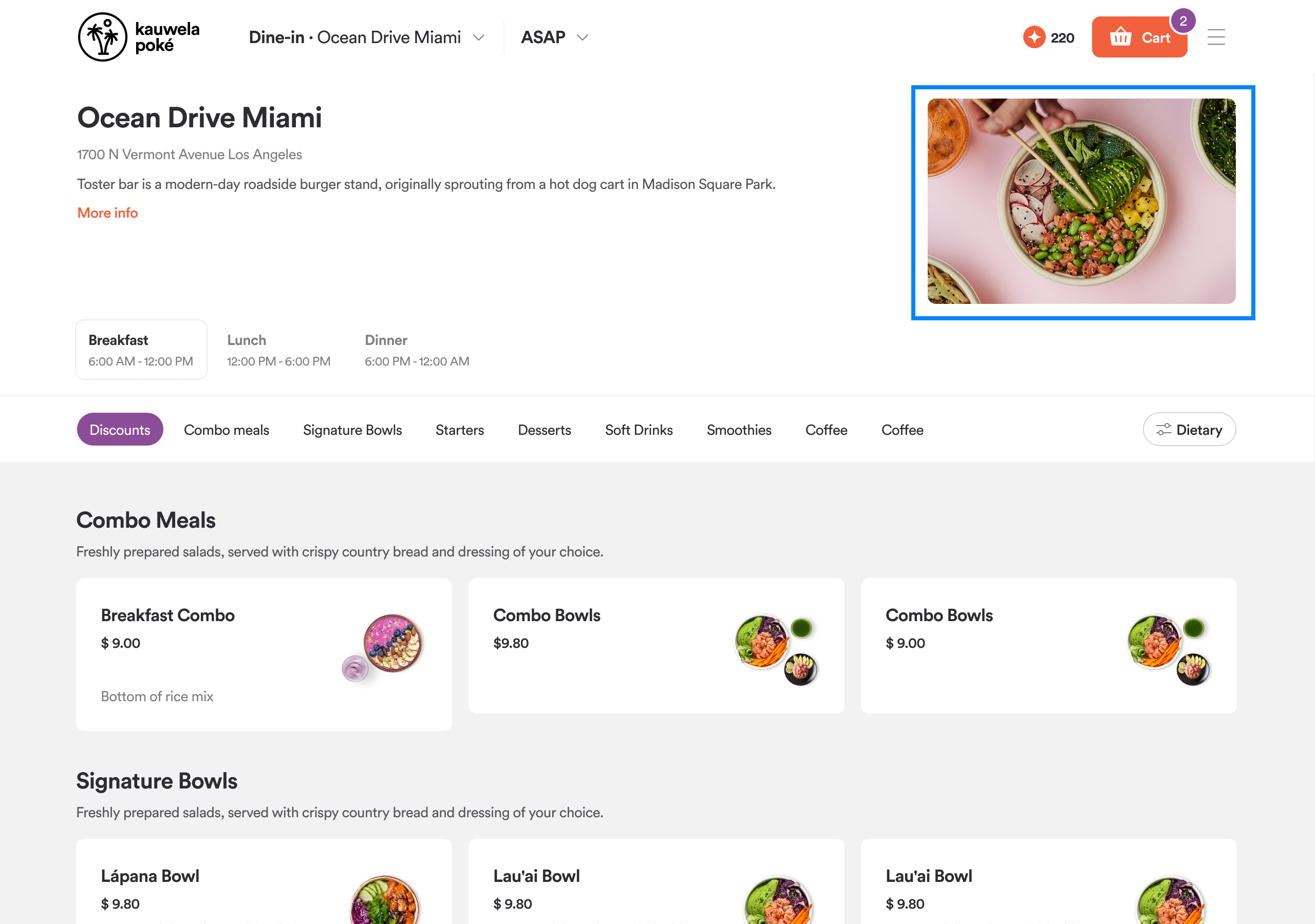
Text and image: Venue name, hours and status, description, and a "More info" link on the left; venue photo on the right
-
Image only: Full-width banner image with store info chip and favorite button overlaid
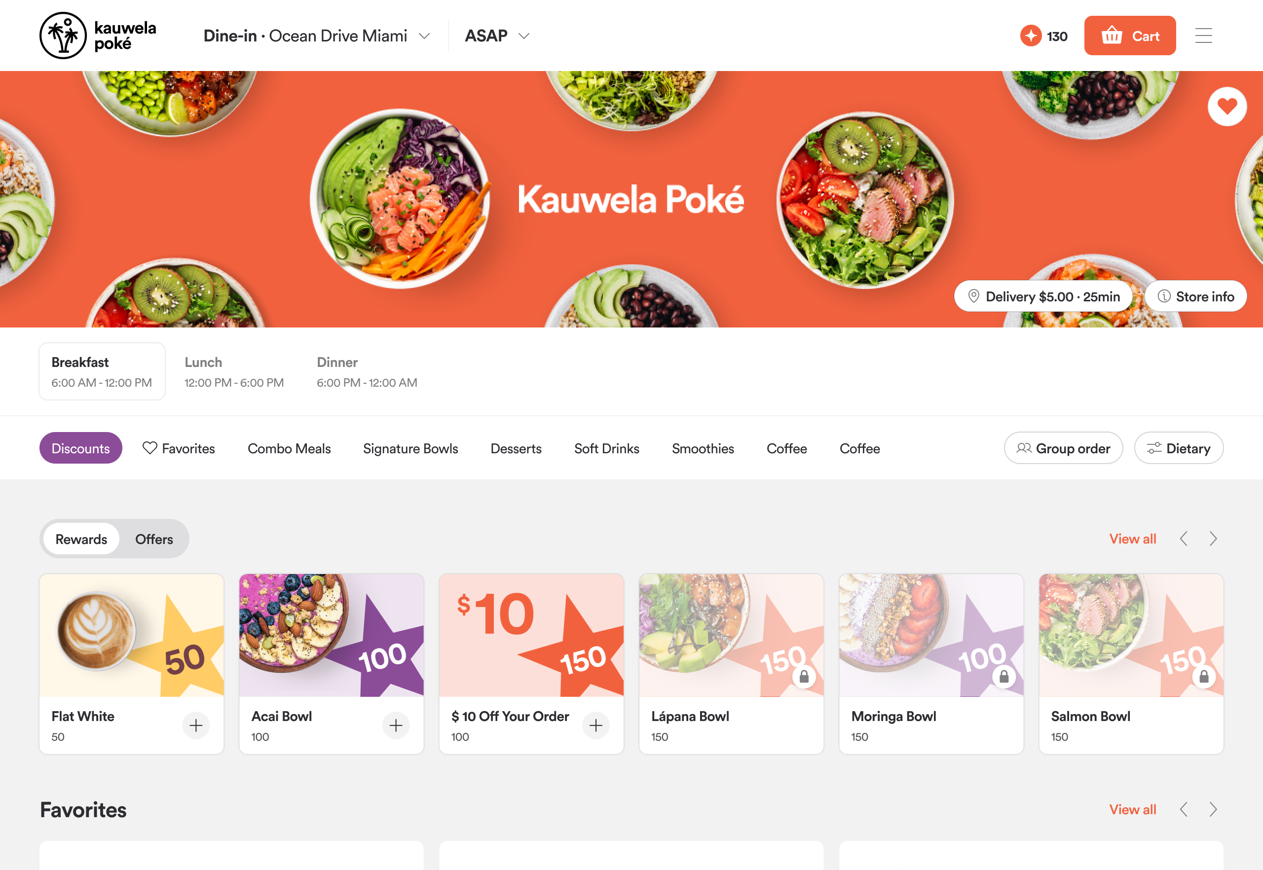
Image source:
| Option | Behavior |
|---|---|
| Per store | Each venue shows its own image from the CMS |
| Shared | All venues show the same banner image uploaded in the Customization Center |
Menu Item Layout
Controls how product cards look in the menu grid.
-
Horizontal: Classic list row with text and details on the left, small product image on the right
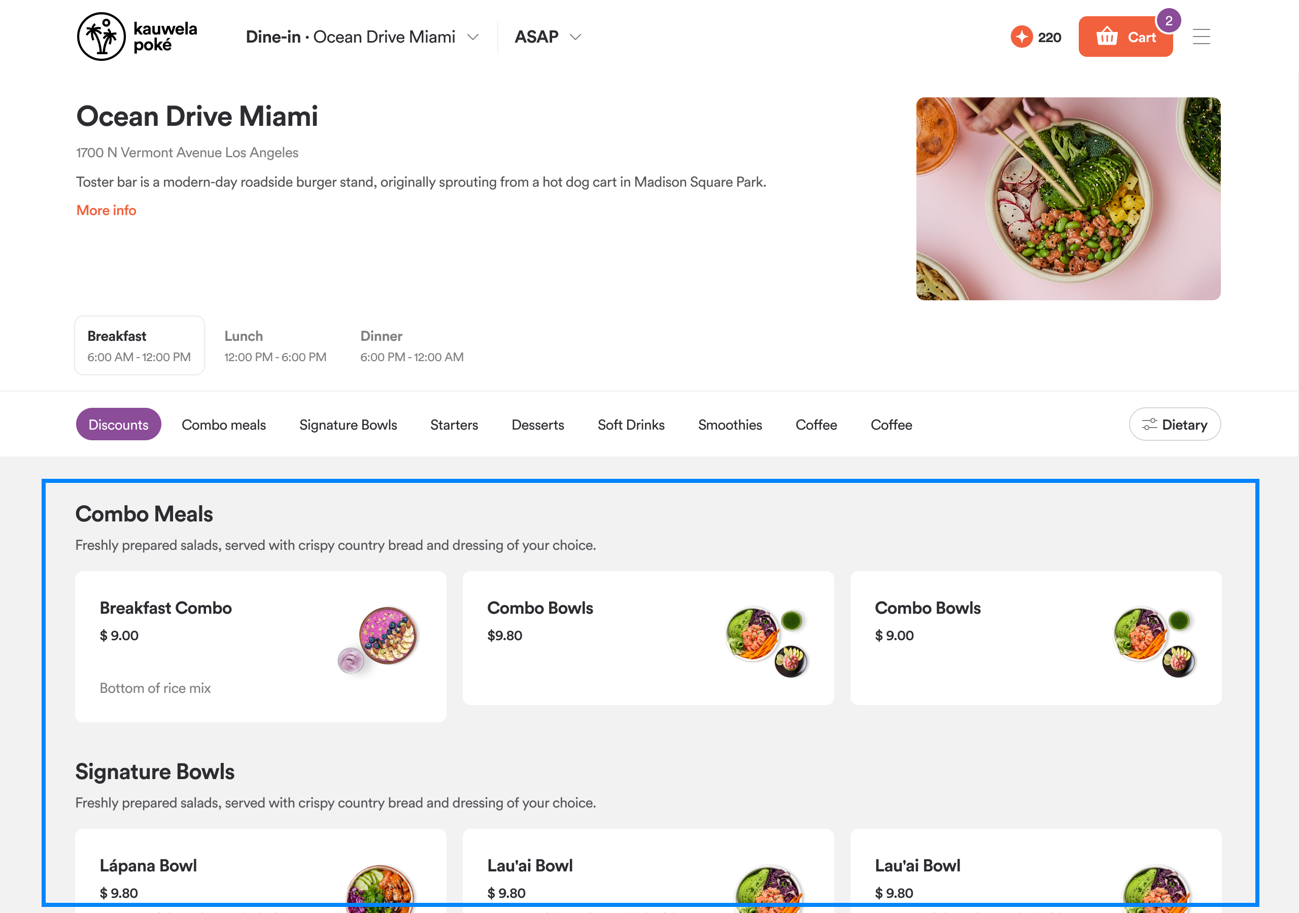
-
Vertical: Full-width card with a large product image on top, details stacked below
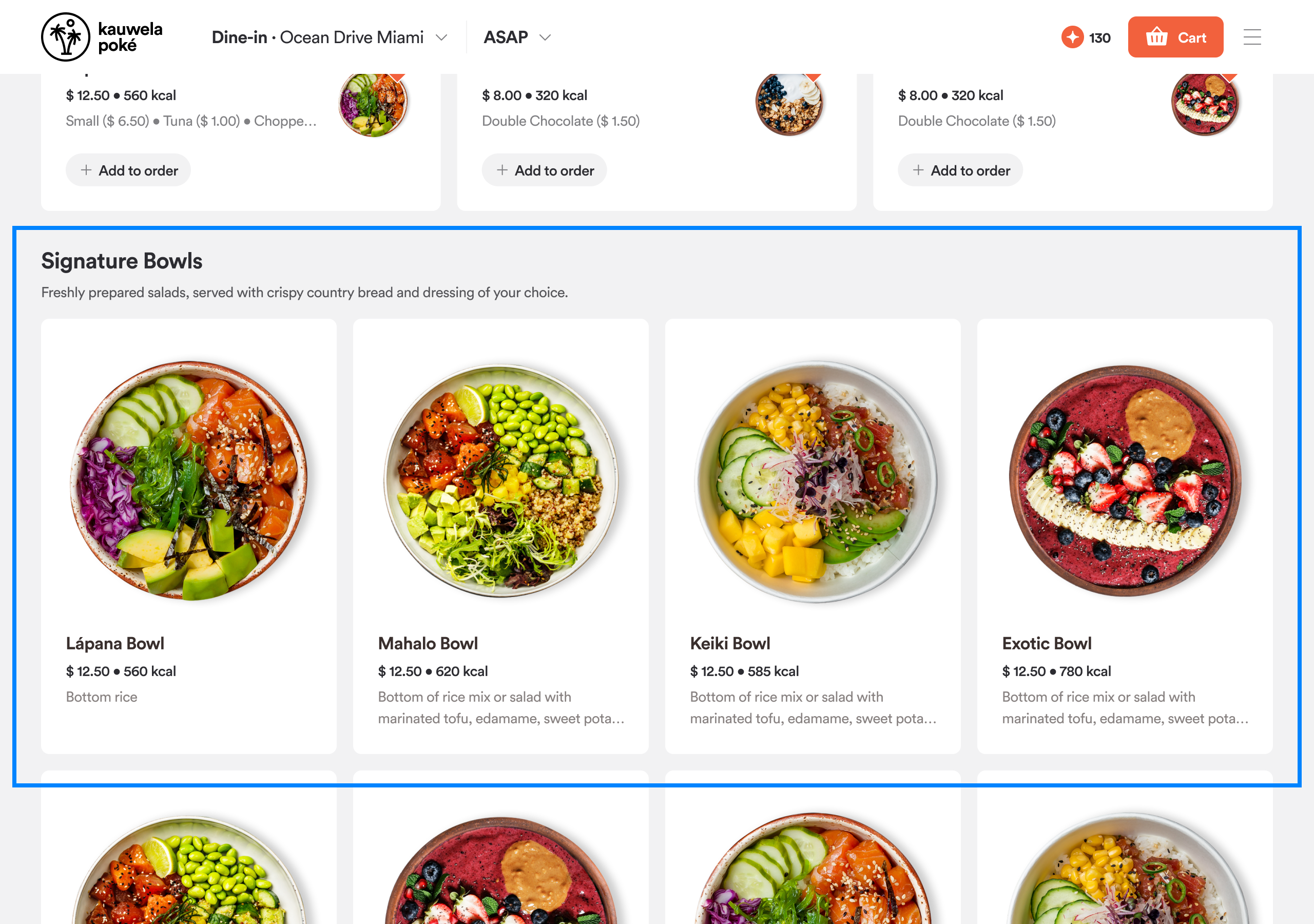
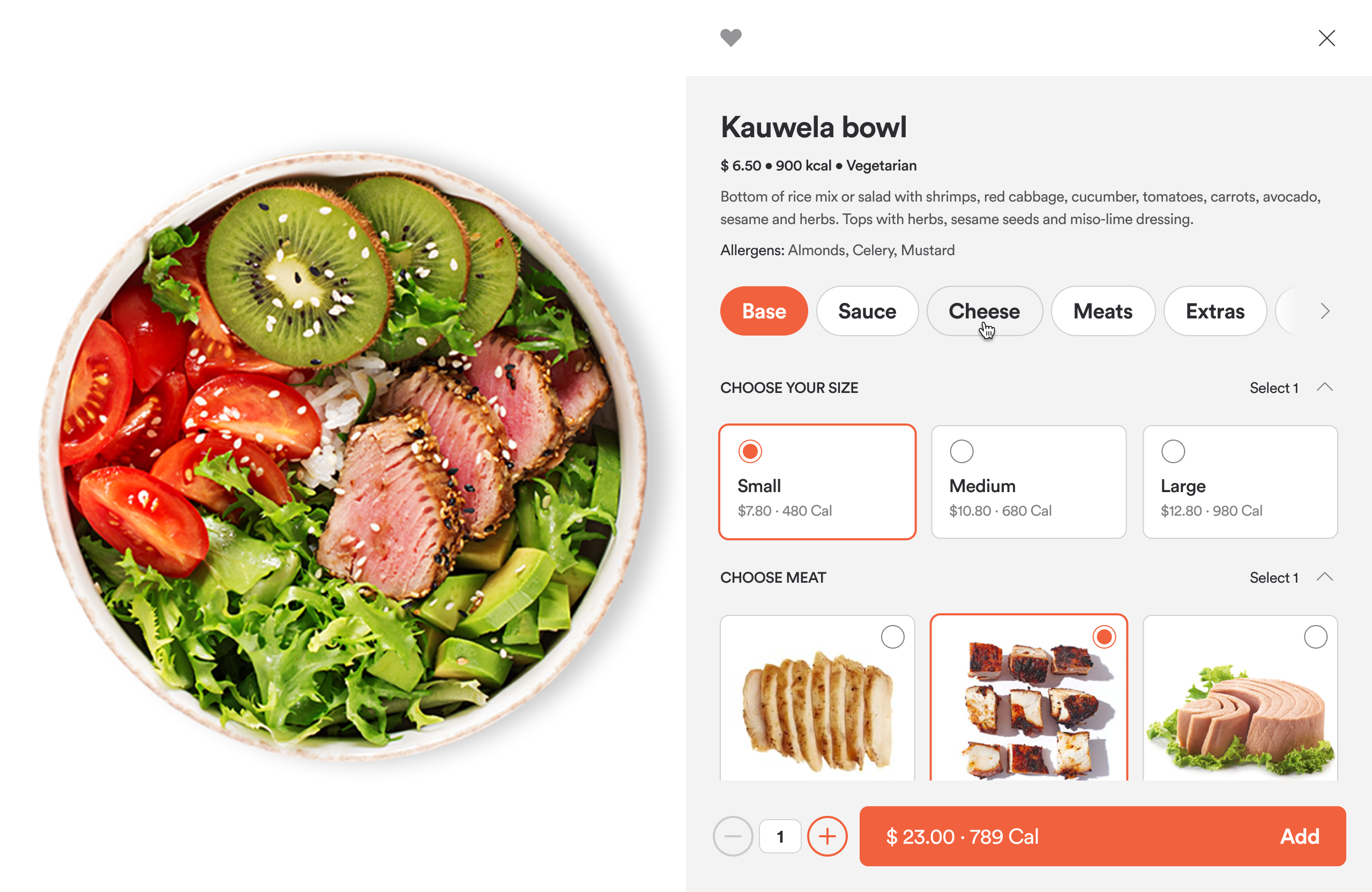
Product Detail View
Controls the layout of the product screen when a customer selects a menu item.
-
Horizontal windowed: Centered dialog window; the standard modal style
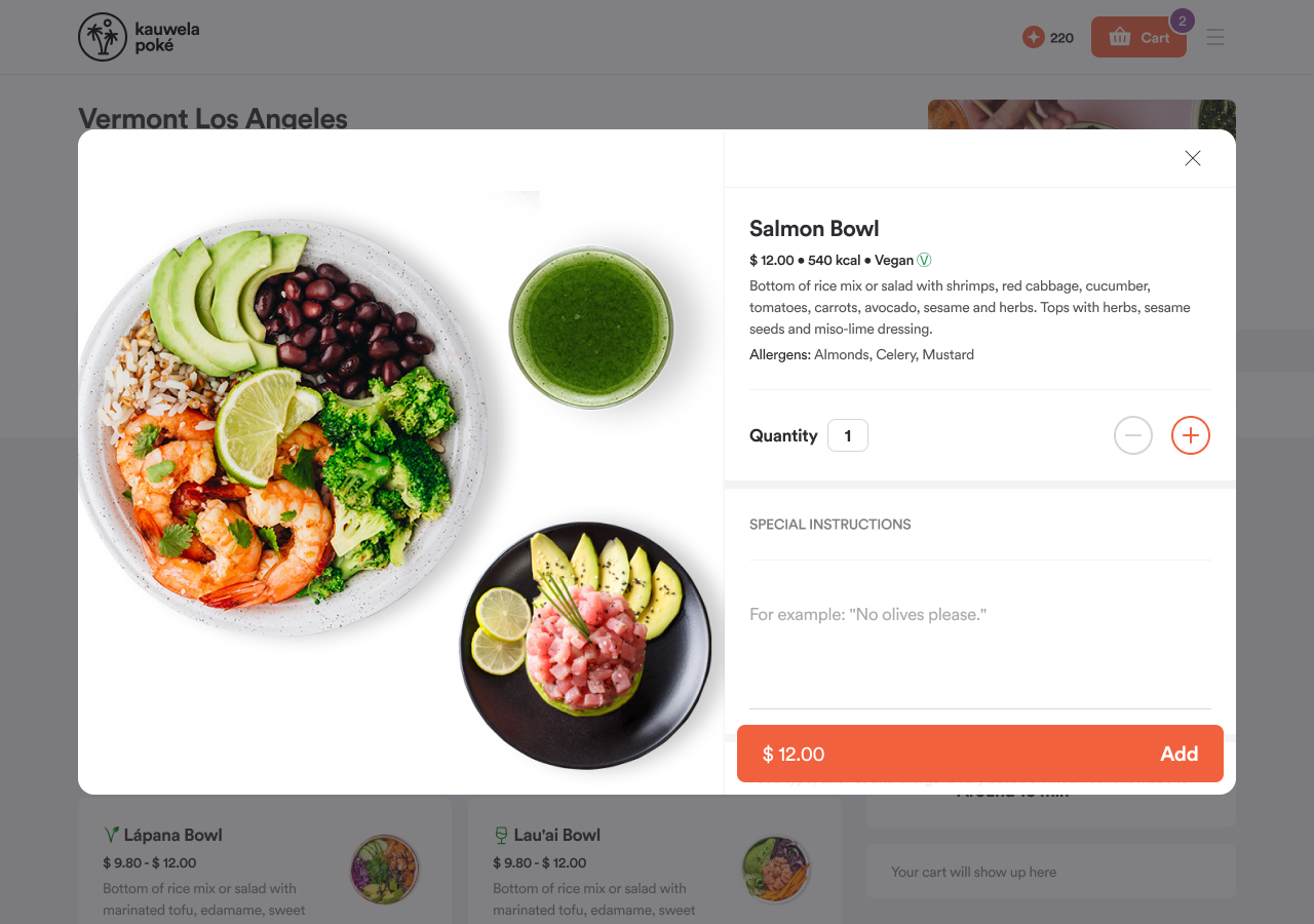
-
Vertical full screen: Full-screen experience: on desktop, image on the left and options on the right; on mobile, stacked vertically
Modifier and Combo Groups
Controls how modifier groups (for example, "Choose your size" or "Add toppings") behave inside the product screen.
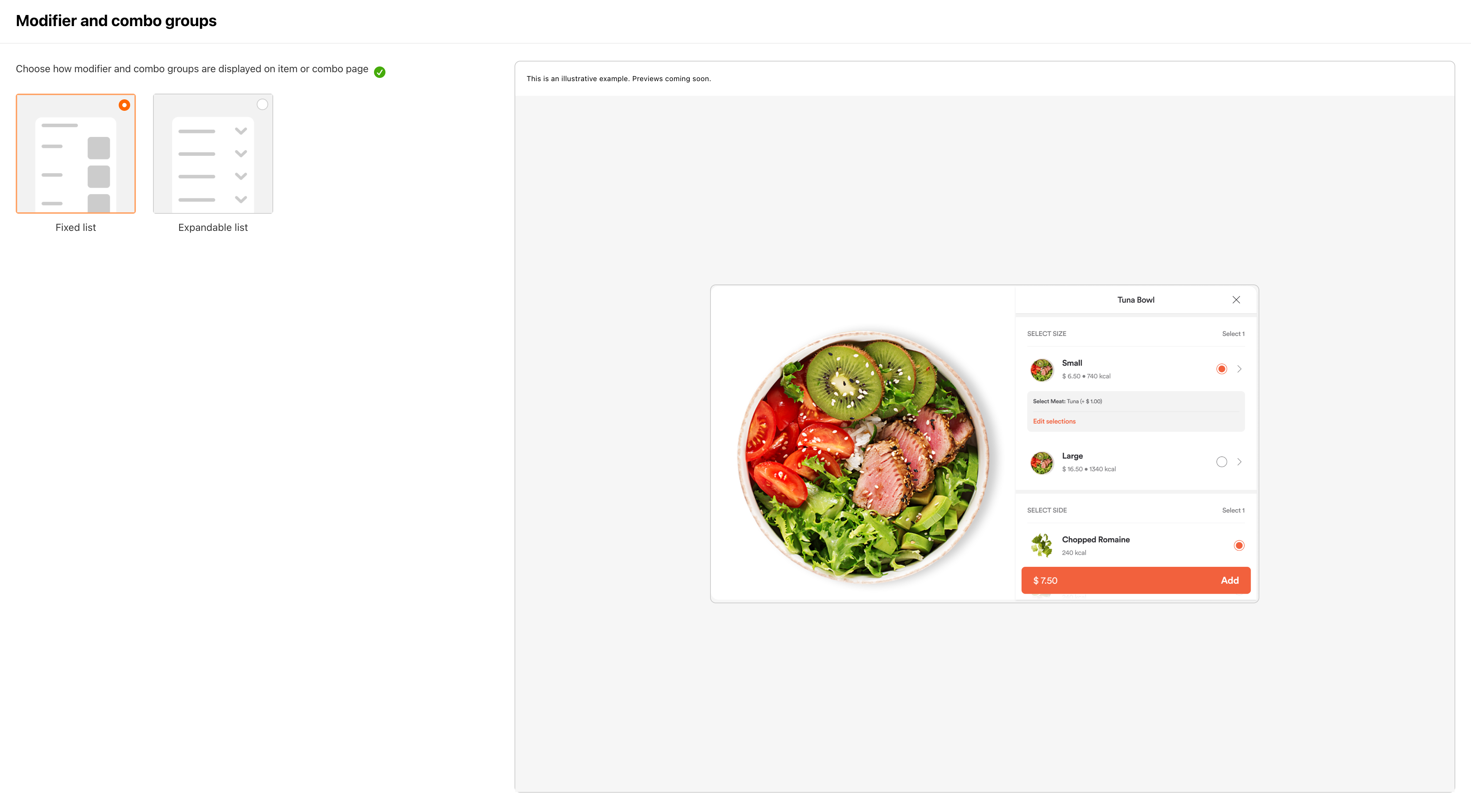
| Setting | What customers experience |
|---|---|
| Fixed list | All modifier groups always visible; no collapsing |
| Expandable - all expanded | Groups can be collapsed, but start open by default |
| Expandable - all collapsed | Groups can be expanded, but start closed; customers tap to reveal options |
Fees
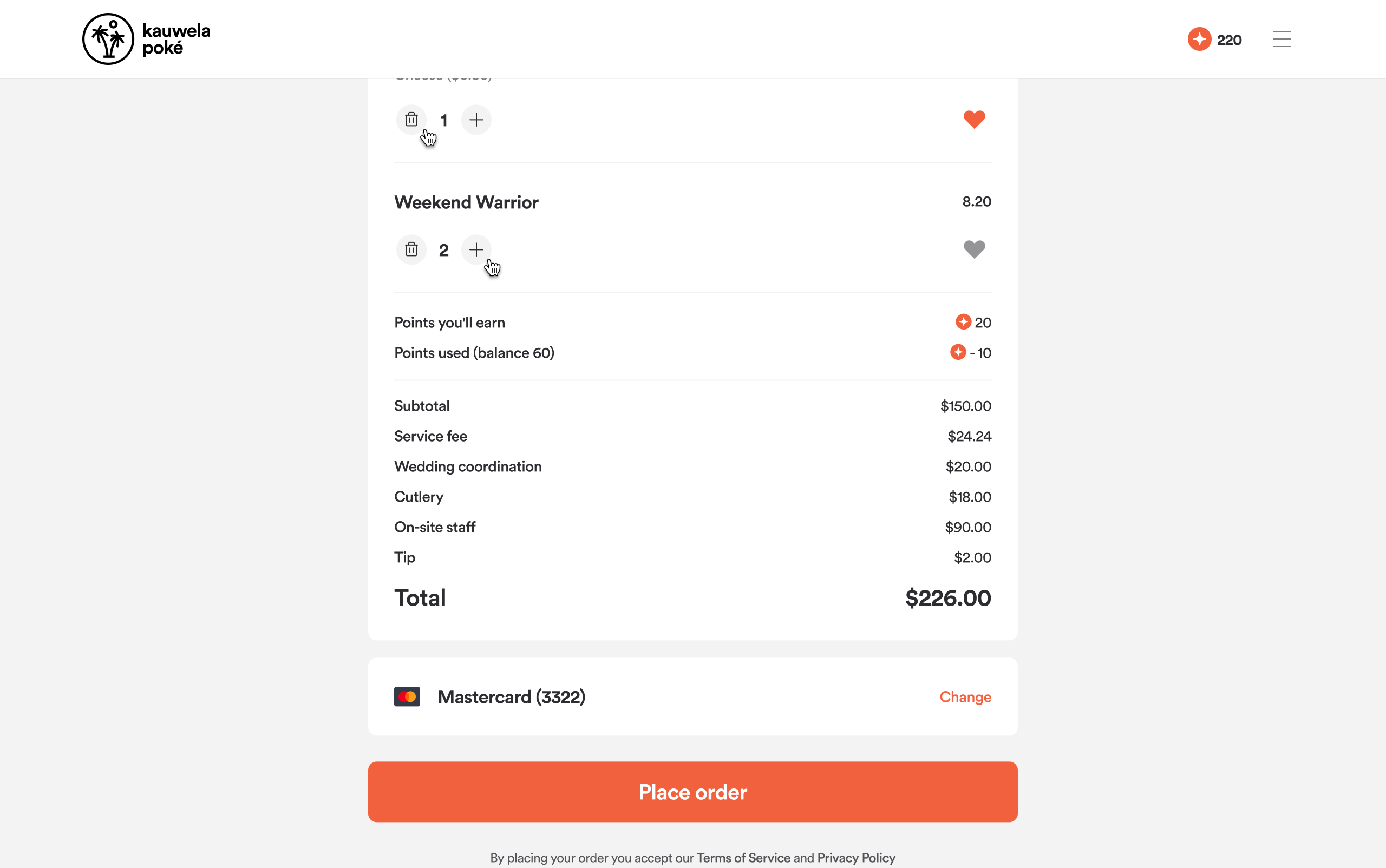
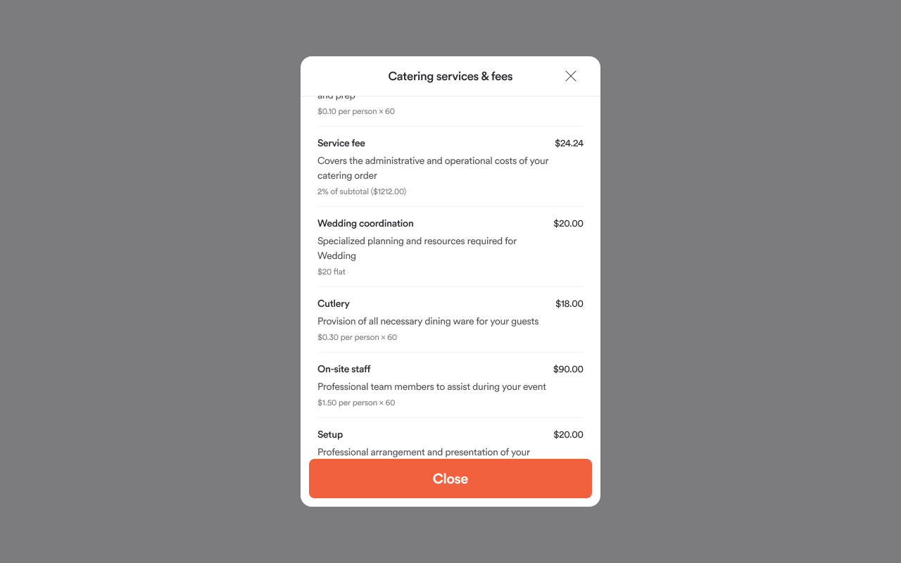
Fees Display
Controls how taxes and fees appear in the cart and checkout totals.
-
Itemized: Each individual tax and fee on its own line
-
Consolidated: A single "Taxes and fees" line with the combined total; customers can tap to see the full breakdown
Others
The Others section contains settings for specific features and integrations. The options available here vary by channel. The following describes the settings available in the Web & Mobile App channel.
Gift Cards
A toggle that shows or hides the gift cards section on your home page. Turn it on to promote gift cards as part of your ordering experience, or off to remove it entirely.
Header and Footer
Controls whether your marketing website header and footer appear inside the web app. This lets you maintain a consistent look between your marketing site and your ordering experience.
| Setting | What it does |
|---|---|
| Use marketing header | Toggle on and enter the header URL to display your marketing site's header at the top of the web app |
| Use marketing footer | Toggle on and enter the footer URL to display your marketing site's footer at the bottom of the web app |
External Configuration
Configures third-party sign-in options, analytics, and display settings.
Sign-in options:
| Setting | What it enables |
|---|---|
| Apple Sign-In | Apple login button on auth screens (requires Client ID and Redirect URL) |
| Google Sign-In | Google login button on auth screens (requires Web Client ID) |
Analytics and tracking:
| Setting | What it connects |
|---|---|
| Google Tag Manager | GTM container ID |
| Google Analytics | GA tracking ID (separate IDs available for Web, iOS, and Android) |
| GTag | Google global site tag ID |
| Attentive | Attentive SMS marketing tag ID |
Display settings:
| Setting | What it does |
|---|---|
| Expandable modifier groups | Controls whether modifier groups in the product detail screen are collapsible |
| Show postcode in delivery address | Adds a postcode field to the delivery address form |
| Show city and province in delivery details | Adds city and province fields to the delivery details |
Apple Pay domain verification: Upload the Apple Pay domain verification file required to enable Apple Pay on your web app domain.
Legal Pages
Add links to your brand's legal documents. They appear in the app footer and on relevant screens such as registration.
Each link has:
- A type: GDPR, Terms of Service, Privacy Policy, or Other
- A title and URL, configured per language
Up to 6 links can be added. Each language in your brand can point to its own localized legal document.
Tip: Legal pages can also be set in the Global channel as a shared baseline. Channel-specific links override the Global ones when set.