Web & Mobile: Borders & Shadows
Border radius and shadows finish the edges and depth of the interface elements in the web and mobile apps.
This article gives the default values and design guidance for each setting. For what each setting controls in the Customization Center, see Customizations. Line colors are covered in Web & Mobile: Colors.
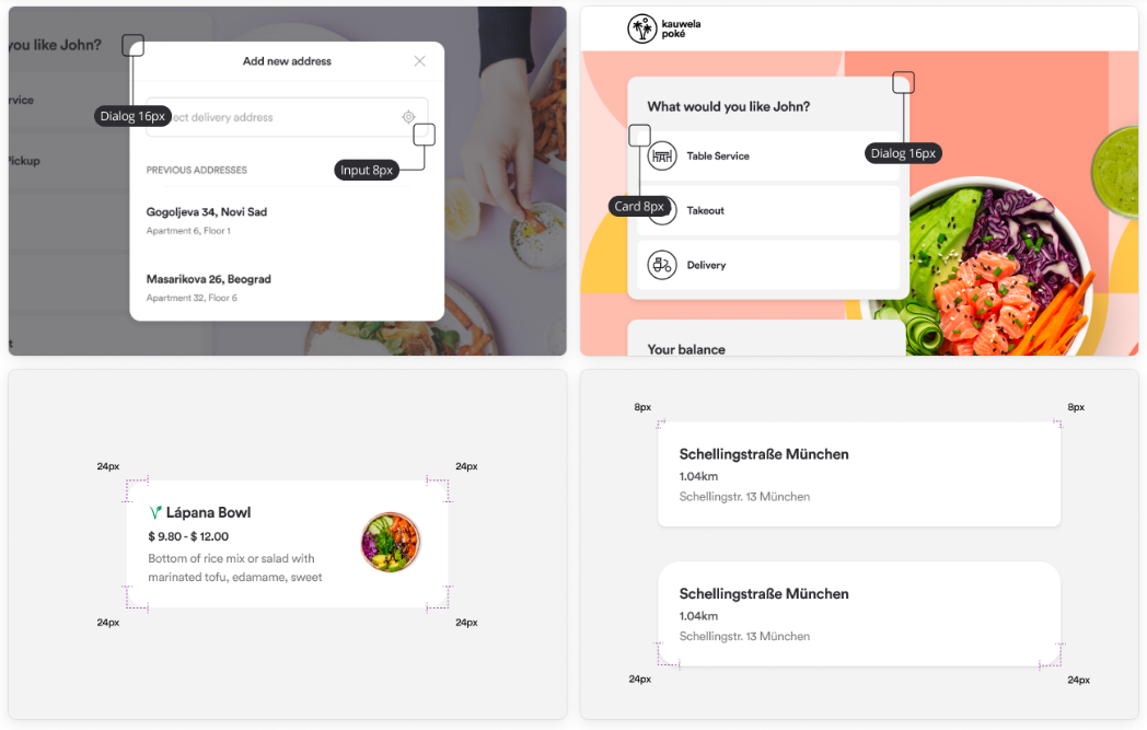
Border radius
The border radius rounds the corners of an element's outer border.
| Setting | Applies to | Default |
|---|---|---|
| Inputs | Outlined text inputs | 8px |
| Cards | Cards and surfaces that display content or actions, which can hold images and text | 8px |
| Modals and Dialogs | Popups and containers displayed on top of the page content | 16px |
| Images | Any image except those that take the full width of the page or a container | 8px |
Shadows
Shadows lift one surface above another along the vertical axis. A larger shadow means a higher elevation. Shadows appear on hover states, cards, modals, directory containers, and navigation.
Focus shadow works as a border that shows which element is selected. This helps customers who navigate with a keyboard or have a sight condition.
Note: Leave the default shadow values unchanged, as they are tuned for usability. The one exception is the Focus shadow color, which should match your Primary color.
Each shadow is defined by six properties:
- X Offset: Moves the shadow horizontally.
- Y Offset: Moves the shadow vertically.
- Blur: Softens the shadow. A higher blur simulates a greater distance from the light source and a lighter outer edge.
- Spread: Expands or contracts the shadow in all directions.
- Color: The color of the shadow.
- Opacity: The transparency of the shadow color.
| Shadow | X | Y | Blur | Spread | Color | Opacity |
|---|---|---|---|---|---|---|
| Short | 0 | 2 | 4 | 0 | #2C2C31 |
10% |
| Long | 0 | 4 | 10 | 0 | #2C2C31 |
15% |
| Focus | 0 | 0 | 0 | 2 | #F2613D |
100% |