Web & Mobile: Buttons
Buttons are the elements customers select to take an action. Your button settings apply to every button in the web and mobile apps.
This article gives design guidance for button fonts, colors, and corner radius. For what each setting controls in the Customization Center, see Customizations.
Button text style
The text style sets the font family, weight, and text casing for the labels on all button variants. Choose a font with the weight you prefer. Bold is recommended.
Font requirements:
- File format: OTF or TTF
- A Bold weight is preferred
- A valid license for the font
Button colors
Each button variant has a button color (the background) and a text color. Choose a combination that keeps the label easy to read.
Primary button
The main action on a screen, such as Add to Cart, Checkout, Place Order, Log In, and Sign Up.
- Primary button color
- Primary button text color
Secondary button
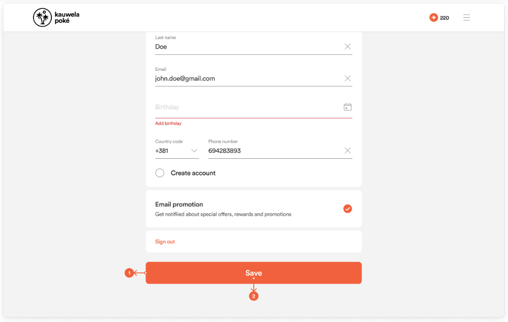
An alternative action, second in importance to the primary button. It is usually placed next to a primary button, but it can also stand alone.
- Secondary button color
- Secondary button text color
Tertiary button
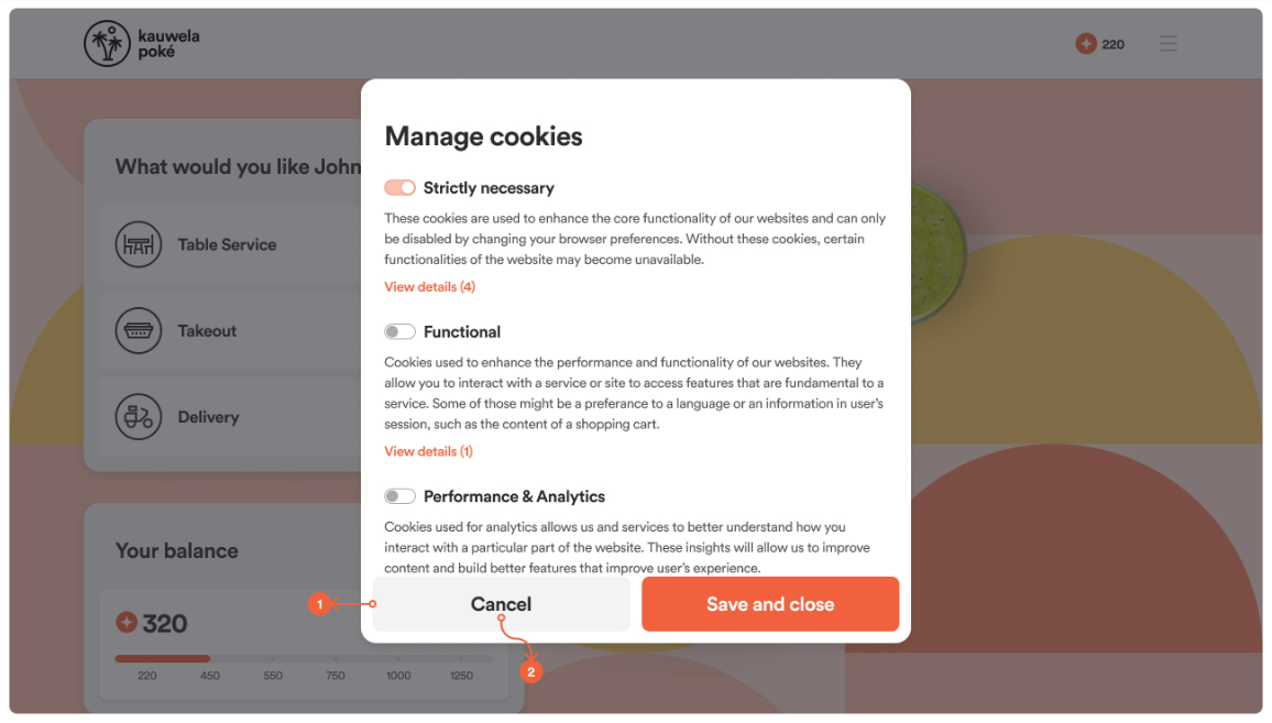
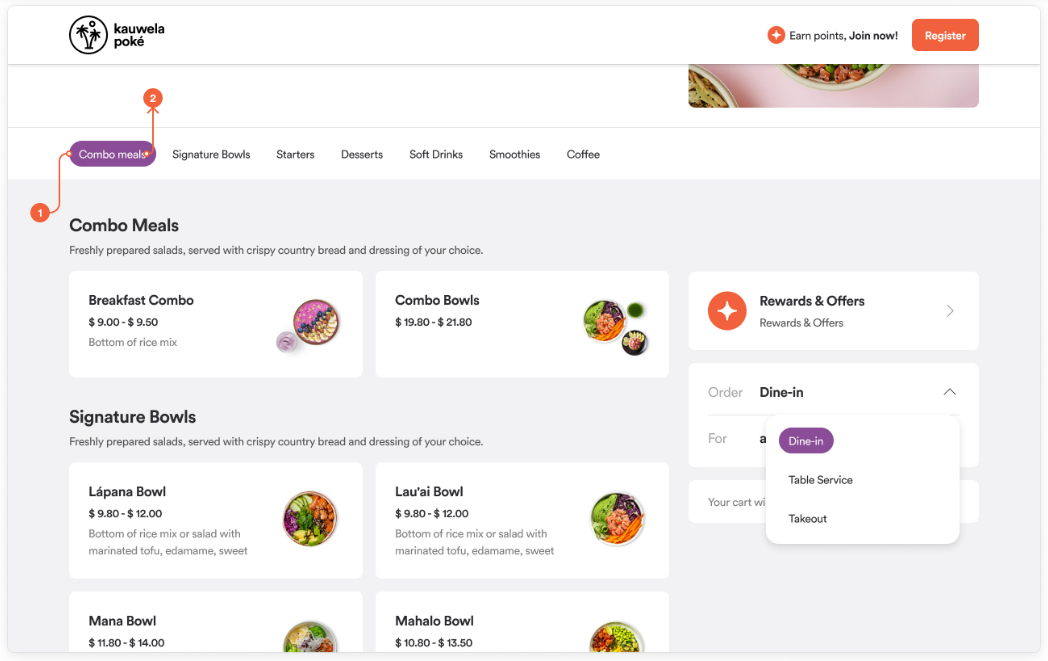
The lightest button style, for additional or low-emphasis actions. It is used mostly for dropdown options, navigation menu items, and subcategories (item groups).
- Tertiary button color
- Tertiary button text color
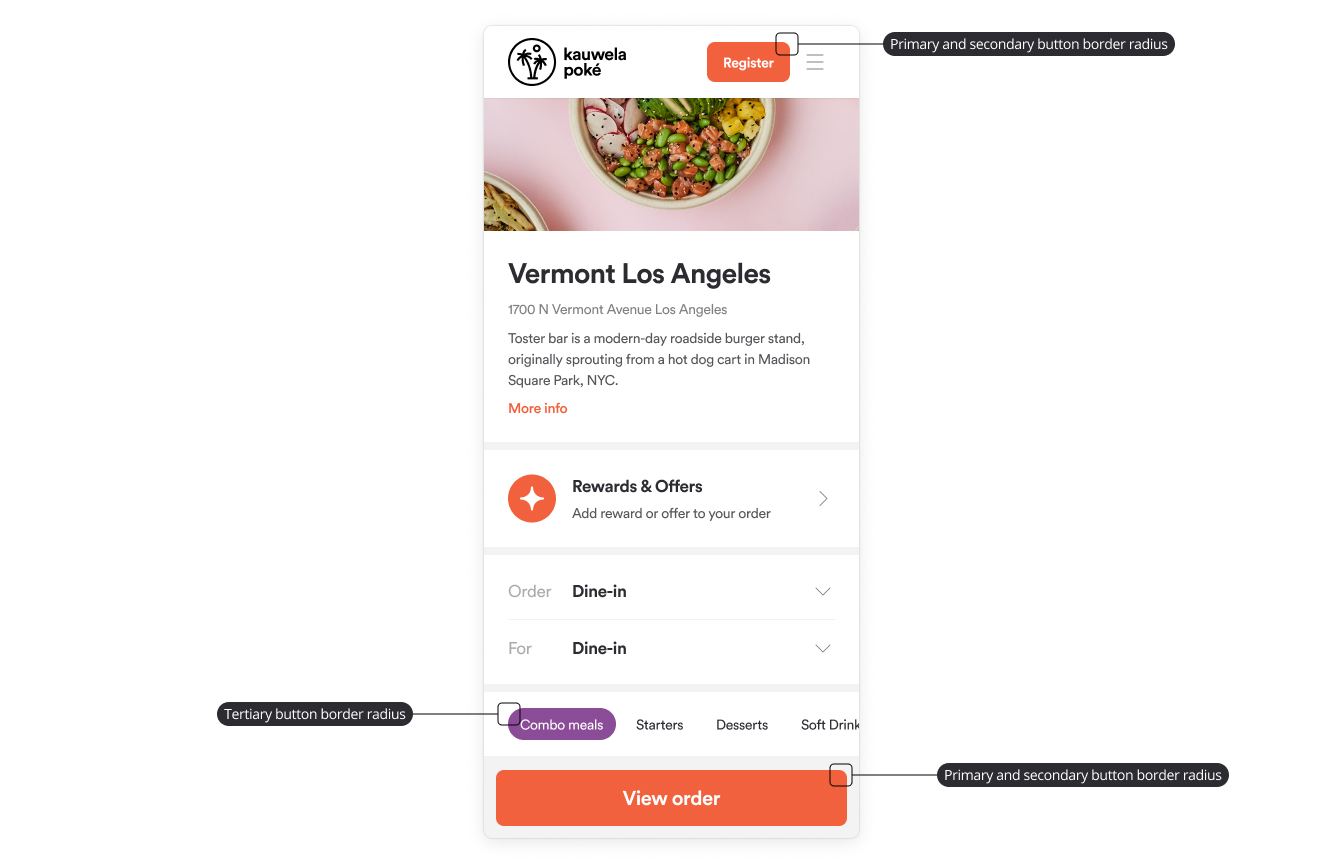
Button border radius
The border radius rounds the corners of buttons. Two settings control it.
| Setting | Applies to | Default |
|---|---|---|
| Small | Primary and secondary buttons | 8px |
| Large | Tertiary buttons, also called pill buttons | 16px |