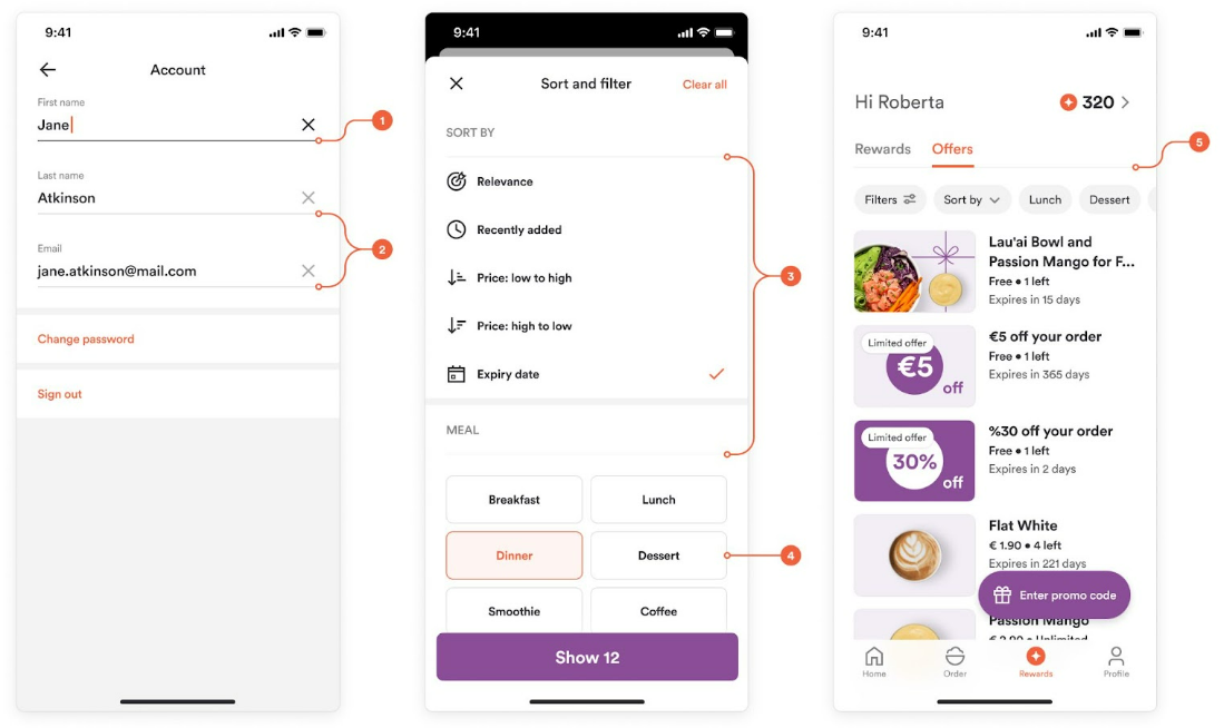
Web & Mobile: Colors
Colors have the biggest effect on how your web and mobile apps look. Some colors, such as Luma, can stay at their default value. Focus your changes on Primary and the three button colors (see Web & Mobile: Buttons).
Note: Provide all colors in hex format, for example #ff6600.
This article gives design guidance for each color. For what each setting controls in the Customization Center, see Customizations.
Primary
Your main brand color and the most prominent color in the app. It highlights important actions and selectable elements. Choose a color with enough contrast that text in this color stays readable.
Customers see it on:
- Links
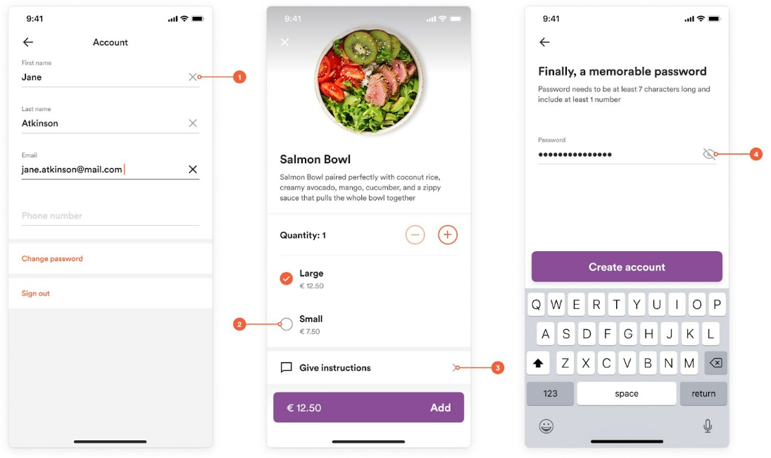
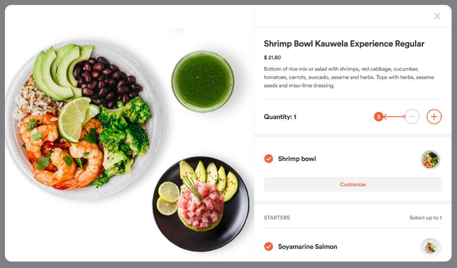
- Active quantity buttons and plus and minus buttons that add items to the cart
- Checkmarks and toggle buttons
- Active tabs and active tab icons
- Filter pills and selected filters
- Tags
- The language selector (web)
- The text cursor (mobile)
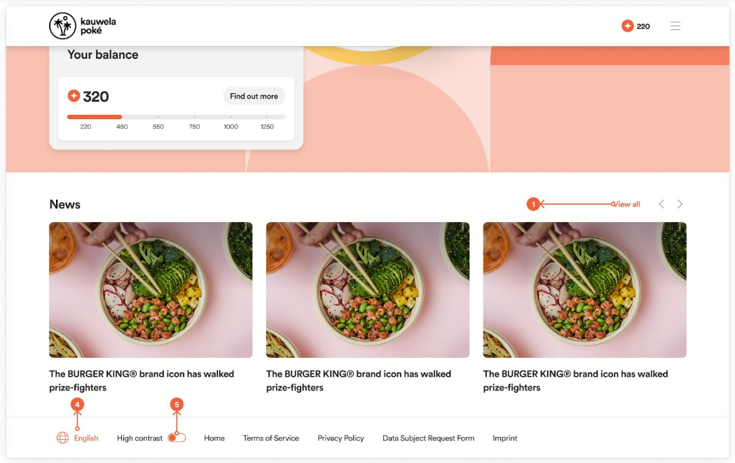
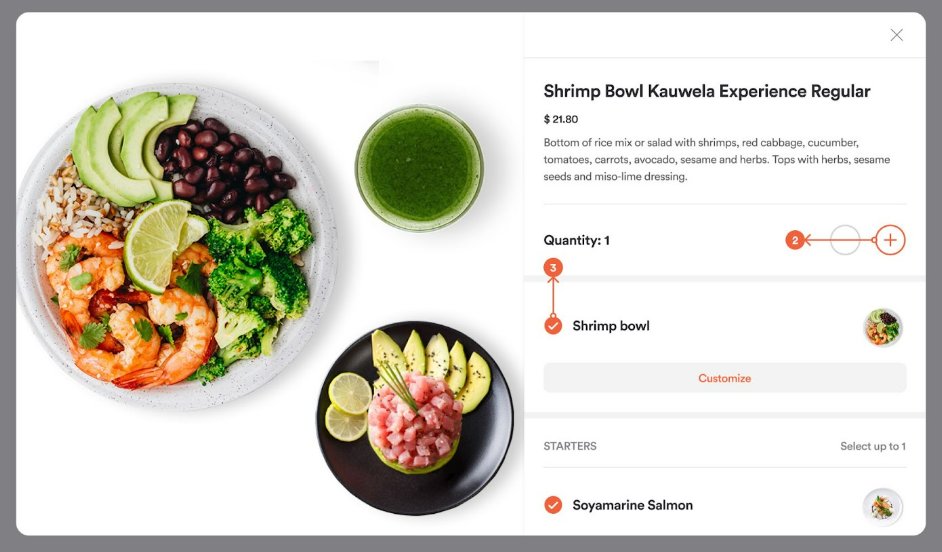
Background colors
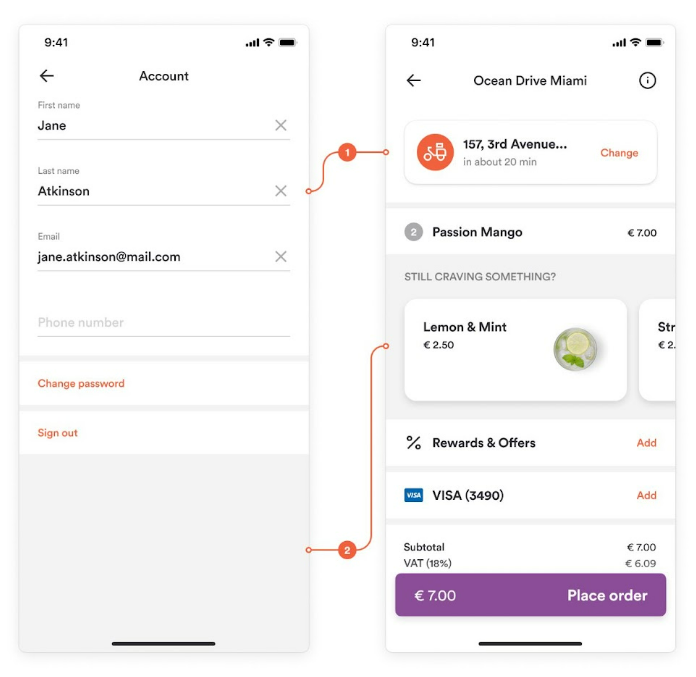
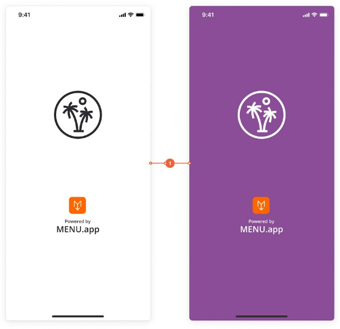
- Background Back: The main background color of the app.
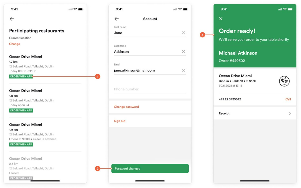
- Background Front: The color of elements that sit above the main background, such as modals and cards. On some screens, the entire background uses Background Front.
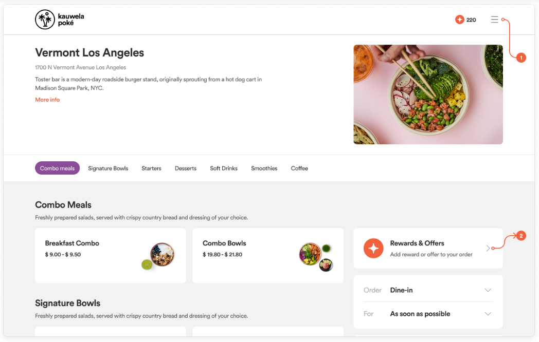
- Background Footer: The background of the footer (web).
- Background Splash Screen: The background of the splash screen that appears when a customer opens the mobile app. It usually shows your logo (mobile).
Tip: Make Background Front slightly different from Background Back so cards and modals stand out from the base layer.
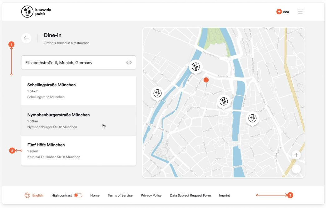
State colors
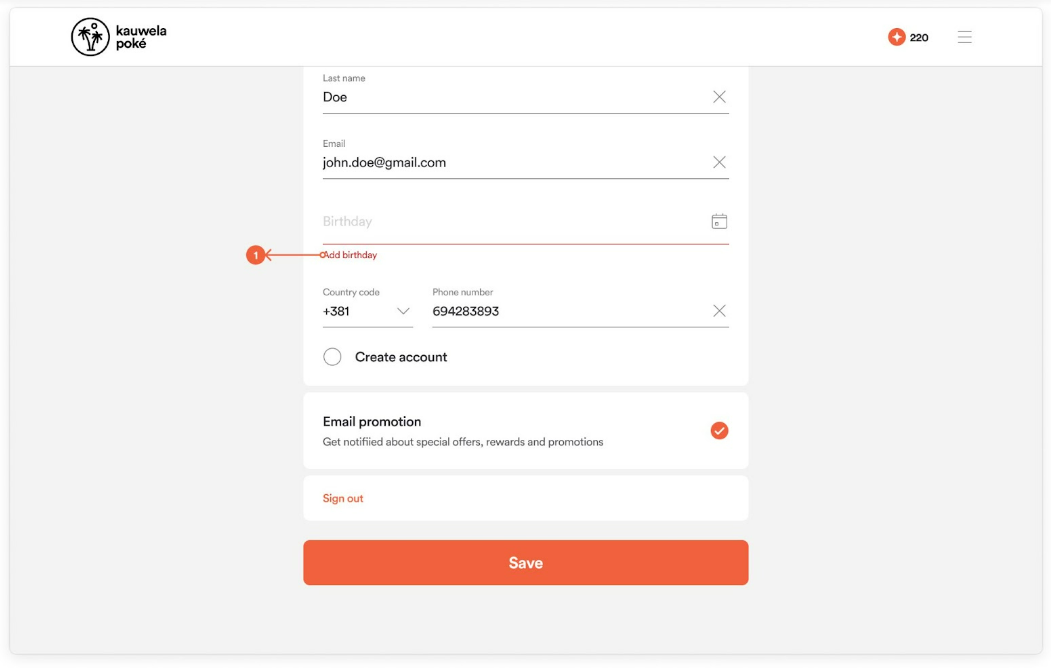
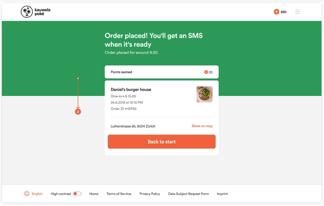
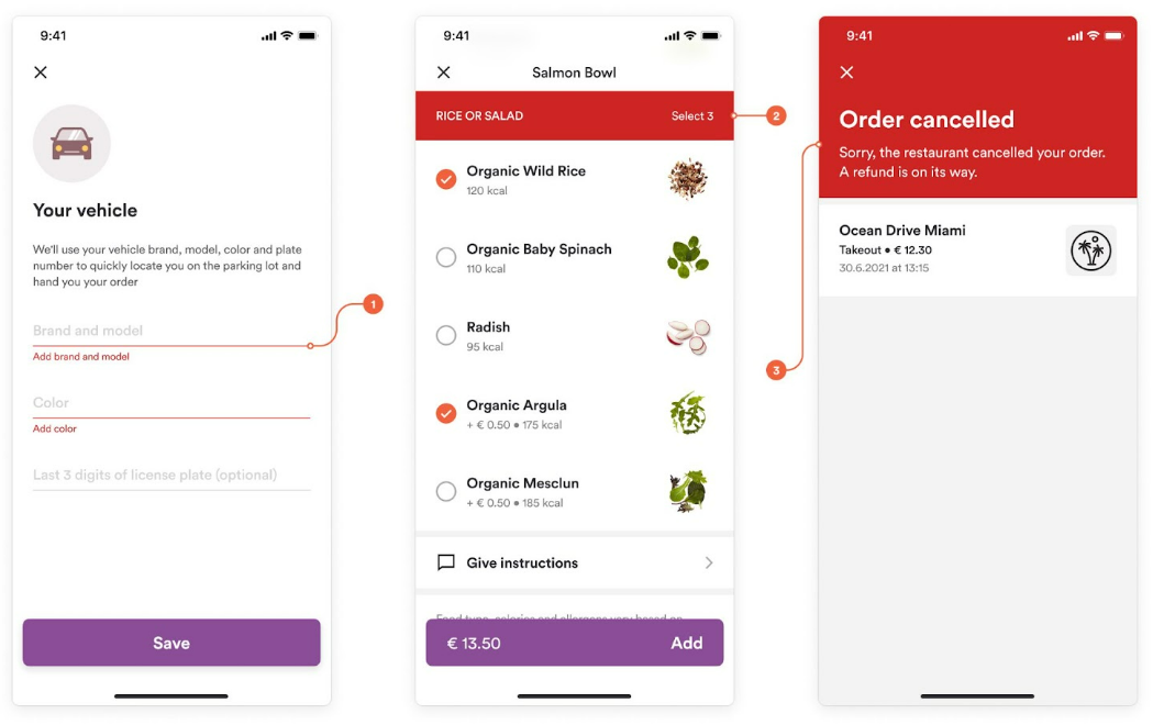
State colors show whether an action succeeded or failed. They are typically green and red, but you can change them.
- Success: Successful actions and availability, such as a confirmed order, success snackbars, and the order status screen.
- Error: Errors and failed actions, such as input validation messages, modifier errors, and the status screen for a canceled order.
Icon colors
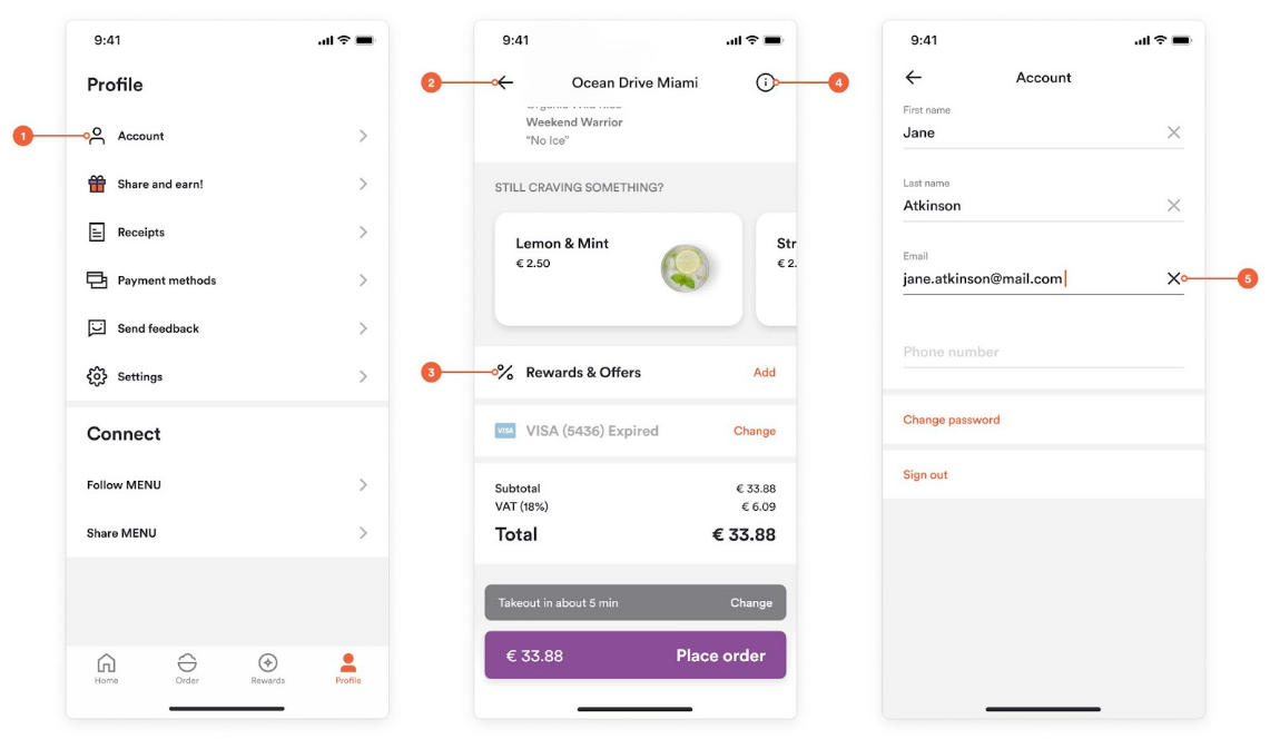
- Icon Active: Icons that trigger an action, such as profile, back, close, rewards and offers, and info icons.
- Icon Idle: Icons used for guidance or in an inactive state, such as dropdown arrows, disclosure arrows, empty checkmarks, inactive tab bar icons, and inactive order type icons.
Tip: On mobile, use a darker gray for Icon Idle. Some idle icons are shown at reduced opacity.
Miscellaneous colors
Counter
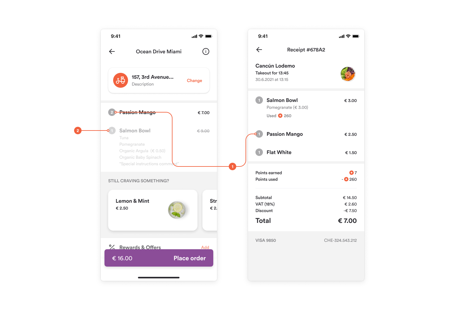
The badge color on item cards that shows how many units are in the cart, including the disabled state on mobile. Choose a color that keeps the white number readable.
Luma
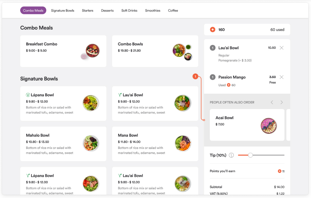
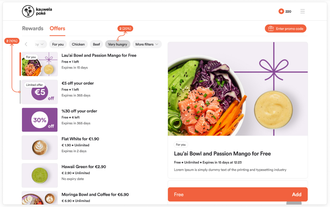
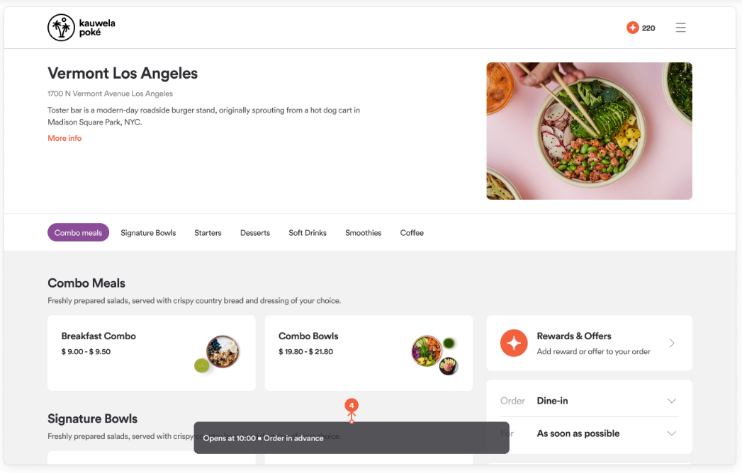
Controls the tint of borders, lines, tooltips, hover states, and other subtle surfaces. The app generates these shades by lowering the opacity of the Luma color. Choose a very dark color so that even low opacities (such as 6%) stay visible. Leave Luma at its default value unless your brand requires a change.
On web, Luma is used for:
- The background of the upselling section (10% opacity)
- Hover states in Offers and Rewards (10% and 20%)
- The disabled quantity button (20%)
- Snackbars
Line colors
Lines divide sections and smaller blocks of related information. The app generates line shades by lowering the opacity of the line color, so choose a dark color.
| Line | Use it for | Default color | Default opacity |
|---|---|---|---|
| Default | Dividing elements on light surfaces | #2C2C31 |
6% |
| Passive | Dividing elements on dark surfaces or dividing large sections of a page | #2C2C31 |
20% |