Kiosk: Buttons
Context
These are, simply put, all the elements in your Web App that Users can click on to execute an action.
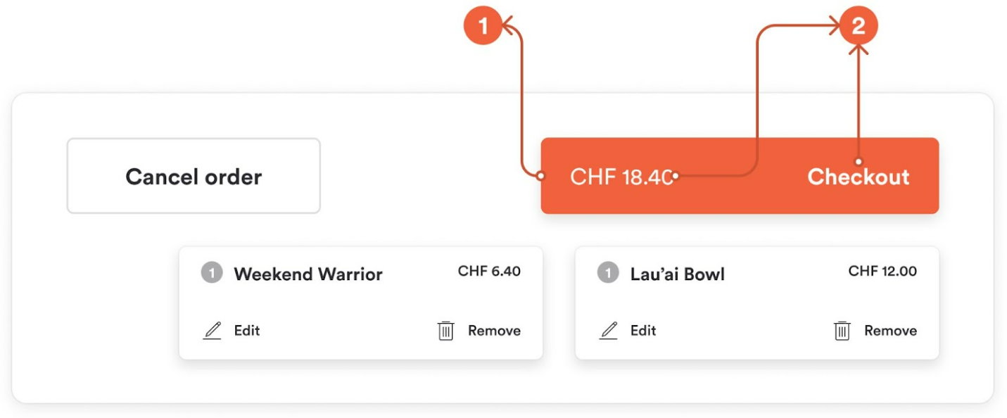
Button Font
This is a default font family for primary and secondary buttons.
- Choose a font with the font weight you prefer, although we recommend using Bold
- Letter case: You can choose to display button text in uppercase (capital), lowercase (small), capitalized (title case), or as originally typed
Requirements:
- File format: OTF or TTF
- License
Primary Button and Text Color
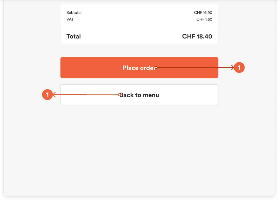
Primary buttons are used for a primary action on the screen. Primary buttons are created from two colors: Primary button background color and primary button text color. Create a combination in a way that makes the text readable against the background you've selected.
- Primary button background color
- Primary button text color
Button Border Radius
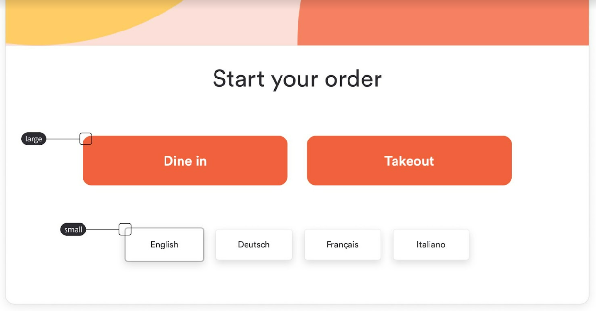
The border-radius property is used to round the corners of buttons. We have a large and small button border radius. Large is used for almost all the buttons in the system. Small button border radius is only used for language selection on the home screen.
- Large button border radius
- Small button border radius