Kiosk: Borders & Shadows
Context
These are the elements that help put nice finishing touches on the edges and corners of the visual elements of your Web App. And mostly nobody likes edges that scratch, right? Well, apart from cats. We're just not sure if they order online (yet).
Border radius
Card and Dialogs
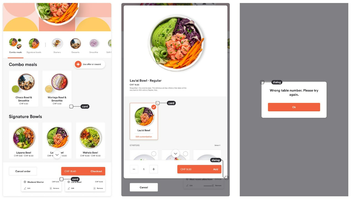
The border-radius property can be used to round the corners of elements in the interface. You can tackle cards and dialogs separately:
- Cards are surfaces that display content and/or actions. Cards can have elements on top of them like images and texts
- Dialogs are used for a popup, a container that is displayed on top of your content and page
Shadows
The main use of shadows is to elevate two surfaces along the z-axis (the up/down one). Larger shadows mean bigger elevation from the surface on the z-axis.
On the other end, focus shadow is used as a border that indicates which element is selected. This is especially useful for Users with different conditions that impair their sight so that they use keyboards to navigate in the app.
The only value that will affect your branding is the color of the focus shadow. The color should use the values of your primary color. We do not recommend changing any other defaults as they are finely tuned to enhance functionality.
Shadows are defined by 6 properties:
- X Offset: Pushes the shadow on the X-axis (left/down)
- Y Offset: Pushes the shadow on the Y-axis (right/down)
- Blur: Quite simply, blurs the shadow. Simulates the distance of the surface from the light source. The bigger the blur, the shadow’s outer part is lighter
- Spread: Contrasts the shadow in all directions. Just like blur, contrast and spread are in direct correlation
- Color: Defines the color of the shadow
- Opacity: Defines the transparency of the color
Usage: Card, Modal, Directory containers, Navigation
Short Shadow
Default values:
- X: 0
- Y: 2
- Blur: 4
- Spread: 0
- Color: #2C2C31
- Opacity: 10%
Long Shadow
Default values:
- X: 0
- Y: 4
- Blur: 10
- Spread: 0
- Color: #2C2C31
- Opacity: 15%
Focus Shadow
Default values:
- X: 0
- Y: 0
- Blur: 0
- Spread: 2
- Color: #F2613D
- Opacity: 100%