Kiosk: Colors
Context
The most important thing in customization of the Kiosk App is choosing the right colors for your Brand. Some colors are likely to affect the look of the app more than others. Therefore some of the colors like error, icons, etc. can stay in their default value. The colors we recommend you change are primary and button primary.
Requirements:
- All colors should be provided in hex color code format e.g (#ff6600)
General Colors
Primary
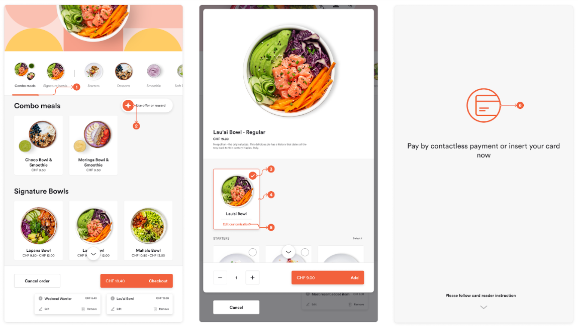
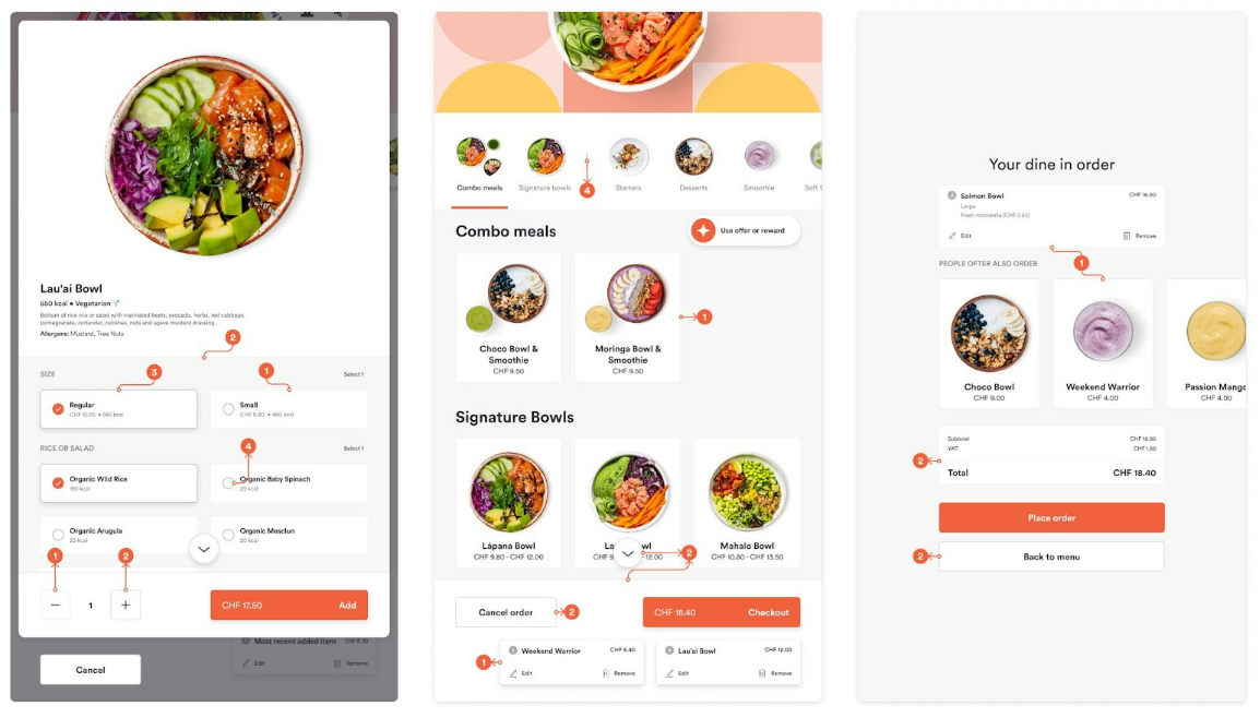
This is the main color of the Brand. It is displayed as the most prominent color across the Kiosk. It's used to highlight important actions and events that the User can select as well important elements that should be highlighted. This color should have enough contrast so the text elements in that color can be easily readable.
- Category selector
- Offers/Reward icon
- Checkmark
- Combo card selection
- Link
- Illustration
Whites and Blacks
Currently not used in the system. Please do not change default values as they can be used in the future as they are.
Background Colors
Front and Back Colors
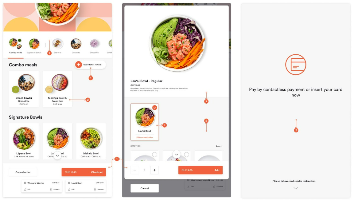
The background color is used across the whole kiosk. Background Back is the main background color, and the Background Front color is used on elements that sit above the main plane, like modals and cards. On some screens, the entire background is made from the Background Back color.
- Background Front
- Background Back
States
Error
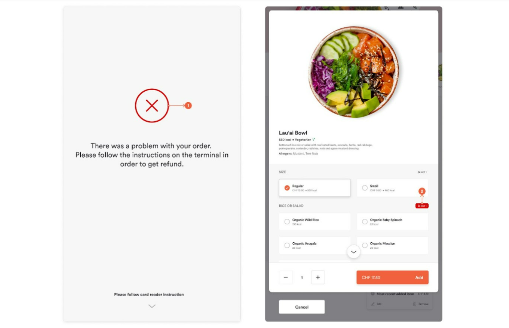
Shows the negative action in the interface. Elements in this color appear to attract attention when immediate action is needed by the user. It usually appears in system errors in the ordering flow.
- Error illustration
- Item selection error
Icons
Icon Active and Idle
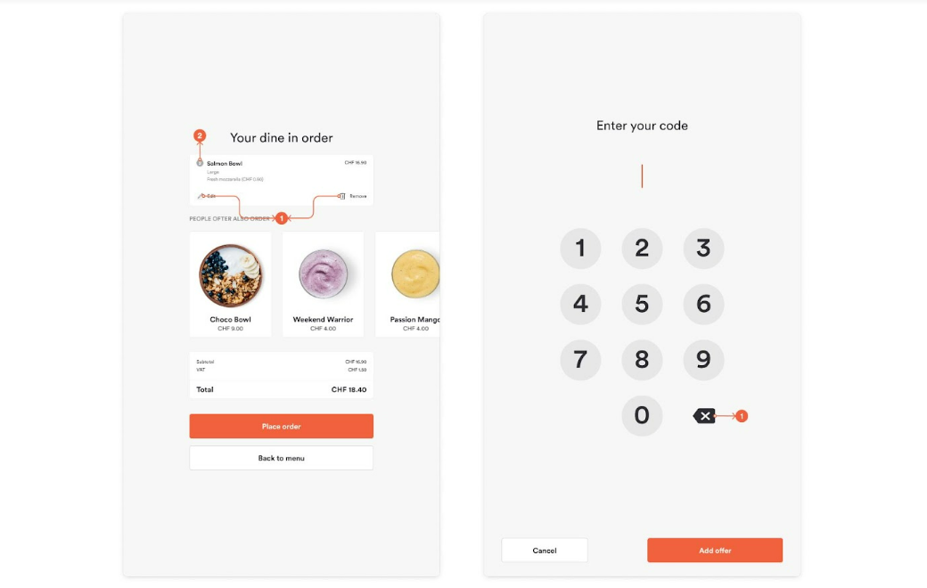
Icon Active color is used for icons that trigger some action, like edit and delete. Icon Idle color is used for item count on the menu and summary screen.
- Icon Active
- Icon Idle
Miscellaneous Colors
Line
This one is a color for any divider lines used on the interface. Line color is used for every line throughout the system. All the line colors are made from one certain color by reducing its opacity. So that is why line color must be really dark color so even 6% of opacity can be visible. We recommend black.
- Line 6% opacity
- Line 15% opacity
- Line 30% opacity
- Line 40% opacity
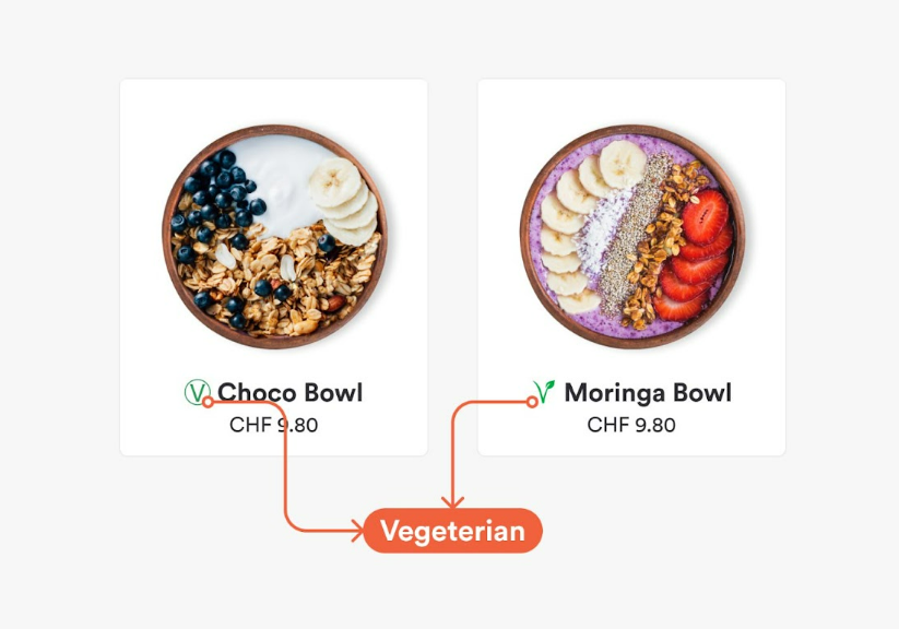
Vegetarian
Used by the inline icon that highlights the vegetarian and vegan items on the menu.