PAR App Studio User Guide
The PAR App Studio is currently available to select brands as part of a pilot program. Contact your Punchh representative to ask about your brand's eligibility.
For brands utilizing the PAR Punchh Mobile Framework, the PAR App Studio provides a clear and convenient way to configure, test, and update the mobile app. The sections below break down the different sections of the PAR App Studio and detail what each section is used for.
App Status
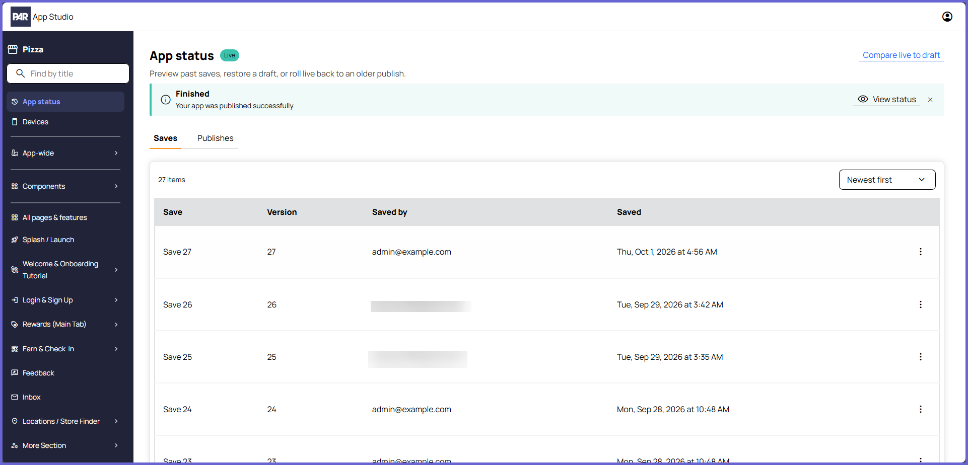
The App Status section of the PAR App Studio shows the save history for the project, including who made the save and when. You can compare, preview, and revert saves from this section.
Reverting a save only impacts the project build in the PAR App Studio. It does not impact the live version of the mobile app.
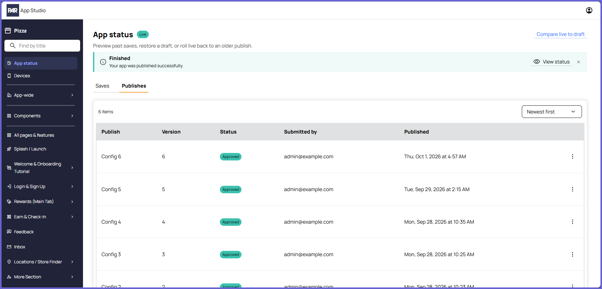
Publishes can also be viewed from this section. You can view the different publishes of your project and who submitted them. You can also preview and roll back publishes.
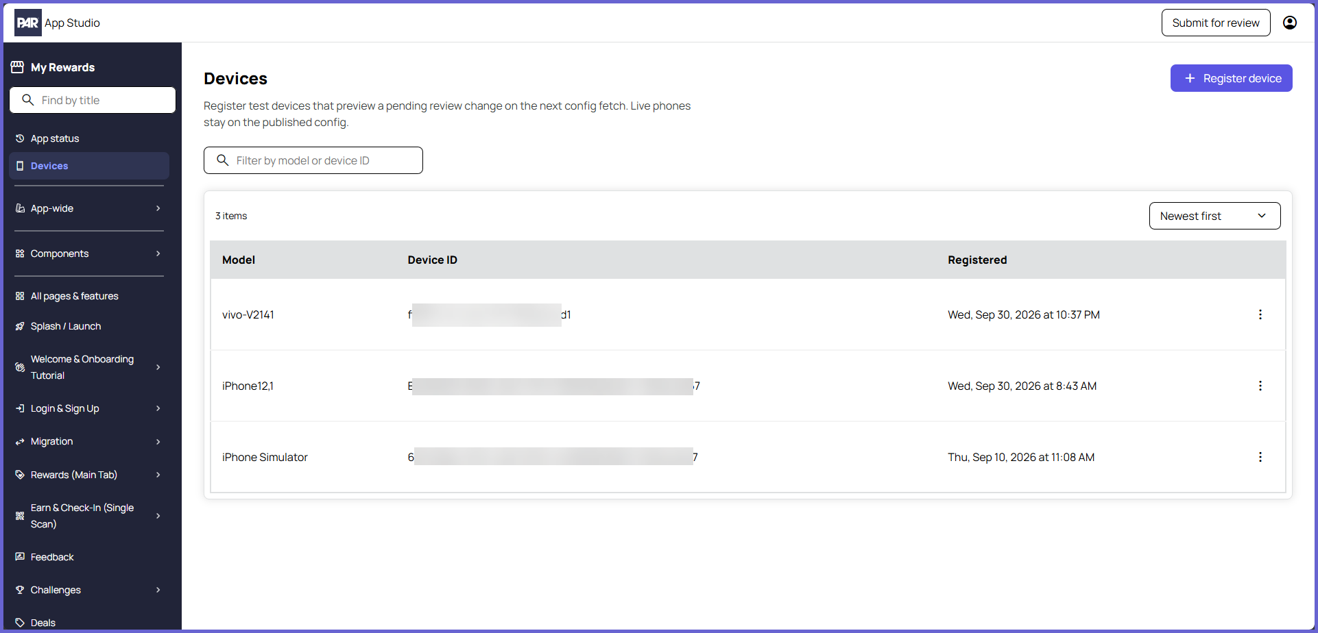
Devices
When a build has been submitted for review, test devices can be used to view the pending changes from the live build of the mobile app. The Devices section is where these test devices can be viewed and managed. Testing in the live build allows you to verify that all features and flows are working as expected before publishing the changes. Refer to the PAR App Studio: App Preview and Testing article for additional information.
Users not on registered test devices will continue to see the existing live build in the mobile app. Pending changes are only visible on test devices.
App-Wide
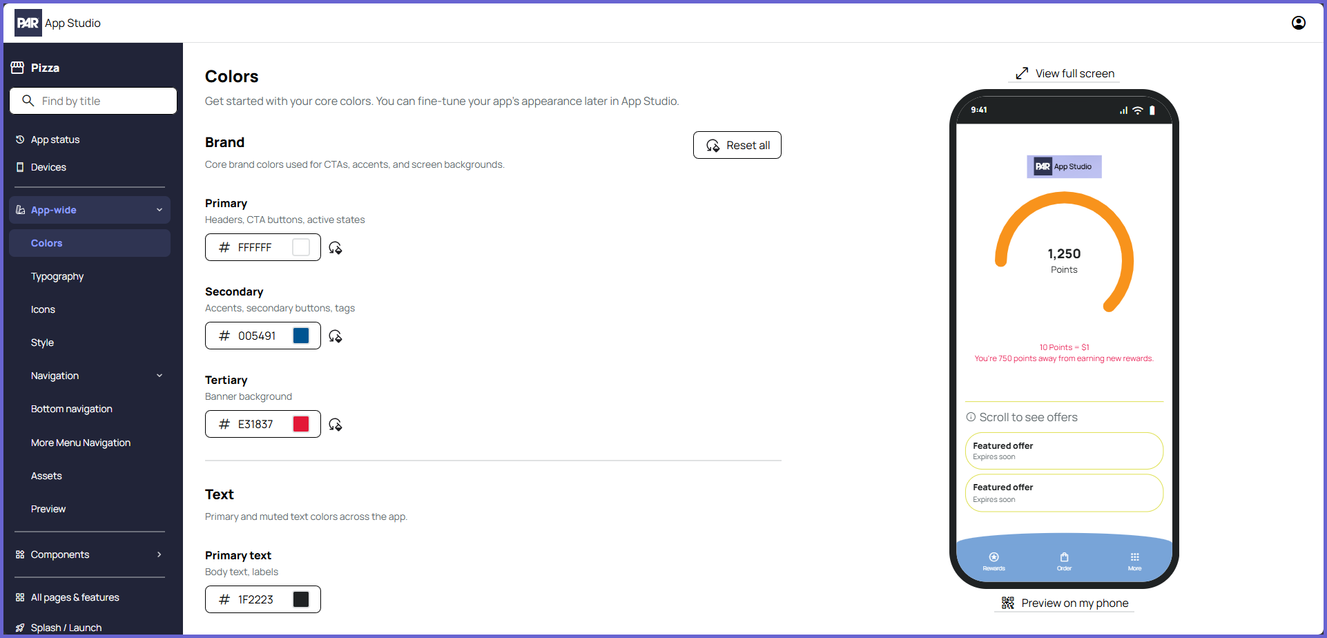
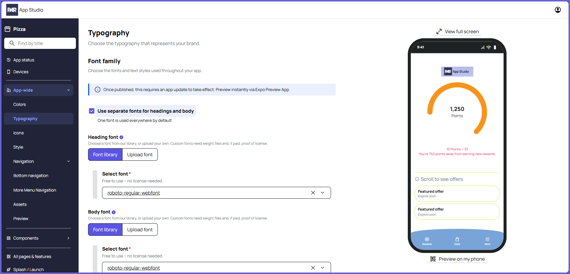
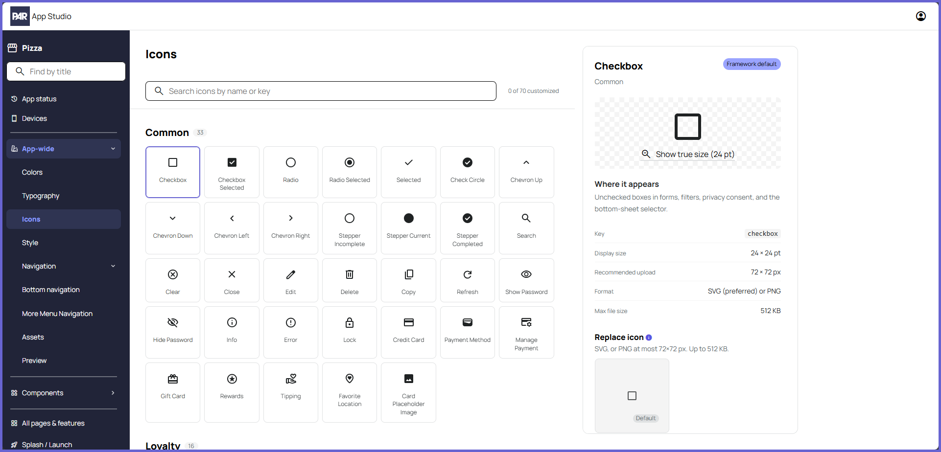
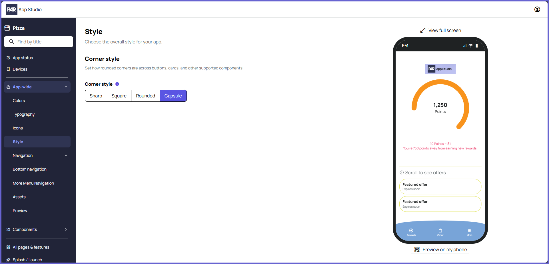
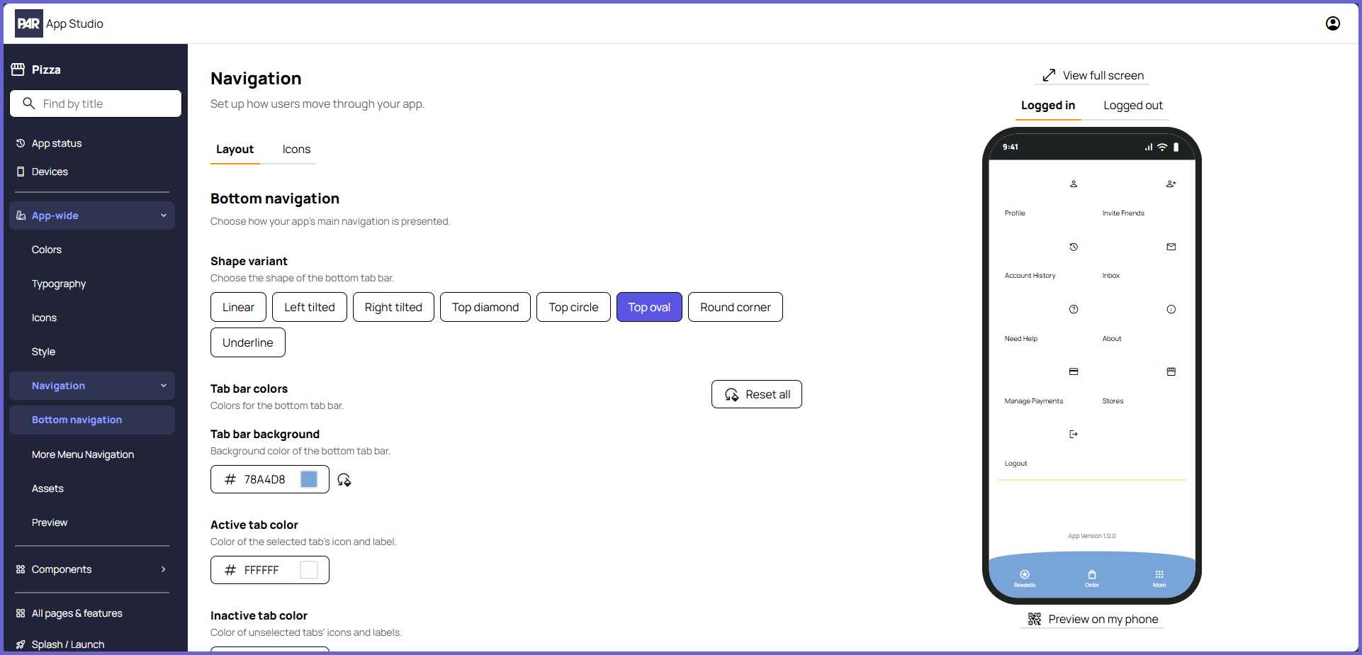
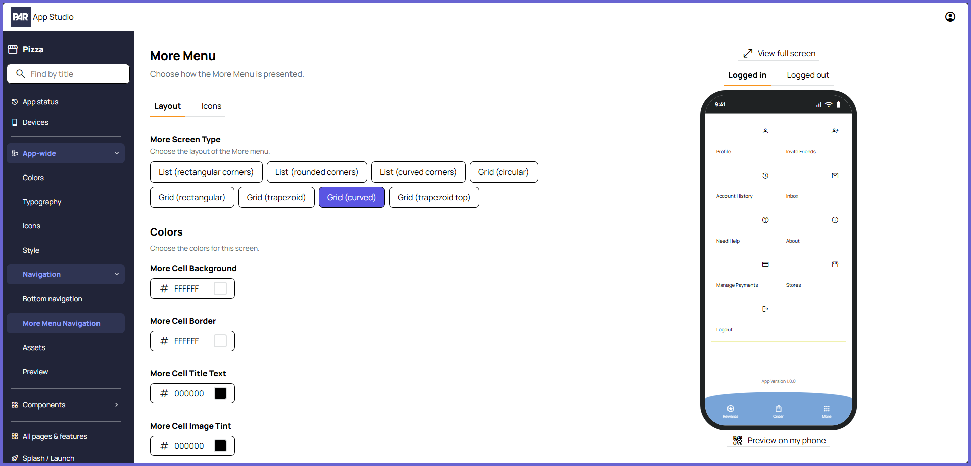
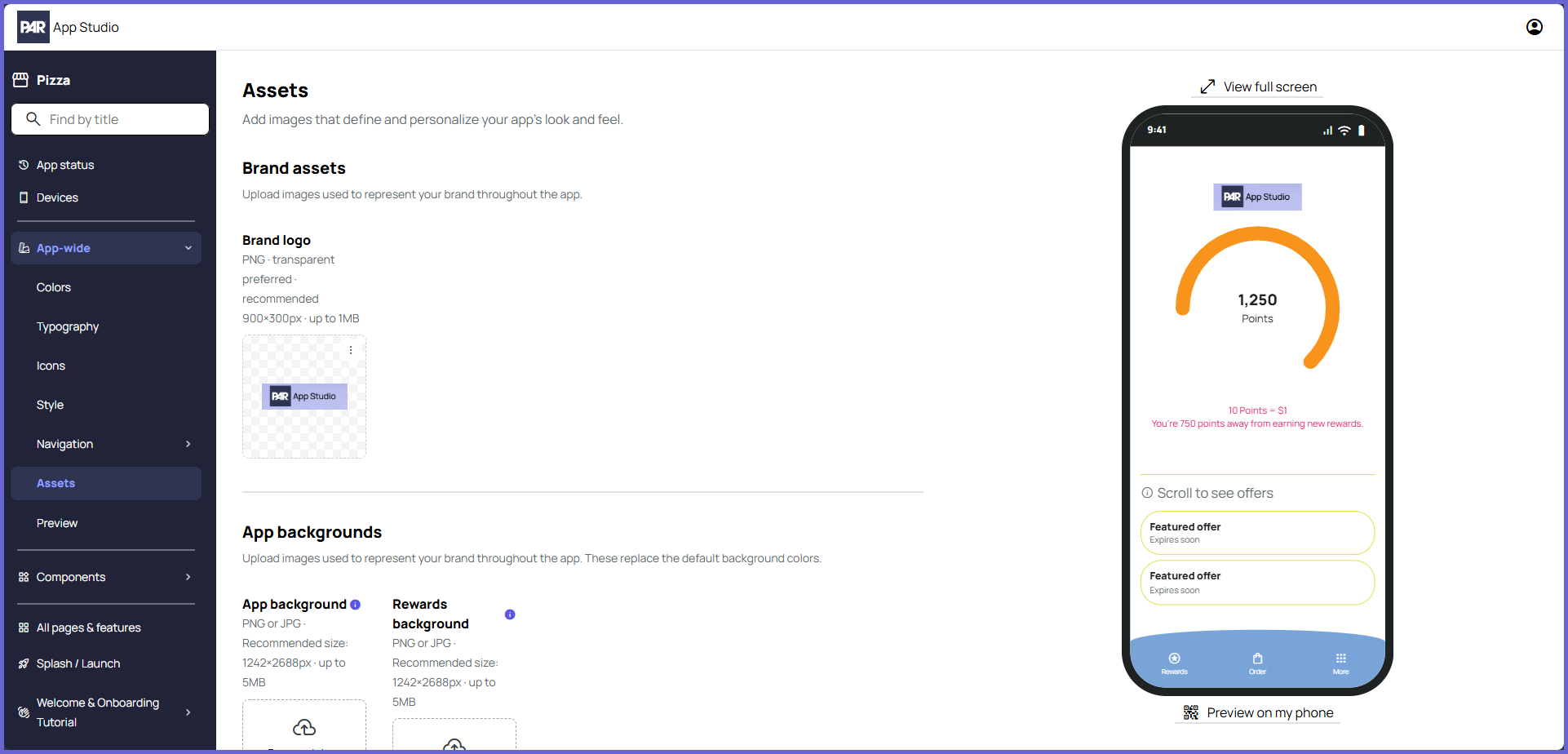
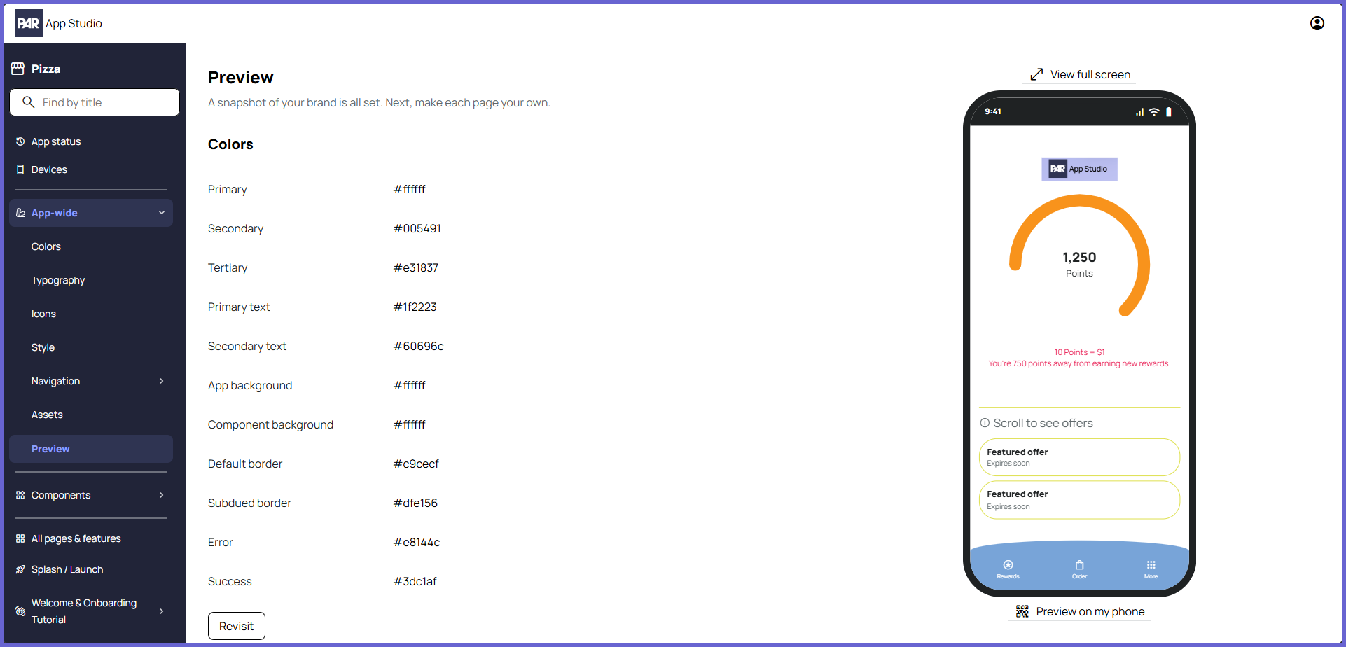
The App-wide section is where you can control the design configurations set during the first-time setup flow, as well as additional elements that appear throughout the app. This includes colors, typography (fonts), common icons, corner style, Bottom Navigation, More Menu, and major branding assets (see PAR App Studio: Assets for First-Time Setup for spec requirements for the major assets).
Expand for screens
Below are examples of what the different App-wide screens look like.
Colors
Typography
Icons
Style
Navigation: Bottom Navigation
Navigation: More Menu
Assets
Preview
Components
By default, components are mapped to the design configurations in the App-wide section. The Components section allows you to customize these components outside of the App-wide designs, providing extra flexibility and customization for your mobile app. See below for a list of components and what can be customized for each one:
- Buttons: Button shape, letter case, colors
- Header Navigation: Letter case, colors, background
- Fields: Field shape, format, colors
- Text: Text case, colors
- Active Redemption: Active redemption shape, colors
- Chip: Colors
- Card Layout: Colors
- Cells: Colors
- Banner: Size, colors
- Tag: Tag shape, colors
- KeyValueRow: Colors
- SearchBar: Variant, placeholder case, colors
- Section Header: Colors
- Segment Control: Shape, variant, colors
- Stepper: Colors
All Pages and Features
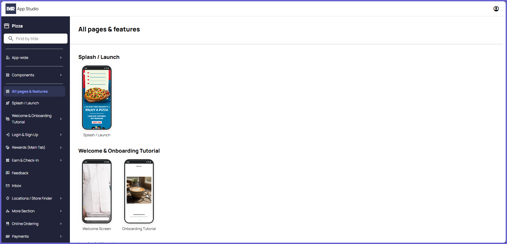
This section is where you can quickly preview and navigate to the major screens in your mobile app project. The screens are organized by their categories. You can click any screen to go directly to that screen's configurations.
Not every individual screen for your mobile app will be displayed here or in the categories below. To explore the full UI/UX for your mobile app project, use the PAR App Studio Preview App. See Preview App below for more information.
Categories and Screens
Individual screens are located underneath the "All pages & features" tab in the left navigation panel. Some screens are organized under categories, such as "Welcome & Onboarding Tutorial", while others are present without a category, such as "Splash / Launch". The visibility of some categories and screens, like Challenges and Gift Cards, is determined by the features configured by your Punchh representative during the initial project creation.
You can use the search bar located at the top of the left navigation panel to quickly find specific screens. This search bar can also be used to locate sub-pages in the App-wide and Components sections.
Screen Configurations
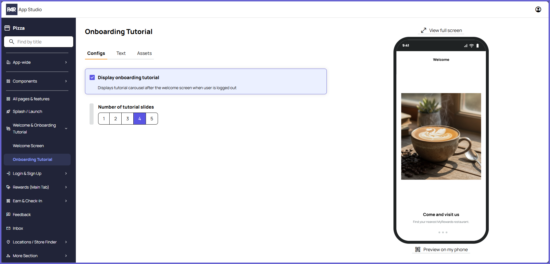
You can customize the unique elements for different modules/screens by navigating to that category/screen in the left navigation panel. For many screens, the page will be broken into different tabs. Which tabs are available for that screen depends on the customizations available for that screen.
-
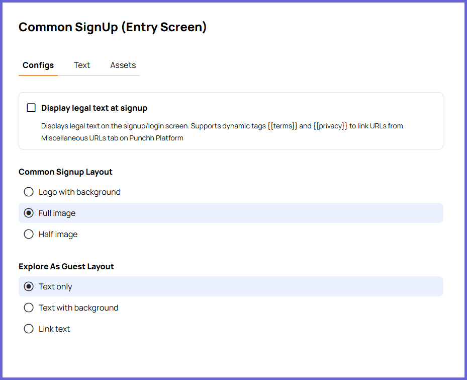
Configs: Settings that can be changed to control the user's experience in the mobile app.
- Example: Common SignUp (Entry Screen)
- Example: Common SignUp (Entry Screen)
-
Text: Dynamic text that can be changed from the default.
- Example: Onboarding Tutorial
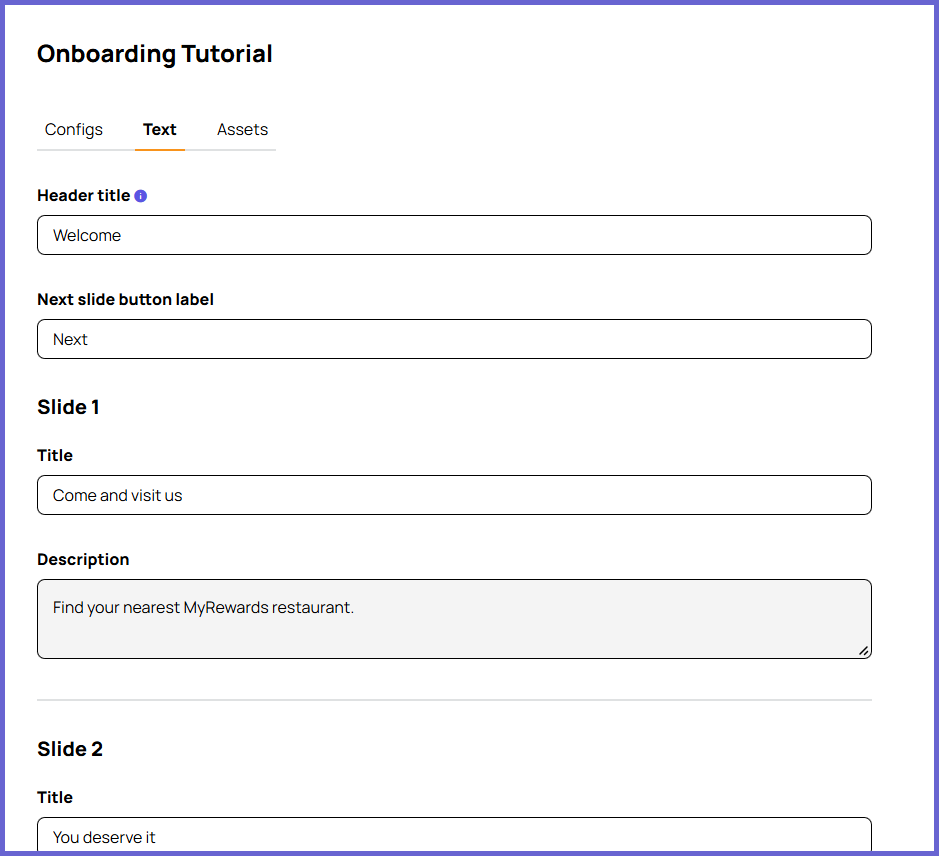
- Example: Onboarding Tutorial
-
Assets: Images and icons unique to that module/screen. Some assets are only visible if they are enabled on the Configs tab for the screen.
- Example: Feedback
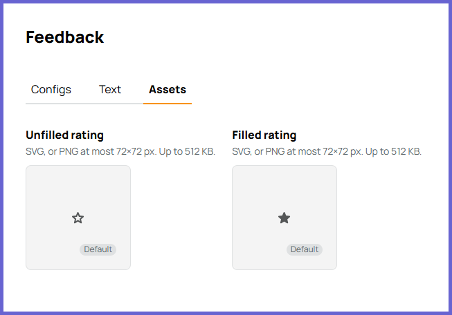
- Example: Feedback
For some screens, all customizations will be displayed together. This can be caused by a screen only having one applicable tab (example: QR Code Screen only has text) or a screen having unique configurations that require everything to be displayed together (example: Reward Meter).
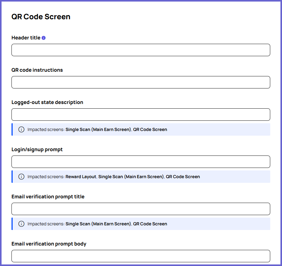
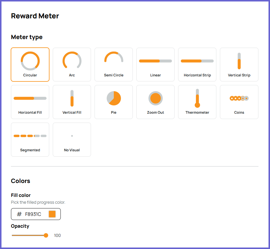
Preview App
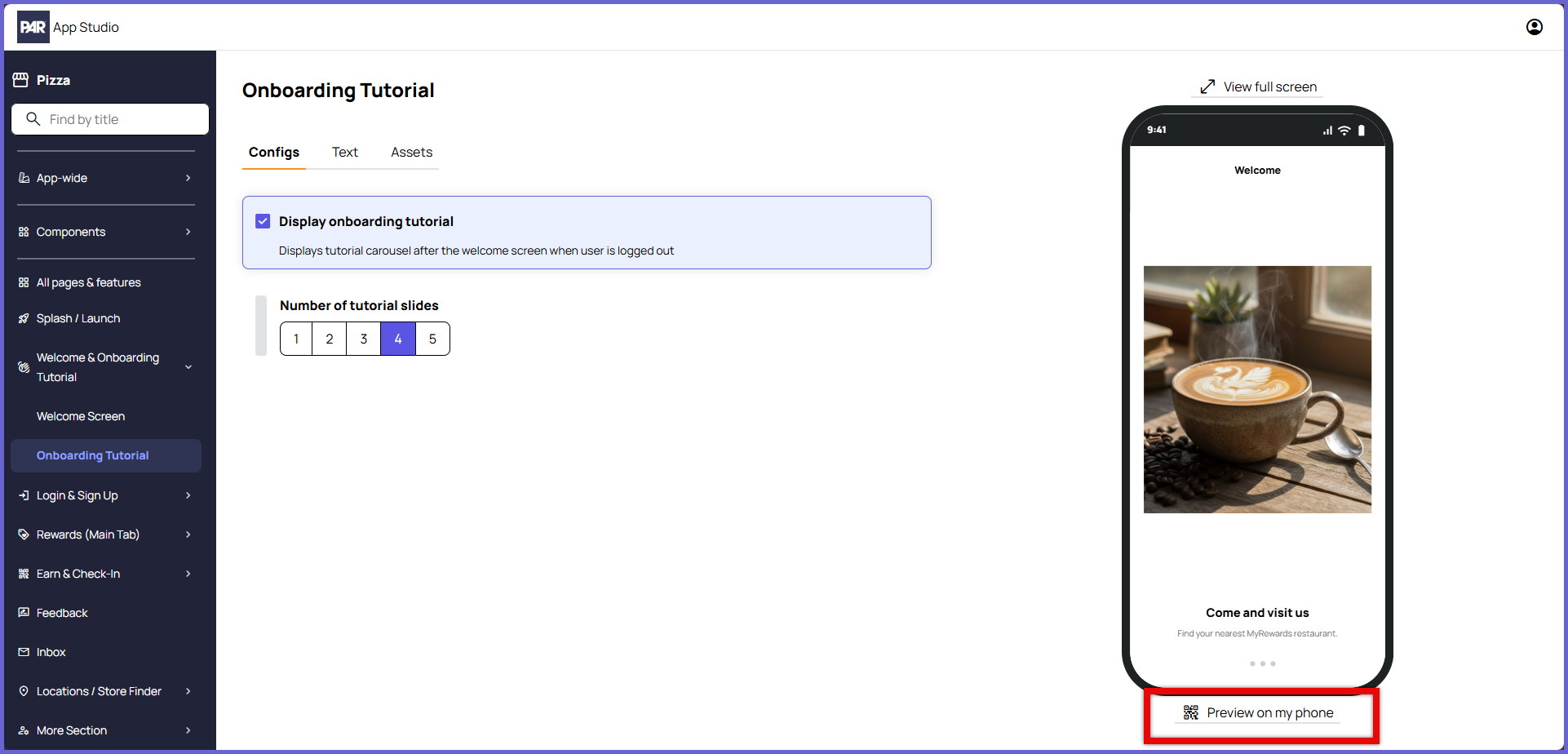
The PAR App Studio Preview App allows you to fully explore the UI/UX of your mobile app project from your device. To download the Preview App, click the Preview on my phone button on any of the screen pages and follow the directions provided. Refer to the PAR App Studio: App Preview and Testing article for additional information.
The Preview App allows you to view the full UI/UX of your mobile app project. Features such as ordering and earning will not function as they do in a production build. Orders will not actually be placed, and no points will be earned.