Customer Analytics Report
This article was previously titled "Customer Metrics."
The Customer Analytics Report is a powerful way to track KPIs such as spending habits, behavior, and activity of both Loyalty and Non-Loyalty customers, new user signups, and sales revenue by user type. Customer Analytics can break down your loyalty base into smaller cohorts such as Total Users, Loyalty Users, eClub Users, etc. Use this analytics tool to track key metrics such as engagement, sales and redemptions, signups, and churn and gauge the trajectory of your efforts over time.
Customer Analytics Report data is refreshed daily.
Visualizations and trends of the KPIs around various customer/user activities and engagements are generated in easy-to-understand graphs and charts. You can set the date range/durations to focus on and compare current and past time periods. Click on an individual cohort or user type to view more detailed information. At any time, you can capture the current report view by exporting to PNG, PDF, or PowerPoint, and export any selected data into a CSV or Text file.
To view the Customer Analytics Report, navigate to Guests > Customer Analytics Report in the Punch platform. The Customer Analytics Report page is split into three sections: Overview, Loyalty, and Activity.
- Overview shows high-level information such as Gross Sales, Spend Lift, and eClub Signups.
- Loyalty shows more detailed tracking of user signups and user spending behavior based on channel (Mobile, Online Order, POS, or POS Console).
- Activity is focused more on user behavior as it relates to visit frequency, average check size, and total transaction trends over time.
High-Level Metrics
High-level customer metrics are shown at the top of the dashboard, reflecting both lifetime and recent (past 30 days) stats.

- Total Customers (lifetime)
Total number of total loyalty customers and all non-loyalty (eClub) customers, as of today. This is the sum of Total Loyalty Customers and all Non-Loyalty (eClub) Customers. The percentage below the total number represents the change in this number as compared to the preceding 30-day time period. - Total Loyalty Customers (lifetime)
Total number of users in your loyalty program tracked by Punchh as of today. The percentage below the total number represents the change in this number as compared to the preceding 30-day time period. - Total Non-Loyalty Customers (lifetime)
Total number of non-loyalty customers who were created as eClub but did join the loyalty program, whose unique identity has been associated with a transaction. The percentage below the total number represents the change in this number as compared to the preceding 30-day time period. - Active Customers (past 30 days)
Total number of customers (Loyalty and Non-Loyalty combined) who performed some form of activity (including using the mobile app) in the past 30 days. The percentage below the total represents the relative change as compared to the previous 30-day period. Green is good. - New Loyalty Signups (past 30 days)
Total number of Loyalty Signups that occurred in the past 30 days. The percentage below the total represents the relative change of new loyalty signups as compared to the previous 30-day period. - Lapsed Customers (past 30 days)
Total number of customers (Loyalty and Non-Loyalty combined) with no activity during the past 30 days. Lapsed Users are calculated by subtracting Active30-day users from Active365 users (users who have been active in the last year). The percentage below the total represents the relative change of lapsed customers as compared to the previous 30-day period.
Overview
The Overview tab shows a high-level glimpse of your customers' behavior, including information such as Gross Sales, Spend Lift, and eClub Signups.
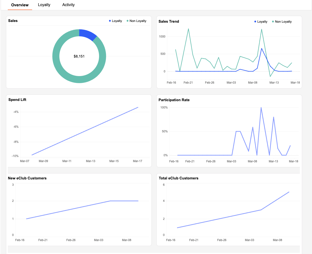
Overview Data Visualizations
The data values and intervals shown along the Y-axis of trend line graphs in the following visualizations are dynamic, reflecting the time period specified in the Date Range. The larger the Date Range, the larger the intervals.
Sales
TheSales pie chart shows loyalty and non-loyalty gross sales as a proportion of the total gross sales recorded on a given date.
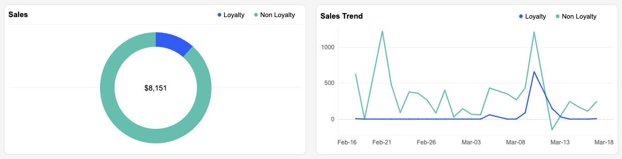
The Sales Trend line graph shows the gross sales total (broken down by loyalty and non-loyalty transactions) recorded across the entire business on a given date.
Spend Lift
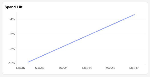
The Spend Lift trend line graph shows the net percentage difference in average check total for loyalty customers as compared to the average check total for non-loyalty customers on a given date.
Participation Rate
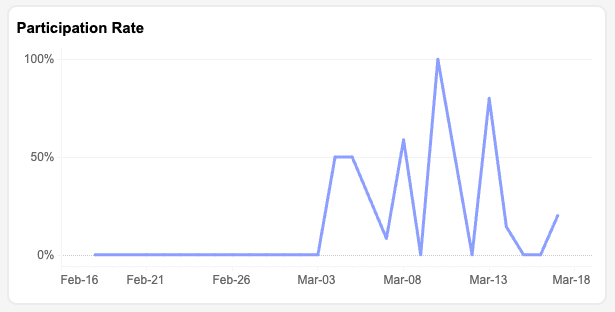
The Participation Rate trend line graph shows the percentage of Loyalty Transactions within the Total Transactions for the given date range (based on the actual transaction date).
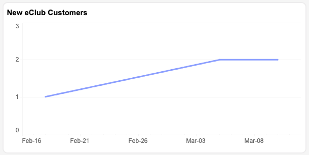
New eClub Customers
The New eClub Customers trend line graph shows the total number of new eClub members who signed up on a given date.
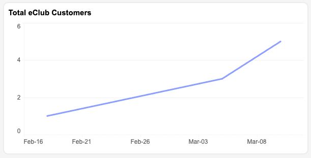
Total eClub Customers
The Total eClub Customers trend line graph shows the total number of eClub users in your loyalty program on a given date.
Loyalty
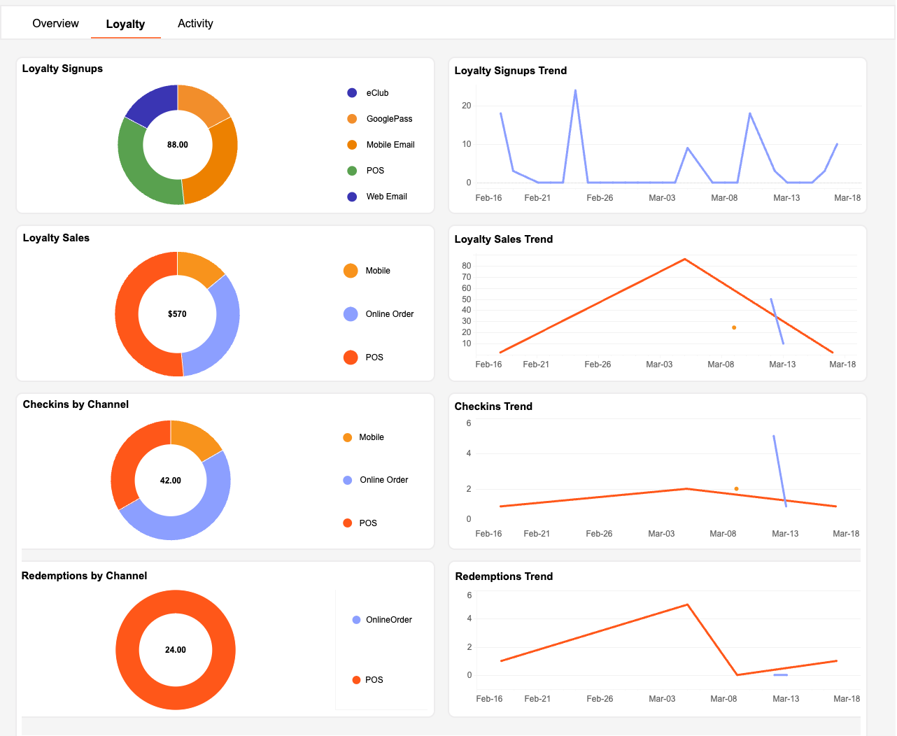
The Loyalty tab shows in-depth tracking of new user signups and loyalty user engagement, such as spending behavior, broken down by channel (Mobile, Online Order, or POS) and device type (Android, iOS, etc.).
Loyalty Data Visualizations
The data values and intervals shown along the Y-axis of trend line graphs in the following visualizations are dynamic, reflecting the time period specified in the Date Range. The larger the Date Range, the larger the intervals.
Loyalty Signups
The Loyalty Signups pie chart shows the total number of new loyalty signups logged, broken down by signup channel (eClub, Mobile Email, Mobile Facebook, etc.). The Loyalty Signups Trend line graph shows the new loyalty signups on each date between the date range selected.

Loyalty Sales
The Total Loyalty Sales pie chart shows the total value in ($ USD) of sales associated with the transactions made by loyalty users for a given date range. The channel denotes the channel/device used for making the checkin (tagging the transaction made by a user as a loyalty transaction). Channels include, but are not limited to POS, Online Order, Mobile, Web, etc. The Loyalty Sales Trend shows the total sales amount associated with the transactions made by loyalty users on each date between the date range selected.

Note: Mobile as a channel means that the loyalty user used the app to do the checkin and does not reflect the actual place at which the transaction was carried out. If a transaction is carried out in-store and the corresponding checkin is made through mobile, the channel is Mobile. However, if a transaction is carried out online, and the corresponding checkin is made through mobile, the checkin channel is still tagged as Online Order.
Checkins by Channel
The Total Checkins by Channel pie chart shows the total number of checkins by channel made by loyalty users for a given date range. The checkin channel denotes the channel/device used for making the checkin (tagging the transaction made by a user as a loyalty transaction). Channels include, but are not limited to POS, Online Order, Mobile, Web, etc. The Checkins Trend shows the total number of checkins made on each date between the date range selected.

Note: Mobile as a channel means that the loyalty user used the app to do the checkin and does not reflect the actual place at which the transaction was carried out. If a transaction is carried out in-store and the corresponding checkin is made through mobile, the channel is Mobile. However, if a transaction is carried out online, and the corresponding checkin is made through mobile, the checkin channel is still tagged as Online Order.
Redemptions by Channel
The redemption channel denotes the channel in which the redemption is used (and not the device on which the redemption code is generated). There are two possible values: POS (All redemptions made in-store) and Online Order (All redemptions made online). The Redemptions Trend graph shows the total number of redemptions made on each date between the date range selected.

Note: The reason we excluded % or $ discount-based Promo and Coupon offers is because we do not store the channel for these types of redemptions
Activity
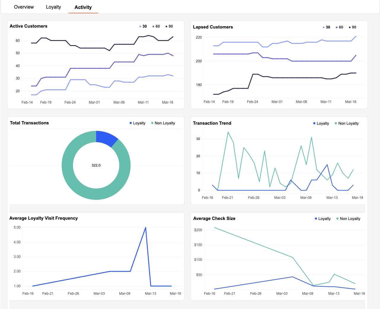
Activity is focused more on user behavior as it relates to visit frequency, average check size, and total transaction trends over time, with comparisons between Loyalty users and Non-Loyalty customers.
Activity Data Visualizations
The data values and intervals shown along the Y-axis of trend line graphs in the following visualizations are dynamic, reflecting the time period specified in the Date Range. The larger the Date Range, the larger the intervals.
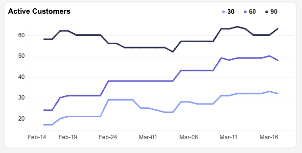
Active Customers
The Active Customers trend line graph shows the total number of loyalty users who were active within the past 30 days, 60 days, and 90 days at each specific date during the time period. The same users active within the past 30 days are also a part of the active within 60 days and 90 days groups. However, a user active within 90 days at the start of the time period and remains inactive past 90 days will fall out of that group as soon as 90 days have lapsed.
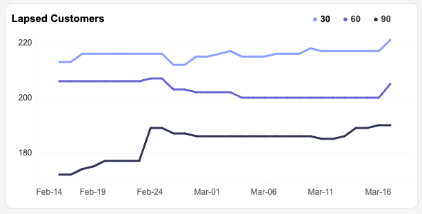
Lapsed Customers
The Lapsed Customers trend line graph shows the total number of customers that were lapsed (inactive) for a period of at least 30 days, 60 days, and 90 days on each specific date during the time period. Lapsed Users are calculated by subtracting Active30,60,90 day users from Active365 users (users who have been active in the last year).
Total Transactions
The Total Transactions pie chart shows the total number of transactions for your business logged by Punchh. This may include, but is not limited to, Loyalty Checkins and POS Receipts.
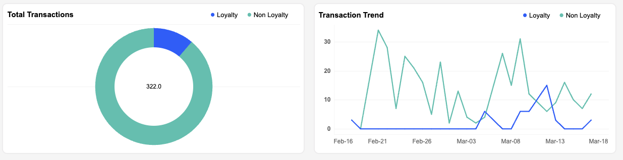
The Transactions Trend line graph shows the total number of transactions logged each day.
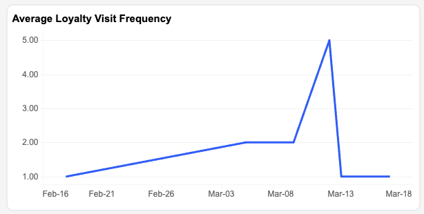
Average Loyalty Visit Frequency
The Average Loyalty Visit Frequency trend line shows the average visit frequency across all loyalty users (total checkins over the past 30 days/total loyalty users) on a given date.
Average Check Size
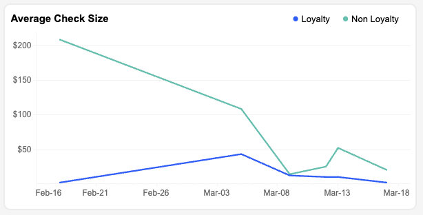
The Average Check Size trend line graph shows the average check size (gross sales/total transactions) logged each day.
Download Customer Data
You can export/download a snapshot of your current dashboard view at any time by clicking the Download button at the bottom right of the page. Select the file type you'd like to generate and click Download to download the file to your computer.
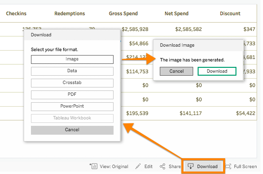
- "Image" generates a PNG snapshot of the current dashboard tab.
- "Data" opens a new screen with populated data. From here you can download a text (CSV) file of the data list.
- "Crosstab" generates a CSV file of whatever cells you have selected (or all cells if none have been selected).
- "PDF" generates a PDF snapshot of the current dashboard tab.
- "Powerpoint" generates a PPTX deck with snapshots of each of the current Overview Loyalty and Activity tabs as separate slides.