CSS Customization Guide
This article provides step-by-step instructions for customizing your own CSS to personalize your iFrame appearance.
We recommend implementing the iFrame signup and login experience on your website as a link that opens in a separate tab rather than as an embedded page within your website. This approach aligns with modern browser security/privacy requirements and avoids issues caused by third-party cookie restrictions.
Getting Started with Customization
Before customizing the CSS, you should understand the structure of CSS files and how to customize them.
Prerequisites:
- Basic knowledge of CSS
- Text editor or CSS editing software
What You Can Customize:
- Colors (backgrounds, text, borders)
- Fonts and typography
- Layout and spacing
- Button styles and hover effects
- Form field appearance
- Mobile responsive behavior
Step-by-Step Customization Process
Step 1: Download the Base CSS File
- Copy the complete CSS code, which can be accessed at https://s3.amazonaws.com/punchhstatic/whitelabel_csses/iframe-style.css
- Save it as a new file in a text editor, such as VS Code, Sublime Text, or Notepad++
Step 2: Identify Elements to Customize
Identify which elements you want to change and customize. Refer to the Implementation Notes section for Key Customization Areas. Common customization targets include:
Brand Colors
Primary brand color for buttons:
/* Primary brand color for buttons */
.iframe-container .btn-primary {
    background-color: #YOUR_BRAND_COLOR;
    border-color: #YOUR_BRAND_COLOR;
}
Background colors:
/* Background colors */
.iframe-container{
    background-color: #YOUR_BACKGROUND_COLOR;
}
Typography
Change the font family:
/* Change font family */
.iframe-container {
    font-family: 'Your Brand Font', Arial, sans-serif;
}
Change the text colors:
/* Text colors */
.iframe-container {
    color: #YOUR_TEXT_COLOR;
}
Form Elements
Change the input field styling:
/* Input field styling */
.iframe-container .form-control {
    border-color: #YOUR_BORDER_COLOR;
    border-radius: 8px; /* Rounded corners */
}
.iframe-container .form-control:focus {
    border-color: #YOUR_FOCUS_COLOR;
    box-shadow: 0 0 0 3px rgba(YOUR_RGB_VALUES, 0.1);
}
Step 3: Create Your Custom CSS File
There are three methods for customizing a CSS file: modifying an existing style, adding a new style, or overriding the existing classes.
Method 1: Modify Existing Styles
Change the existing CSS file to match your brand's styling.
Example: Changing Button Colors
Find the .iframe-container .btn-primary rule to change button colors and hover colors:
/* Find this existing rule and modify it */
.iframe-container .btn-primary {
    color: #fff;
    background-color: #e74c3c; /* Change from default #337ab7 to red */
    border-color: #c0392b;
}
.iframe-container .btn-primary:hover {
    background-color: #c0392b;
    border-color: #a93226;
}
Method 2: Add New Custom Styles
Add unique elements and styles that are unique to your brand. Custom brand elements should be added at the end of the CSS file.
Example: Adding Custom Brand Elements
Use .iframe-container .brand-header to add a custom header:
/* Add at the end of your CSS file */
/* Custom brand header */
.iframe-container .brand-header {
    background: linear-gradient(135deg, #667eea 0%, #764ba2 100%);
    padding: 20px;
    text-align: center;
    color: white;
    margin-bottom: 20px;
}
Use .iframe-container .custom-form to add custom form styling:
/* Add at the end of your CSS file */
/* Custom form styling */
.iframe-container .custom-form {
    background-color: #f8f9fa;
    padding: 30px;
    border-radius: 10px;
    box-shadow: 0 4px 6px rgba(0, 0, 0, 0.1);
}
Method 3: Override Specific Classes
Create new designs for specific classes in your CSS file. This requires more knowledge and experience with CSS files.
Example: Complete Button Redesign
Find .iframe-container .btn and override all button styles:
/* Override all button styles */
.iframe-container .btn {
    background: linear-gradient(45deg, #FE6B8B 30%, #FF8E53 90%);
    border: none;
    border-radius: 25px;
    color: white;
    font-weight: bold;
    text-transform: uppercase;
    transition: all 0.3s ease;
}
.iframe-container .btn:hover {
    transform: translateY(-2px);
    box-shadow: 0 4px 8px rgba(0,0,0,0.2);
}
Step 4: Test Your Customizations
Test your CSS file to ensure that everything is being displayed as expected. There are two ways to test your CSS file: local testing and URL testing.
Method 1: Local Testing (Recommended)
-
Create a test HTML file that contains your CSS file:
<!DOCTYPE html> <html> <head> <link rel="stylesheet" href="your-custom-iframe-style.css"> </head> <body> <div class="iframe-container"> <div class="login-form"> <form> <div class="form-group"> <input type="email" class="form-control" placeholder="Email"> </div> <div class="form-group"> <input type="password" class="form-control" placeholder="Password"> </div> <button type="submit" class="btn btn-primary">Login</button> </form> </div> </div> </body> </html> -
Open the HTML file in your browser to preview changes
-
Make adjustments in your CSS file as needed and refresh to see updates
Method 2: Testing with URL Method (Advanced)
Using this method will require support from your Punchh representative to add the CSS URL to your iFrame. Reach out to your Punchh representative to get assistance with this testing.
- Upload your CSS file to a publicly accessible location (your website, cloud storage, etc.)
- Provide the CSS file's URL to your Punchh representative, who will add the CSS to your iFrame
- Access your iFrame to view the CSS file in action, make adjustments to your CSS file as needed
- Reach out to your Punchh representative for help accessing your iFrame
Implementation Notes
CSS Loading Order
- Google Fonts import (Oswald font family)
- Base body and typography styles
- Layout and container styles
- Form elements and inputs
- Button styles and states
- Navigation and header components
- Compliance sections
- Social media integration
- Responsive breakpoints
- Utility classes
Key Customization Areas
- Colors: Easily customizable through CSS variables
- Typography: Oswald font can be replaced with custom fonts
- Layout: Container widths and spacing are adjustable
- Compliance: New compliance sections are fully customizable
- Buttons: All button styles support color and sizing changes
- Mobile: Responsive breakpoints can be modified
Best Practices
Performance Optimization
- Minimize CSS file size: Remove unused styles and comments
- Combine styles: Merge multiple customizations into one file
- Use efficient selectors: Avoid overly complex CSS selectors
Maintainability
- Document your changes: Add /*comments*/ explaining custom modifications
/* Custom brand colors - Updated March 2024 */
.iframe-container .btn-primary {
    background-color: #e74c3c; /* Brand red */
}
-
Keep a backup: Save original and modified versions
-
Test thoroughly: Verify all iFrame functionalities work after customization
Design Consistency
- Follow brand guidelines: Ensure colors and fonts match your brand
- Maintain usability: Don't sacrifice functionality for appearance
- Consider accessibility: Ensure your design works for all users
Version Control
- Track changes: Keep notes of what was modified and when
- Test before deploying: Always test in a staging environment first
- Have a rollback plan: Keep the previous working version accessible
Troubleshooting Common Issues
CSS Not Loading
Expand for Solutions
- Check file format: Ensure file has
.cssextension - Test URL accessibility: If using URL method, verify the file is publicly accessible
Styles Not Applying
Expand for Solutions
- Check CSS specificity: Your custom styles may need
!importantdeclarations
.iframe-container .btn-primary {
    background-color: #your-color !important;
}
-
Clear browser cache: Force refresh using Ctrl+F5 or Cmd+Shift+R
-
Verify class names: Ensure you're targeting the correct CSS classes from this reference
Mobile Display Issues
Expand for Solutions
-
Test responsive design: Check your customizations on different screen sizes
-
Use media queries: Add responsive rules for mobile devices
@media (max-width: 768px) {
    .iframe-container .your-custom-class {
        font-size: 14px;
        padding: 10px;
    }
}
Color Contrast Problems
Expand for Solutions
- Check accessibility: Ensure sufficient contrast between text and background
- Test with tools: Use online contrast checkers to validate accessibility
- Provide fallbacks: Always specify fallback colors
CSS Class Categories
You can see how the different classes and components impact the design of the iFrame by inspecting the page. To do this, right click on the iFrame page and select "Inspect".
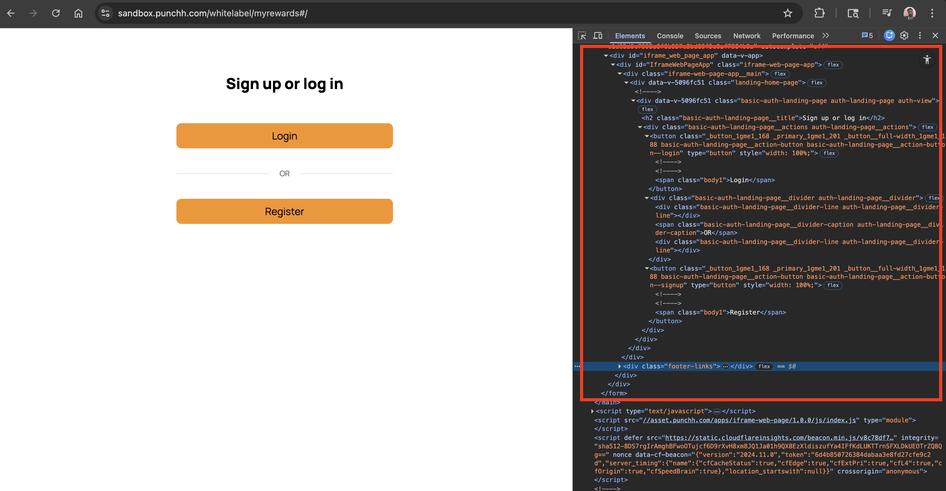
Below are some of the most commonly changed components in the CSS. Additional classes and components can be found by inspecting the iFrame pages or exploring the base CSS provided in Step 1.
Primary Containers
Primary Containers
.iframe-container- Main container for all iFrame content.iframe-header- Header section container.login-form- Login form container.signup-form- Signup form container.user-dashboard- Main dashboard container
Layout Utilities
Layout Utilities
.disp-table- Display table layout.pos-relative- Positive relative.seprator- Separator element with OR text
Padding Classes
Padding Classes
.padt40- Padding top 40px.padb20- Padding bottom 20px.padnb120- Padding bottom 120px (important)
Form Elements
Input Fields
Input Fields
.iframe-container form input- All input fields styling.iframe-container form textarea- Text area styling.iframe-container form label- Form labels
Form Containers
Form Containers
.form-group- Form group wrapper.form-hint- Input hint text.error-messages- Error message container.error-messages h2- Error message header.error-messages li- Individual error items
Select Elements
Select Elements
select#user_fav_location_id- Favorite location dropdown.ecrm-registration-div select- eCRM form selectsselect#location_id- Location dropdownselect[disabled]- Disabled select styling
Button Classes
Primary Buttons
Primary Buttons
.btn-submit- Main submit button.submit-div input- Submit button within div.btn-fb- Facebook button.btn-fb a- Facebook button link
Social Authentication
Social Authentication
.facebook-link- Facebook login link.google-sign_in-link- Google Sign-in button.apple-signin-button- Apple Sign-in button (from application_iframe.scss)
Navigation and Header
Header Components
Header Components
.navbar-div- Navigation bar container.navbar-div .popup- Popup elements in navbar.navbar-div span+span:before- OR separator between nav items
Navigation Stats
Navigation Stats
.user-dashboard .iframe-header .navbar-div span a- Dashboard navigation links.user-dashboard .iframe-header .navbar-div span.signout-link- Logout link.user-dashboard .iframe-header .navbar-div span.signout-link a- Logout button styling
Authentication and Login
Login Components
Login Components
.login-form- Login form container.login-form form- Login form styling.login-form .facebook-login-div- Facebook login section.login-form .submit-div- Login submit section
Password and Recovery
Password and Recovery
.password-form .header-div- Password form header.password-form .submit-div- Password form submit.forgot-div- Forgot password container.forgot-div a- Forgot password link
Basic and Advanced Authentication
Login/Signup Components
Login/Signup Components
basic-auth-sign-in- Sign-in form blockbasic-auth-sign-in__input- Input field inside sign-inbasic-auth-sign-in__input-email- Email input specificallyadvance-auth-landing-page__action-button--phone- Phone action buttonauth-landing-page__divider-caption- "Or" text in divider
Shared Layout Classes (for Override)
Shared Layout Classes
.auth-view- Auth view container (max-width, flex column, gap).auth-view__form- Form wrapper (width, flex, gap).auth-view__form-section- Form section (gap between fields).auth-view__field-group- Field group (gap between label and input).auth-view__field-group--password- Password field group (larger gap).auth-view--compact-gap- Smaller top-level gap (ex. email/mobile/OTP screens)
User Dashboard
Dashboard Layout
Dashboard Layout
.user-dashboard .iframe container- Dashboard main content.user-dashboard .iframe-header- Dashboard sidebar.user-dashboard .current-checkins-div- Current check-ins display
Dashboard Forms
Dashboard Forms
.user-dashboard .checkin-form form- Check-in form.user-dashboard .redemption-form form- Redemption form.user-dashboard .signup-form form- Signup form in dashboard
Dashboard Elements
Dashboard Elements
.user-dashboard .barcode-div- Barcode section.user-dashboard .barcode-digit- Barcode digit display.user-dashboard .barcode-example- Barcode example text.user-dashboard textarea- Dashboard text areas.user-dashboard .feedback-share-div- Feedback sharing section.user-dashboard .expiry-warning- Expiry warnings.user-dashboard .info-div- Information sections
Compliance and Marketing
Compliance Sections
Compliance Sections
.iframe-container .iframe-age-verified-section- Age verification section.iframe-container .iframe-privacy-policy-section- Privacy policy section.iframe-container .iframe-terms-and-conditions- Terms and conditions section.iframe-container #compliance- General compliance section
Compliance Form Elements
Compliance Form Elements
.iframe-age-verified-section input[type="checkbox"]- Age verification checkbox.iframe-privacy-policy-section input[type="checkbox"]- Privacy policy checkbox.iframe-terms-and-conditions input[type="checkbox"]- Terms checkbox#compliance input[type="checkbox"]- Compliance checkboxes
Compliance Labels and Links
Compliance Labels and Links
.iframe-age-verified-section label- Age verification label.iframe-privacy-policy-section label- Privacy policy label.iframe-terms-and-conditions label- Terms label.iframe-age-verified-section a- Age verification links.iframe-privacy-policy-section a- Privacy policy links.iframe-terms-and-conditions a- Terms links
Marketing Email Subscription
Marketing Email Subscription
.checkbox_marketing_email_subscription- Marketing email checkbox.label_marketing_email_subscription- Marketing email label
Social Media Integration
Facebook Integration
Facebook Integration
.facebook-login-div- Facebook login container.facebook-login-div:before- Facebook section separator.facebook-label- Facebook label styling.btn-fb a:before- Facebook icon insertion.facebook-link a:before- Facebook link icon
Social Buttons Hover States
Social Buttons Hover States
.btn-fb a:hover- Facebook button hover.facebook-link a:hover- Facebook link hover.google-sign_in-link:hover- Google Sign-in hover
Responsive Design
Mobile Styles
The CSS includes responsive design rules for mobile devices with screen width max 480px:
Mobile Styles
.iframe-container .login-form- Mobile login form (86% width).iframe-container .signup-form- Mobile signup form (86% width).iframe-container form- Mobile form styling (100% width).iframe-container .facebook-login-div- Mobile Facebook section.iframe-container .facebook-login-div:before- Mobile separator (horizontal).iframe-container .facebook-link- Mobile Facebook link.facebook-label- Mobile Facebook label positioning.forgot-div- Mobile forgot password (100% width)
Typography and Colors
Text Styling
Text Styling
.alert-message- Alert text styling (#c55330 color).alert-message strong- Alert message emphasis.text-link- Text links (#0087d9 color).text-link::before- Text link underline effect
Color Variables
Color Variables
- Primary Text: #414141
- Accent Color: #c55330 (hover states, alerts)
- Background: #edf2f2 (inputs)
- Border: #a3a3a3
- Link Blue: #0087d9
- Facebook Blue: #436c99
Utility Classes
Display and Positioning
Display and Positioning
.show-location- Location display utility.text-space- Text spacing utility (from application_iframe.scss)
Form Utilities
Form Utilities
.required:before- Required field asterisk.middle- Middle alignment.no-locale- No locale class
Special Elements
Special Elements
#all-location- All locations link#fav-location-id-hint- Favorite location hint text
eCRM Widget Classes
eCRM Registration
eCRM Registration
.ecrm-registration-div- eCRM form container.ecrm-registration-div input[type=checkbox]- eCRM checkboxes.ecrm-registration-div form label.middle- eCRM middle labels.ecrm-registration-div .submit-div- eCRM submit section.ecrm-registration-div label.required:before- Required field indicators