Layout
The Layout section allows for editing panels used in the Register application, along with the controls on these panels. The controls define the functionality available to the employee and how the employee interacts with the application.
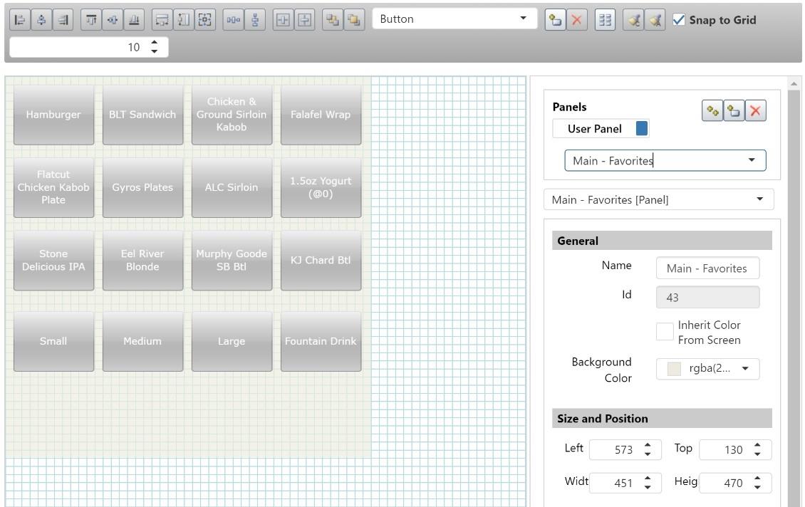
Panel Browser
In the upper right area of the Layout page is the panel browser. Selecting a panel in this list displays it in the editing area on the left, below the layout toolbar.
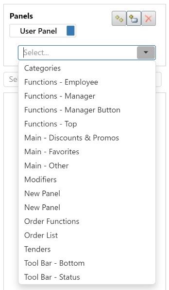
- User Panels button: Displays the user-defined panels. User panels can be added, edited, and deleted as needed.
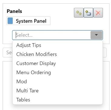
- System Panels button: Displays the system-defined panels. System panels can be modified, but they cannot be deleted because the system expects these panels to exist for certain actions.
- `Copy the Selected Panel' button: Makes a copy of the selected panel.
- `Add a New Panel' button: Adds a new, blank panel to the list.
- `Delete the Selected Panel' button: Deletes the selected panel.
When a panel is selected in the panel browser, the properties area in the lower right displays the panel's properties. The Left and Top property determine where on the screen of the Register application the panel appears, relative to the top/left corner of the screen.
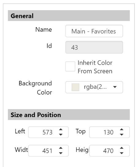
The information displayed in the properties area changes depending on what is selected.
Layout Toolbar
The layout toolbar is used for adding controls to the current panel and for manipulating the controls' size, position, and style.

The buttons on the toolbar are arranged in groups of related functions:
| Buttons | Functions |
|---|---|
 |
Vertical alignment: align left edges, align centers, align right edges |
 |
Horizontal alignment: align tops, align middles, align bottoms |
 |
Size: make same width, make same height, make same size |
 |
Spacing: make horizontal spacing equal, make vertical spacing equal |
 |
Page alignment: center horizontally, center vertically |
 |
Arrangement: send to back, bring to front |
 |
Adding/removing: control drop-down list, add new control, delete selected control, add order items. See Adding New Controls for more information. |
 |
Style: copy style, apply style |
 |
Grid: Check the check box to have controls snap to the grid in the editing area. Use the number field to control how large the grid is. |