Kitchen Displays, Kitchen Key Ingredient Summaries & Kitchen Keypads
Kitchen Displays
Kitchen displays are terminals running the Kitchen application for displaying order items in the kitchen. A single kitchen display can display two different kitchen views in a split screen setup. Whether it displays one view or two views is setup in the Kitchen Display dialog.
The split screen functionality is provided to allow the user to make use of one terminal for two functions. For instance if you have a grill and a fryer right next to each other, you can have one terminal that is setup to split screen so that half of the kitchen display is the grill and the other half is the fryer.
To create a new kitchen display, click Add New Kitchen Display. To edit an existing kitchen display, click its name.
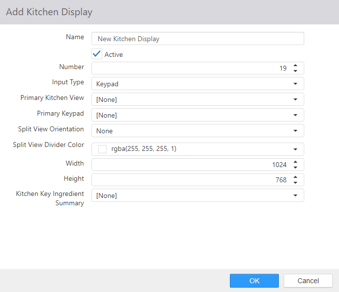
- Name: Name of the Kitchen Display
- Active: Kitchen application can run on kitchen display.
- Number: Terminal number to be used in the Kitchen.cfg file.
- Input Type:
- Keypad: Use keypad or bump bar to manipulate the kitchen display.
- Touchscreen: Use touchscreen buttons to manipulate the kitchen display.
- Primary Kitchen View: The 1st view that will display on the kitchen display.
- Primary Keypad: Bumpbar connected to the primary kitchen view.
- If Input Type = Touchscreen, this field will be hidden on the dialog.
- Split View Orientation:
- None: The kitchen display is not using split screen (default).
- Horizontal: The kitchen display will be split into two kitchen views horizontally.
- Vertical: The kitchen display will be split into two kitchen views vertically.
- Secondary Kitchen View: The 2nd view that will display on the kitchen display.
- If Split View Orientation = None, this field will be hidden on the dialog.
- Secondary Keypad: Bumpbar connected to the secondary kitchen view.
- If Split View Orientation = None, this field will be hidden on the dialog.
- If Input Type = Touchscreen, this field will be hidden on the dialog.
- Split View Divider Color: Select the color of the visible split view divider on the kitchen display
- Width: Width in pixels of the Kitchen application window.
- Height: Height in pixels of the Kitchen application window.
-
Kitchen Key Ingredient Summary: Select which Kitchen Key Ingredient Summary will display on
the kitchen display.
- None is a valid option (default)
Kitchen Key Ingredient Summaries
Kitchen Key Ingredient Summaries allows you to configure how the key ingredients will display on the kitchen display. Key ingredients are created in the Key Ingredients entity.
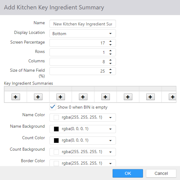
To create a new kitchen key ingredient summary, click Add New Kitchen Key Ingredient Summary. To edit an existing kitchen display, click its name.
-
Name: Name of the Kitchen Key Ingredient Summary
-
Display Location: Use the drop-down list to set the location of the key ingredient summaries:
- None (the default), Top, Bottom, Left, or Right.
- Note that the remainder of settings below will only be visible if the Display Location is set to other than None.
-
Screen Percentage: How much of the screen the key ingredient summaries area takes up.
-
Rows: How many rows of key ingredient summaries there are.
-
Columns: How many columns of key ingredient summaries there are.
-
Size of Name Field (%): How much of the key ingredient summary area is taken up by the name of the ingredient.
-
Key Ingredient Summaries: The list of key ingredient summaries to be displayed (see Key Ingredients).
-
Show 0 when BIN is empty:
-
When a key ingredient is defined but there are currently none of the key ingredients
ordered, this setting defines what to display on the Kitchen Display.
- When checked (Default), the key ingredient will display on the Kitchen Display with a value of 0
- When unchecked, the key ingredient will not display on the Kitchen Display
-
When a key ingredient is defined but there are currently none of the key ingredients
ordered, this setting defines what to display on the Kitchen Display.
-
Click the "+" button to add a new key ingredient summary.
![Edit dialog with a Key Ingredient drop-down set to [None]](/docs/par-pos/82ccf64e2d49-image0215.png)
-
"Show 0 when BIN is empty" checkbox: When the number of key ingredients gets to 0, the cell will display the number 0. If the checkbox is disabled, the whole key ingredient cell will be removed from the grid when the number of key ingredients gets to 0.
-
Name Color: The color that the key ingredient summary name is displayed in.
-
Name Background: The color of the background behind the name of the key ingredient summary.
-
Count Color: The color of the digit that shows the ingredient count.
-
Count Background: The color of the background behind the digit that shows the ingredient count.
-
Border Color: The color of the border around the key ingredient summary.
Kitchen Keypads
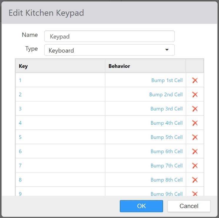
Kitchen keypads define the mapping of key characters to behaviors in the Kitchen application. To create a new kitchen keypad, click the Add New Kitchen Keypad button. To edit an existing kitchen keypad, click its name in the list.
-
Name: Name of the Kitchen Keypad
-
Type: Type of keypad or bump bar.
- Keyboard: Is a keyboard, or emulates a keyboard.
- Serial: Connected via a serial COM port.
- Parity: Parity setting of the device.
- COM Port: COM port the device is physically connected to.
- Baud Rate: Baud rate setting of the device.
-
Keys:
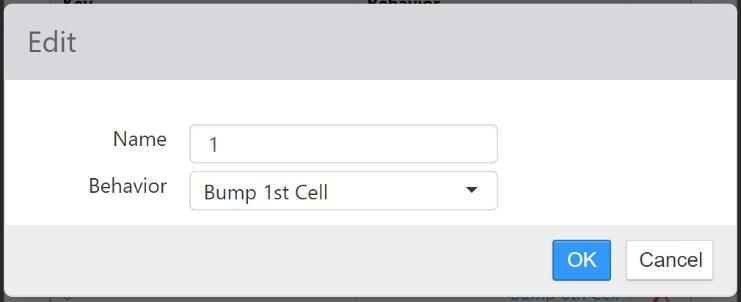
- Key: Key character to be mapped
- Behavior: Kitchen behavior to execute when key character received by Kitchen application.