Mobile: Typography (Fonts)
Context
The second step in the process of defining a visual style of a Mobile White Label Application is choosing the right fonts.
We recommend buying the license for the font in use, but also you can choose a similar free font from free libraries like Google Fonts.
The font family should contain three different font weights (i.e. Regular, Semibold & Bold), so they can be properly used across the whole application.
Fonts cover all text elements of the Mobile interface such as headings, call to action buttons, and all descriptive text that your customers will use to navigate through the app. In order to avoid potential readability issues, make sure that the readability of the fonts you’re choosing is clear.
Fonts selection and formatting tips
Heading
Use these for large headings typically at the top of a page or as a starting point of a section.
- Choose a font with the font weight you prefer, although we recommend using Bold
- Letter case: You can choose to display headings in uppercase (capital), or as originally typed
Body
Most-used style, usually for all texts that are smaller in size, full sentences, titles, links and paragraphs.
- Choose a font that includes Regular, Semibold, and Bold weights since all three are in use
Font requirements:
- File format: OTF or TTF
- Font for body text Bold, Semibold, and Regular weight
- Additional font for Headings with one font weight (i.e.: Bold) if necessary (Optional)
- License
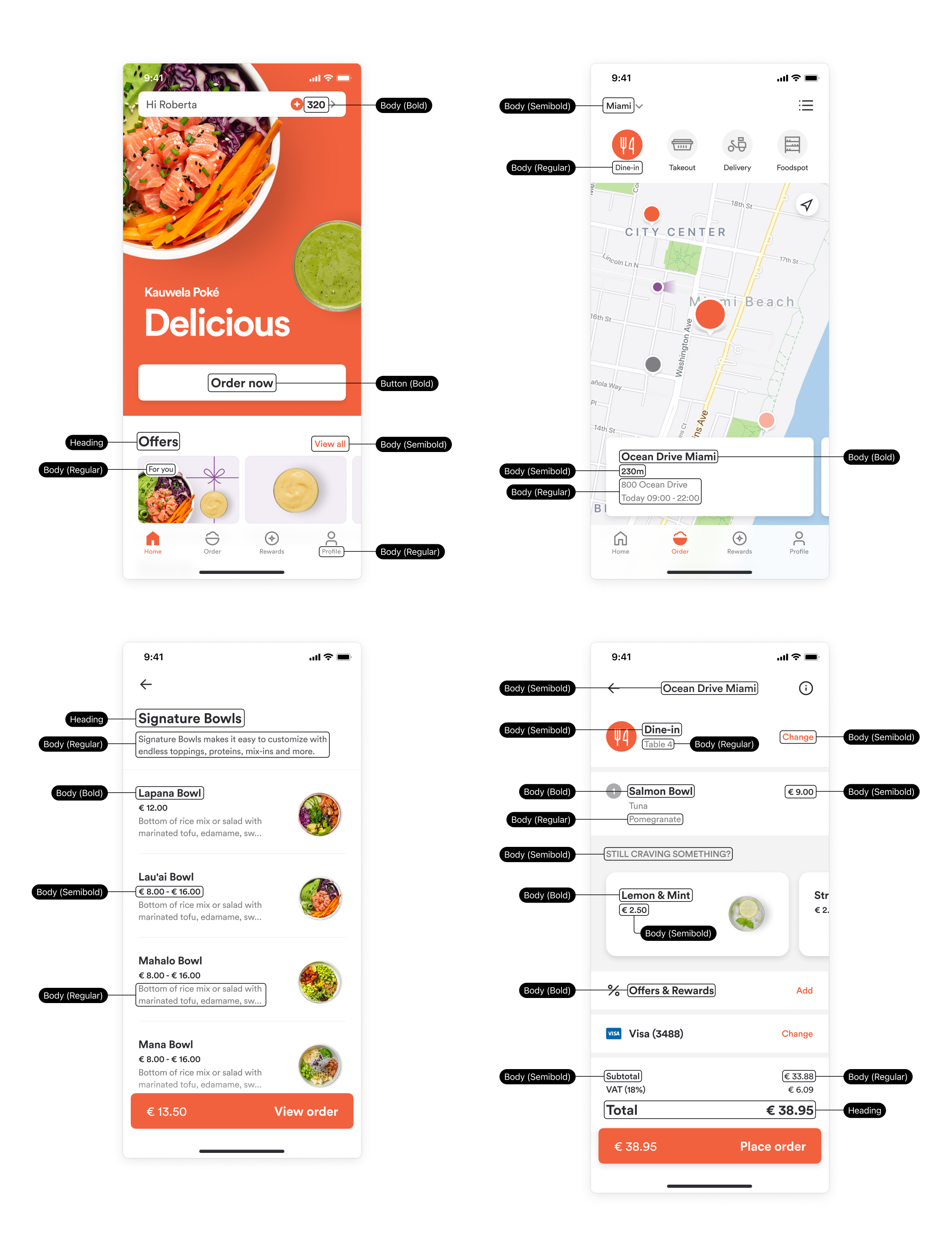
You cannot change font properties like font size, letter spacing (kerning), paragraph spacing, and line height.
Colors
Heading color
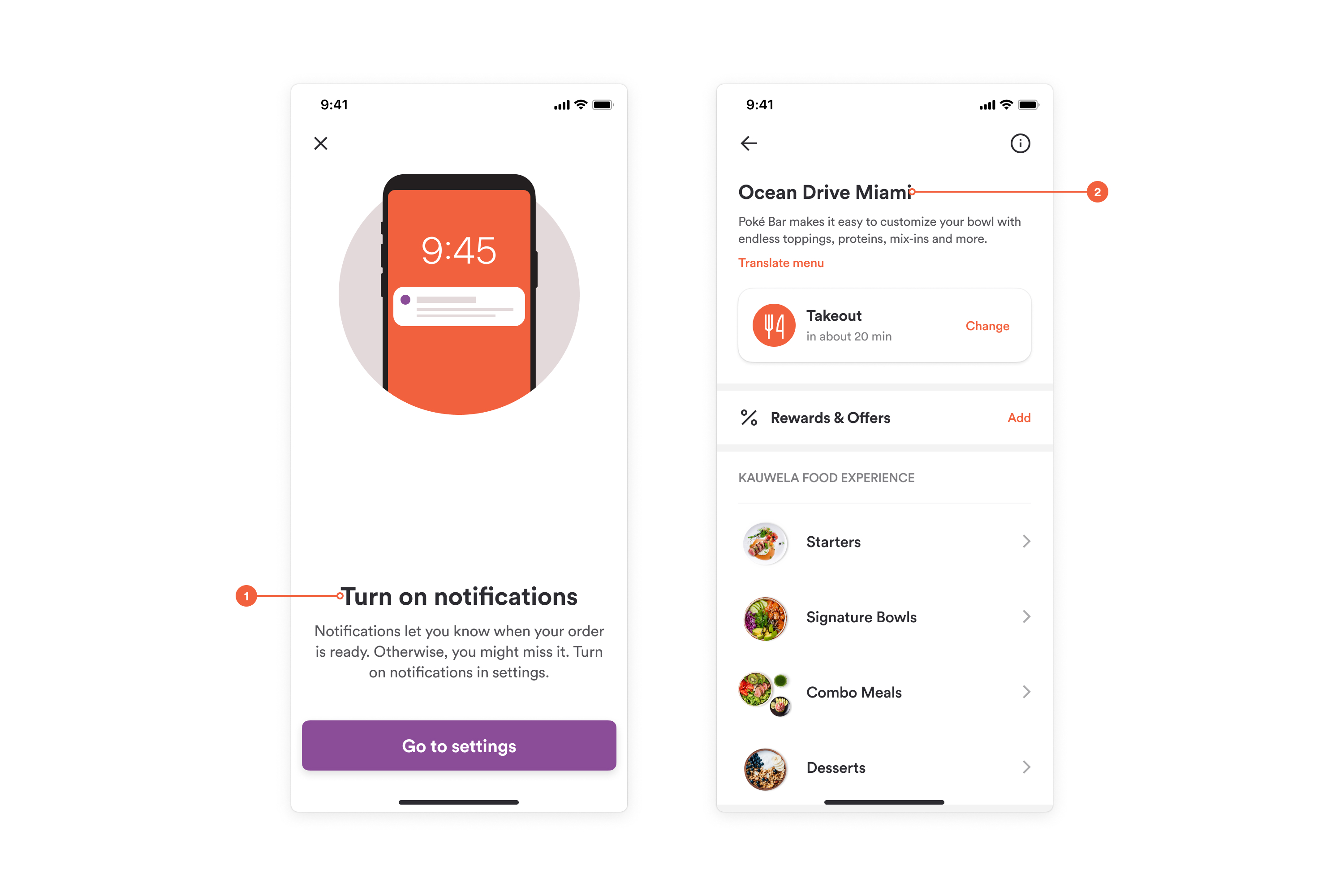
Our advice: be extra careful when choosing text colors. That color should have enough contrast with the background to be readable and satisfy accessibility standards. For Heading colors, we recommend using the same color as in the rest of the app - black, but you can choose other - just remember to keep it visible enough:
- Large heading
- Heading
Body color
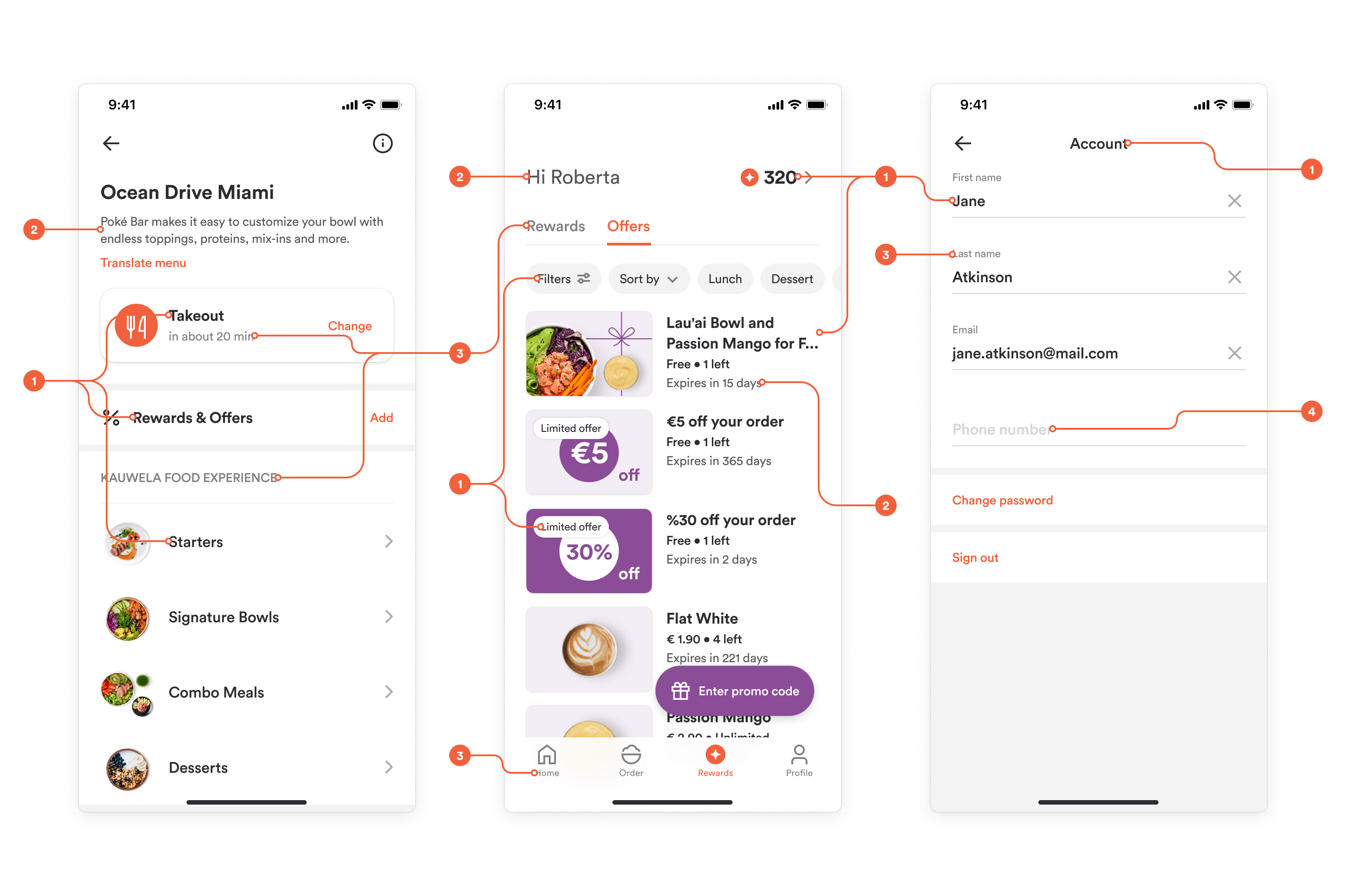
Same advice here - keep in mind that it should be readable and accessible for all. Additionally, for body text, you should choose a really dark color, preferably black because all other shades of text colors are made from that darkest color. So, for example, the placeholder for the input field is only 20% of the body text color:
- Body color 100%
- Body color 80%
- Body color 60%
- Body color 20%
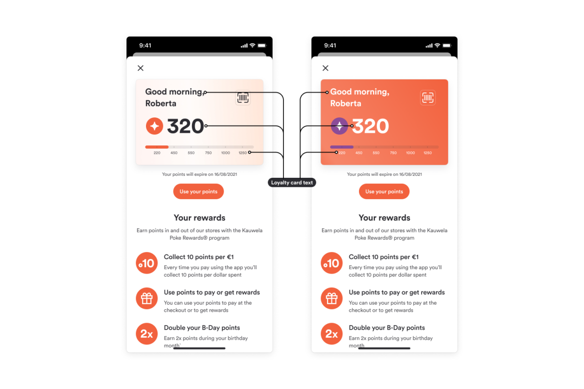
Loyalty card text color
When choosing the color of text on your loyalty card, we recommend using white if the background is dark and a darker color if the background is light: