User Acquisition by Location Report
Overview
User Acquisition by Location Report is a unique dashboard that allows you to understand the volume of signups taken at a specific location(s). This dashboard can be found under Guests > User Acquisition by Location Report
Using the dashboard, you can track the following high-level metrics at the location level:
- Total Unique Loyalty Signups
- eClub Users
- Converted from eClub to Loyalty
- Loyalty Users Favorite locations
Note: All high-level metrics are calculated at the business level
In addition, trends such as Top and Bottom 15 locations by Loyalty Signups are shown to quickly understand which locations are performing better and which ones are not. You can select a specific date range of interest. The date range will be applicable to high-level metrics and show the metrics and recent past days' stats for a selected duration.
User Acquisition by Location Report data is refreshed daily.
High-Level Metrics
High-level metrics are shown at the top of the dashboard.

The high-level metrics displayed above include:
- Total Unique Loyalty Signups: Total number of unique users who have signed up for the loyalty program for the business in a selected duration.
- eClub Users: Total number of eClub users in a selected duration.
- Converted from eClub to Loyalty: Total number of users who joined the loyalty program from eClub in a selected duration.
- Loyalty Users Favorite Location: Total number of loyalty users who marked their favorite location in a selected duration (if they haven't selected a favorite location they will appear under "No Favorite Location").
Note: The percentage value denotes the percentage change of a metric in the user-selected date range compared to the metric in the same length of period prior to the selected date range.
For example, if you are looking at Total Loyalty Signups between 2022-Jan-01 and 2022-Jan-07, the % change denotes the % increase/decrease of this number, compared to the Total Loyalty Signups between 2021-Dec-25 and 2021-Dec-31.
Select Metrics
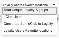
Use the dropdown allows you to toggle between different metrics. This is applicable to top or bottom 15 trends and map charts.
Top and Bottom Trends
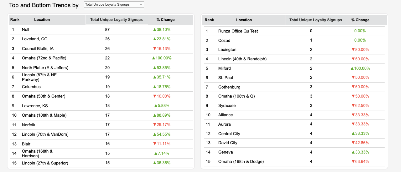
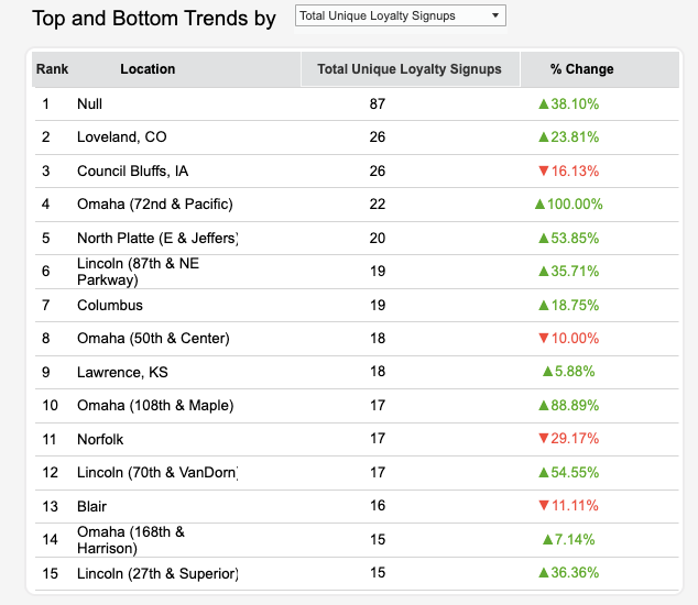
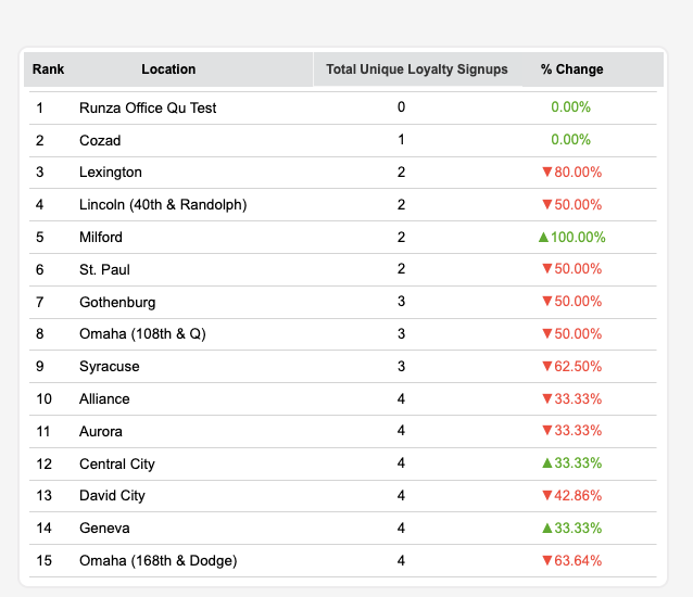
In this section, top and bottom trends are shown for each metric by the location. You can select any metrics from the dropdown and according to the selection, Top and Bottom trends show.
Top 15 Locations
For top trends, a list has been created that shows the top 15 locations for the selected metric with percentage change (compared to the same length of the period prior to the selected date range). The list shows an upward green or downward red arrow to indicate an increase or decrease in stats, respectively.
Bottom 15 Locations
For bottom trends, a list has been created that shows the bottom 15 locations for the selected metric with percentage change (compared to the same length of the period prior to the selected date range). The list shows an upward green or downward red arrow to indicate an increase or decrease in stats, respectively.
State-wise Locations
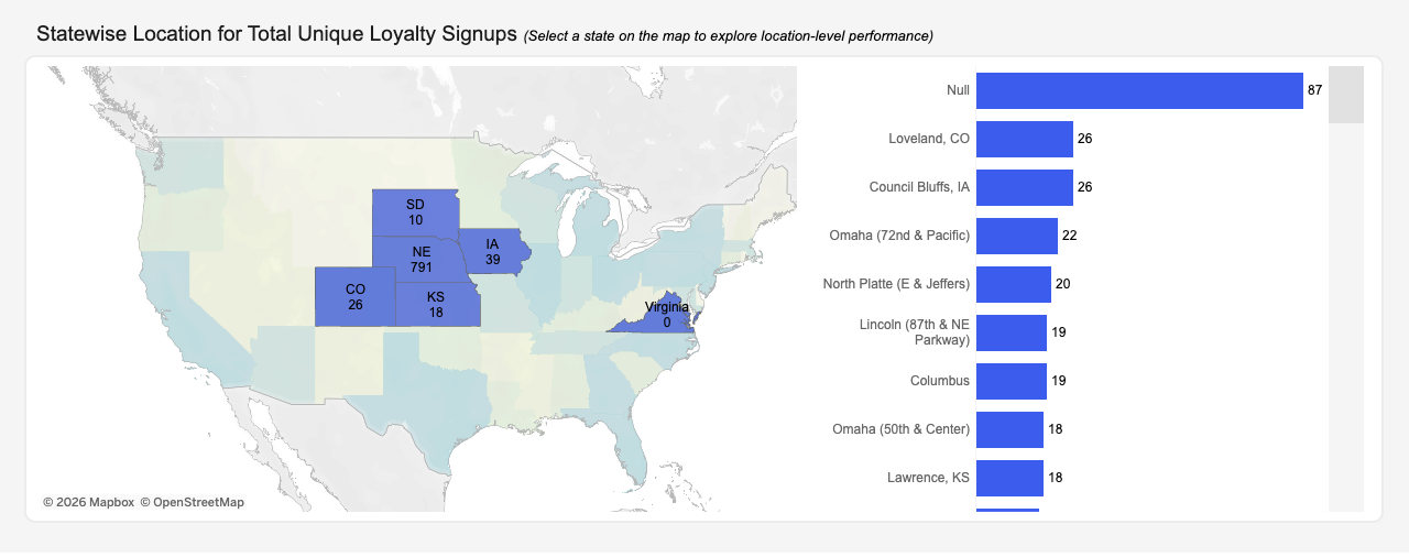
In this visual, the State-wise Location summary is shown on the map. The darker the color of the state, the higher the stats for the selected metric (e.g., Loyalty Signups) for that state. When a user hovers over any state, a tooltip displays the information related to that state: State Name, stats of the metric, and a bar chart that includes the top 10 locations of that particular state by the selected metric. The selected metrics filter apply to this chart.
Export Button
The key functionality of this dashboard is to export the data of the dashboard in CSV or Excel format.
Click Export in the top right of the dashboard.

The export menu appears and shows different data options such as Top 15 locations by selected metrics, Full data, KPI stats data, etc. You can select your desired option, the format of data, and download it.
If you need the full data, click on the Full Data option and click Download.
Note: In order to view signups by location, for ALL locations, choose Full Data as your export option.
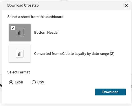
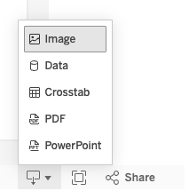
Click the Download icon at the bottom right of the page to capture the current dashboard view by exporting to PNG, PDF, or PowerPoint, and export any selected data into a CSV or Text file.