Mobile: Home Screen Components & Images
Context
Components are ready-made elements, like LEGO bricks, which you can assemble in various ways to build your home screen, insert content and compose and arrange them to achieve a desired goal. Component-based design allows you to create the ideal, one-of-a-kind framework for your home screen.
List of components
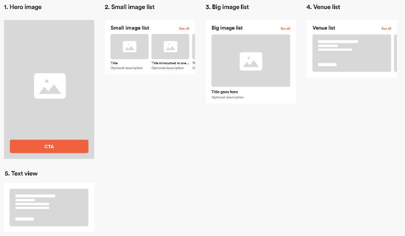
These are the building blocks of your home screen. Connect, rearrange and add content to them to create a perfect home screen for your application.
Components structure
When components are vertically connected, they form a structure of your home screen. When content is applied, you get a ready-made home screen.
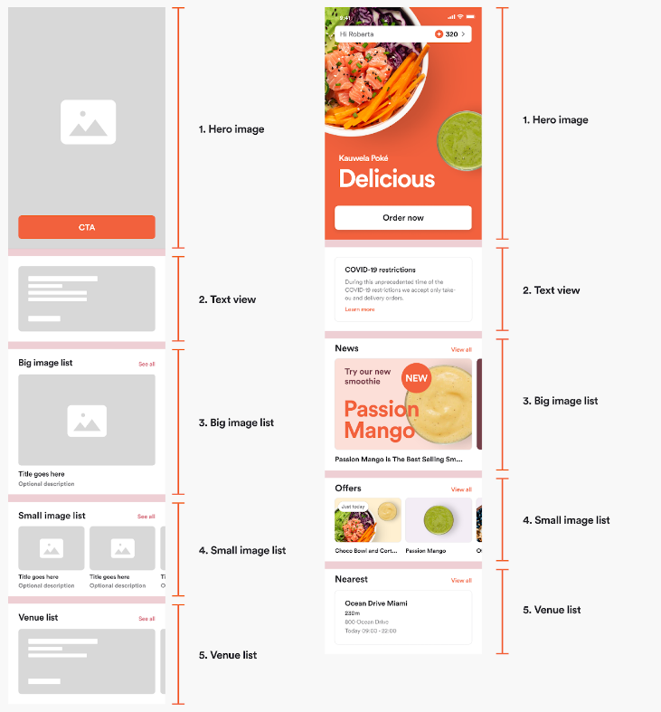
Components functionality
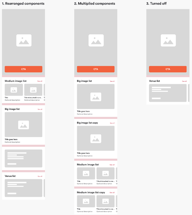
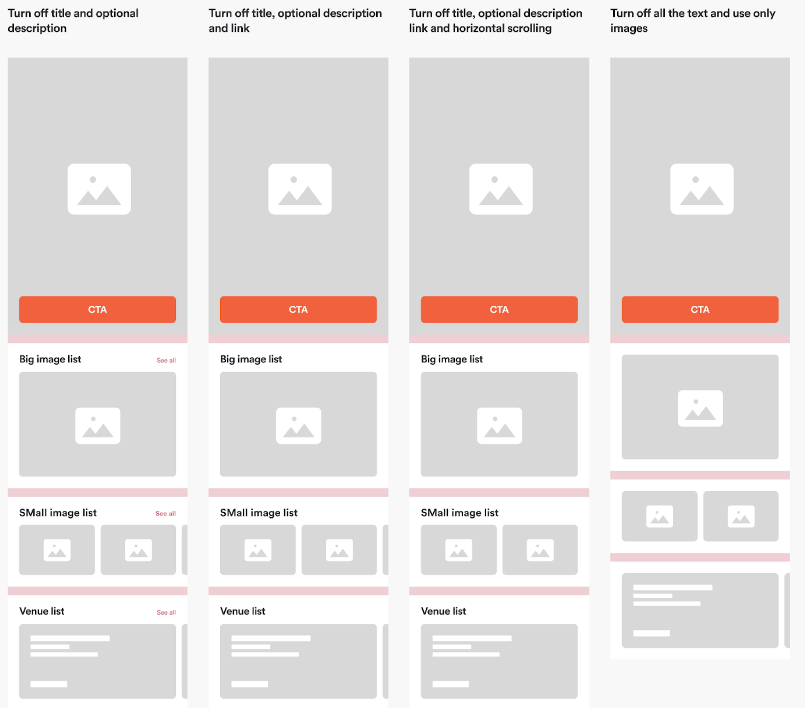
Some of the components can be rearranged, multiplied or even turned off.
-
Rearranged components
Rearrange the components in order to change the vertical structure of the home screen. -
Multiplied components
Multiply the same component several times in order to apply different content types to them. -
Turned off
Turn off any components you don't want to be there and use only those that work best for you.
Components visibility
In order to simplify things, some of the components can also be broken down into smaller elements. You may turn off specific functionality of a single component you don't want to be there.
Some examples:
How to apply content to components
1. Hero image
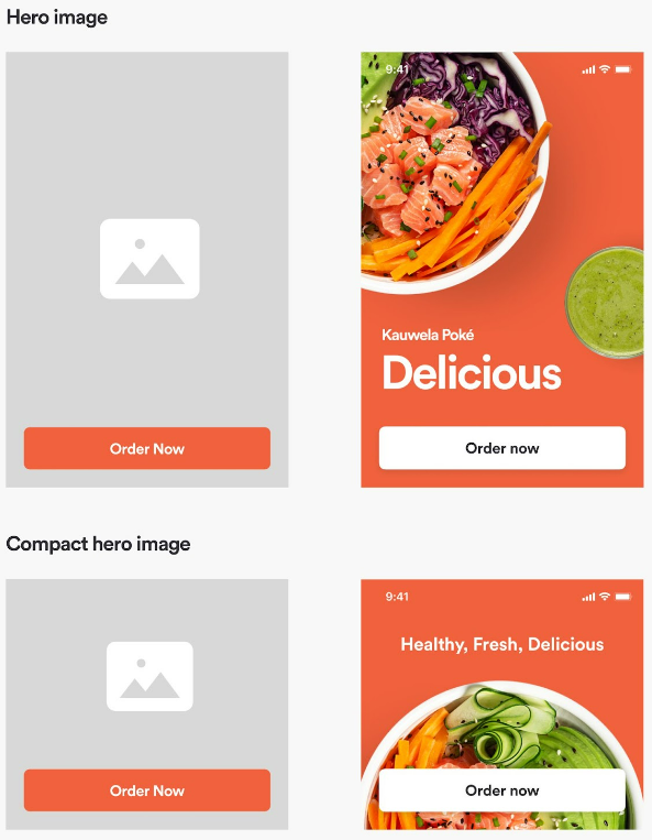
The hero image is structured as an image + button and it’s the first thing user sees upon opening the application. Best practice for using this component is to visually represent your Brand with the image and use the button as a link to the most important action you want your Users to complete.
Link button to:
- Order
- Offers
- Rewards
- Promotions
- Custom actions [URL / Deeplink]
If for some reason you don’t want the button to be there, you can also turn it off.
Configuring hero image is easy and you can do it by following these steps:
- Choose the version of hero image (Regular or Compact)
- Pick the button action (Where to link the button)
- Pick the button colors and text (Which text, background color)
- Pick the image (Which image best represents the button action)
The following details are required for this component to be added to your Home Screen:
| Attribute | Description | Type | Example Value | Localizable |
|---|---|---|---|---|
| Background Image | Image shown for Hero | URL (Image) | https://www.google.com | yes |
| Button Background Color | Background color of call-to-action button (unpressed) | HEX color | #00112233 | no |
| Button Background Pressed Color | Background color for call-to-action button when pressed by user | HEX color | #00112233 | no |
| Button Text Color | Color of text in button | HEX color | #00112233 | no |
| Button Text Pressed Color | Color of text in button when pressed by user | HEX color | #00112233 | no |
| Button Label | Text shown in button | Text | Order Now | yes |
| Action | Action that should be triggered when user taps on button | Action (see table below) | Order | no |
2. Big image list
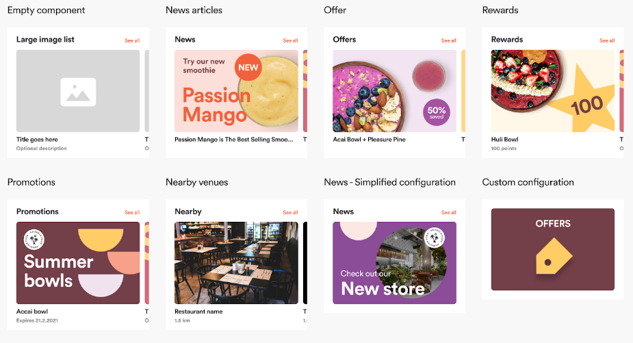
The big image list shows content in a slider with large images so a single full content card fits the screen and the indication of the next content card is presented (if there are multiple cards).
It includes a header and an item list. The header can include a link if a default content type is shown in the component. The header link is not supported for custom items.
Use big image list component to showcase:
- News articles
- Offers
- Rewards
- Promotions
- Nearby venues
- Custom actions (Shows card(s) with custom image, text and action)
The following details are needed for this component to be added to your Home Screen:
| Attribute | Description | Type | Example Value | Localizable |
|---|---|---|---|---|
| Header Title | Text shown in header. If this is empty, the header will not be shown. | Text | Offers | yes |
| Header Link | Text shown in header link. If this is empty, the header link will not be shown. | Text | View All | yes |
| Image Visible | If an image should be shown for every item in the component. | Yes/No | Yes | no |
| Title Visible | If a title should be shown for every item in the component. | Yes/No | Yes | no |
| Description Visible | If a description should be shown for every item in the component. | Yes/No | Yes | no |
| Content | Type of content that should be shown in the component. | Content (see Table below) | Offers | yes |
Some examples:
3. Small image list
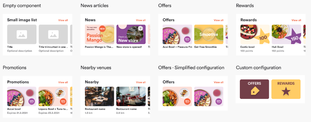
The small image list shows content in a slider with a medium-sized image. The same rules as for the Big image list apply here.
It includes a header and an item list. The header can include a link if a default content type is shown in the component. The header link is not supported for custom items.
Use small image list component to showcase:
- News articles
- Offers
- Rewards
- Promotions
- Nearby Venues
- Custom actions (Shows card(s) with custom image, text and action)
The following details are needed for this component to be added to your Home Screen:
| Attribute | Description | Type | Example Value | Localizable |
|---|---|---|---|---|
| Header Title | Text shown in header. If this is empty, the header will not be shown. | Text | News | yes |
| Header Link | Text shown in header link. If this is empty, the header link will not be shown. | Text | See All | yes |
| Image Visible | If an image should be shown for every item in the component. | Yes/No | Yes | no |
| Title Visible | If a title should be shown for every item in the component. | Yes/No | Yes | no |
| Description Visible | If a description should be shown for every item in the component. | Yes/No | Yes | no |
| Content | Type of content that should be shown in the component. | Content (see Table below) | News | yes |
Some examples:
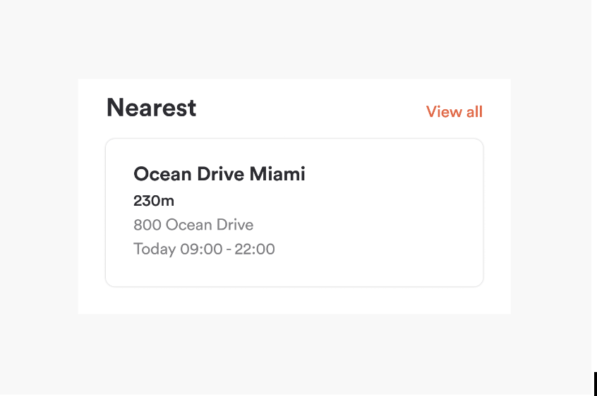
4. Venue list
Venue list is only used as a component to show nearby venues on the homepage of the app. Another way of showing nearby venues, is by using a big or medium image list component, as explained above.
The following details are needed for this component to be added to your Home Screen:
| Attribute | Description | Type | Example Value | Localizable |
|---|---|---|---|---|
| Header Title | Text shown in header. If this is empty, the header will not be shown. | Text | Nearby | yes |
| Header Link | Text shown in header link. If this is empty, the header link will not be shown. | Text | See All | yes |
| Venue Name Visible | If the Venue’s name should be shown for every Venue in the component. | Yes/No | Yes | no |
| Distance Visible | If the distance should be shown for every Venue in the component. | Yes/No | Yes | no |
| Address & Opening Hours Visible | If the the address & opening hours should be shown for every Venue in the component. | Yes/No | Yes | no |
| ORDER WITH APP Tag Visible | If the ORDER WITH APP tag is visible for every Venue in the component. | Yes/No | Yes | no |
Example:
5. Text view
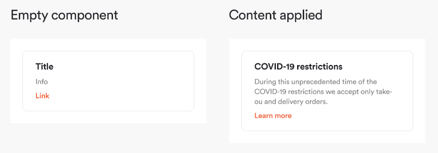
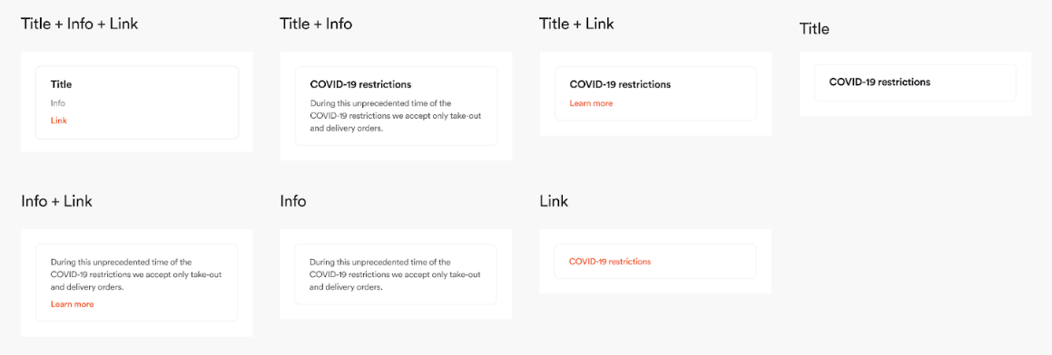
Text view is a component mostly used for informational purposes. You can link it to some external page, or, eventually to a deep link that is implemented inside the application.
The following details are needed for this component to be added to your Home Screen:
| Attribute | Description | Type | Example Value | Localizable |
|---|---|---|---|---|
| Title | Text for title that should be shown. | Text | Covid-19 restrictions | yes |
| Info | Text for info that should be shown. | Text | During this unprecedented time of the COVID-19 restrictions we accept only take-out and delivery orders. | yes |
| Link | Text that should be shown for the link. | Text | Learn more | yes |
| Link Action | Action that should be triggered when user taps on the link. | Action | URL (https://google.com) in in-app browser | yes |
Example:
You can use this component as a combination of:
6. Feature based component
These components are only available if certain features are enabled for your Brand's app.
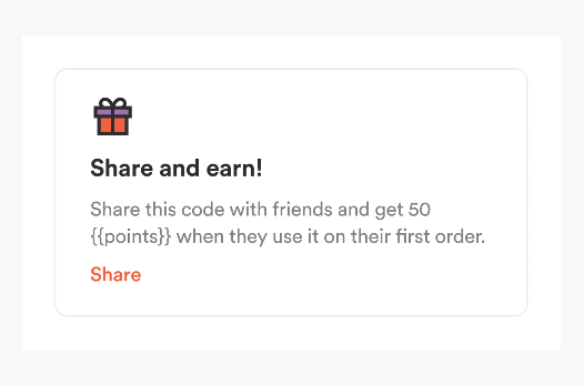
Referral component
If your app has enabled referral program, this component will show up on the home page to promote that functionality.
7. My Order Component
My Order Component will be visible only if you are logged in and if you have placed at least one order. The style of the molecule (font, asset, link, and font color) will not be changeable per the white label app. The position of the component will be decided by the white-label app.
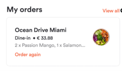
This component will be available from v4.24 release.
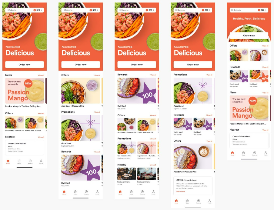
Ready-made templates
Few examples to give you an overview of how you can structure your home page.
Definitions
Actions
| Option | Description | Can be opened in | Notes |
|---|---|---|---|
| News | Opens list of News articles | N/A | |
| Order | Opens the Order page | N/A | |
| Rewards | Opens the Rewards page, Rewards Tab | N/A | |
| Offers | Opens the Rewards page, Offers Tab | N/A | |
| Promotions | Opens the Rewards page, Offers Tab | N/A | |
| Venues | Opens the Store Finder list screen | N/A | Not available for Hero component |
| Custom URL | URL | External Browser (Safari / Chrome) |
Default Content Types
| Option | Description |
|---|---|
| News | List of News articles configured in the CMS |
| Offers | List of Offers that are available to the user |
| Rewards | List of Rewards that are configured in the MC |
| Promotions | List of Promotions available to the user and/or device. If the user is not logged in, an item is shown to ask the user to sign-up / log-in. |
| Venues | Indicates that the user will be shown a list of nearest venues. |
Custom Content
Supported by Big Image List & Small Image List.
| Attribute | Description | Type | Example Value |
|---|---|---|---|
| Image | Desired image that will be presented inside of the item. Image needs to have 3:2 ratio |
URL or other image resource | www.google.com |
| Title | Desired title that will be presented within the item component. | Text | Welcome to the new venue! |
| Description | Desired description that will be presented within the item component. | Text | The newest venue in town. Check it out! |
| Action | Custom action that will be provided when clicked on the item. | URL | www.google.com |
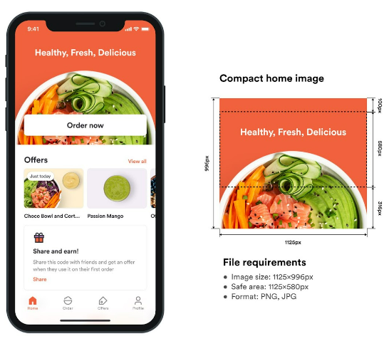
Home Screen images
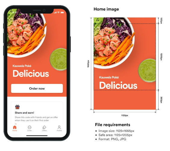
They are used as a welcome image on the Homepage of your app. You can choose between regular or compact home image.
It's really important not to put any text or logo outside safe area as it will be hidden by button or status bar.
Also: for the Brands with Loyalty, the safe area is different. Please check Home Screen requirements in this Mobile: Loyalty article.
Home screen regular image
Requirements
- Image size: 1125x1665px
- Safe area: 1125x1205px
- Format: PNG, JPG
- Filename: hero_image.png
Home screen compact image
Requirements
- Image size: 1125x996px
- Safe area: 1125x580px
- Format: PNG, JPG
- Filename: hero_image_compact.png