Component Options & Attributes
Components
Hero
The Hero component is shown at the top of your Home Screen and includes a large background image, as a single clear call-to-action.
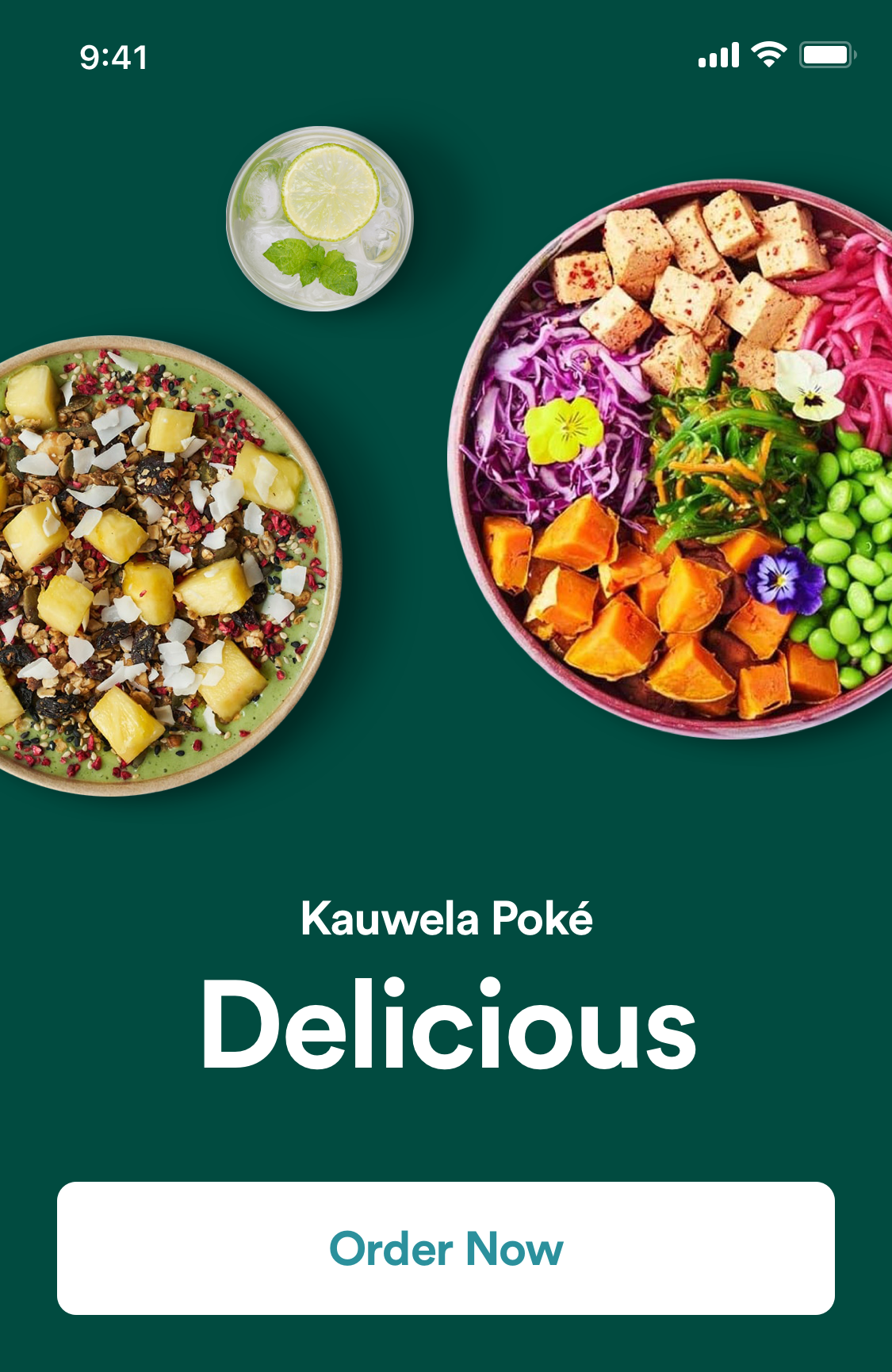
The following details are required for this component to be added to your Home Screen:
| Attribute | Description | Type | Example Value | Localizable |
|---|---|---|---|---|
| Background Image | Image shown for Hero. Resolution 375x555, or higher with same aspect ratio | URL (Image) | https://www.google.com | yes |
| Button Background Color | Background color of call-to-action button (unpressed) | HEX color | #00112233 | no |
| Button Background Pressed Color | Background color for call-to-action button when pressed by user | HEX color | #00112233 | no |
| Button Text Color | Color of text in button | HEX color | #00112233 | no |
| Button Text Pressed Color | Color of text in button when pressed by user | HEX color | #00112233 | no |
| Button Label | Text shown in button | Text | Order Now | yes |
| Action | Action that should be triggered when user taps on button | Action (see Table below) | Order | no |
Big Image List
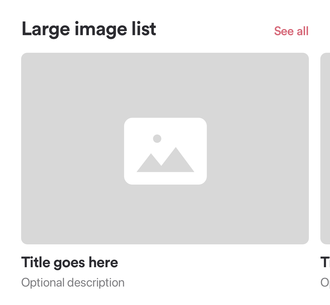
The Big Image List can be used to show different types of content (see Table below).
It includes a header and an item list.
The header can include a link if a default content type is shown in the component. The header link is not supported for custom items.
The following details are needed for this component to be added to your Home Screen:
| Attribute | Description | Type | Example Value | Localizable |
|---|---|---|---|---|
| Header Title | Text shown in header. If this is empty, the header will not be shown. | Text | Coupons | yes |
| Header Link | Text shown in header link. If this is empty, the header link will not be shown. | Text | View all | yes |
| Image Visible | If an image should be shown for every item in the component. | Yes/No | Yes | no |
| Title Visible | If a title should be shown for every item in the component. | Yes/No | Yes | no |
| Description Visible | If a description should be shown for every item in the component. | Yes/No | Yes | no |
| Content | Type of content that should be shown in the component. | Content (see Table below) | Coupons | yes |
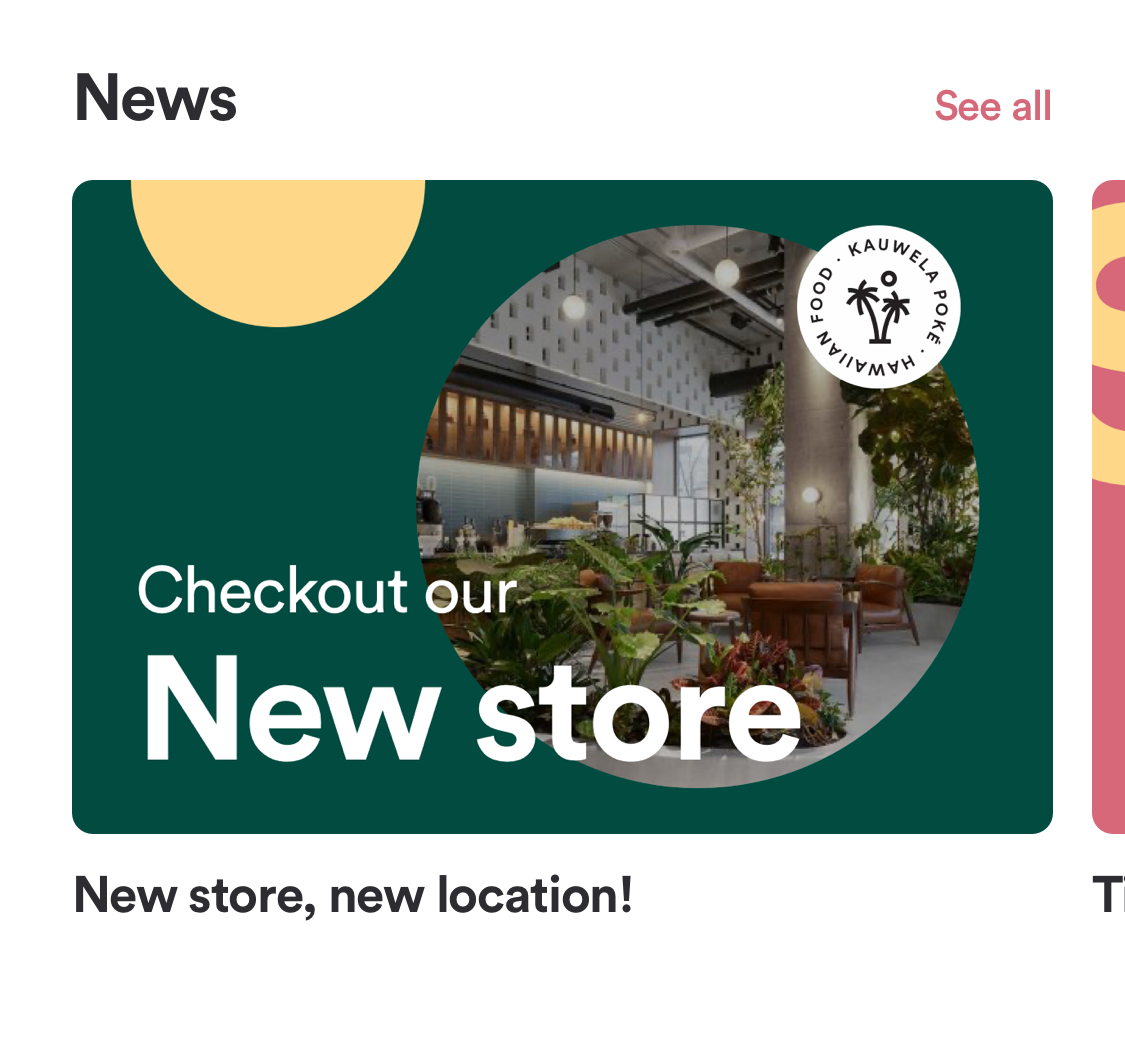
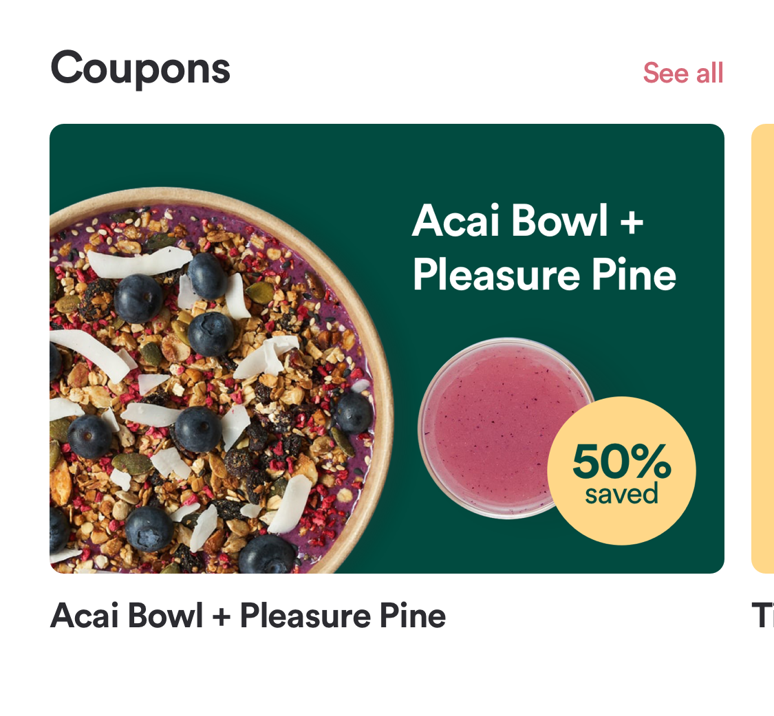
Here are some examples of the component:
|
Header title and link are set Image visible Title visible Description not visible Default content type (News / Coupons) |
|
|---|
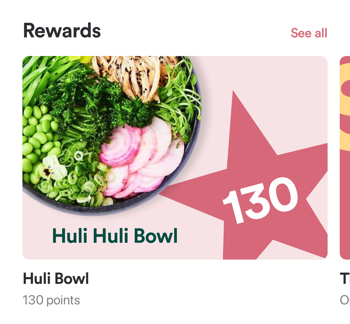
|
Header title and link are set Image visible Title visible Description visible Default content type (Rewards / Promotions) |
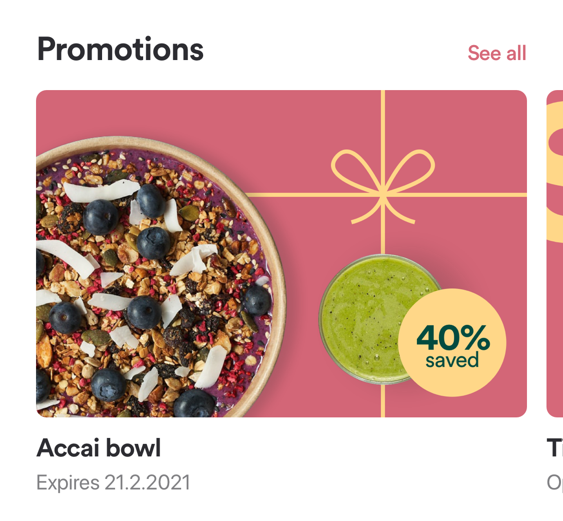
|
|---|
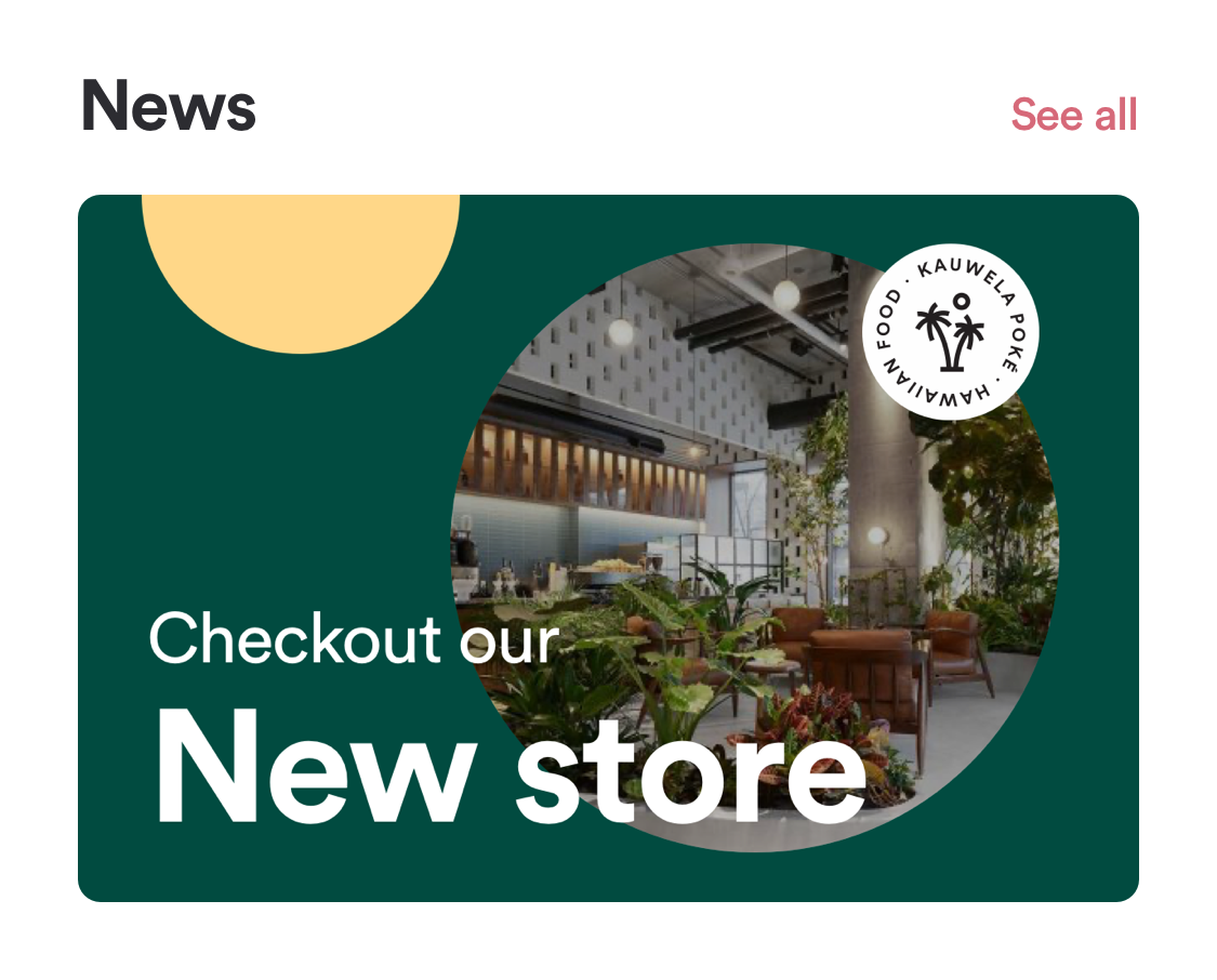
|
Header title and link are set Image is visible Title is not visible Description is not visible News content type |
|---|
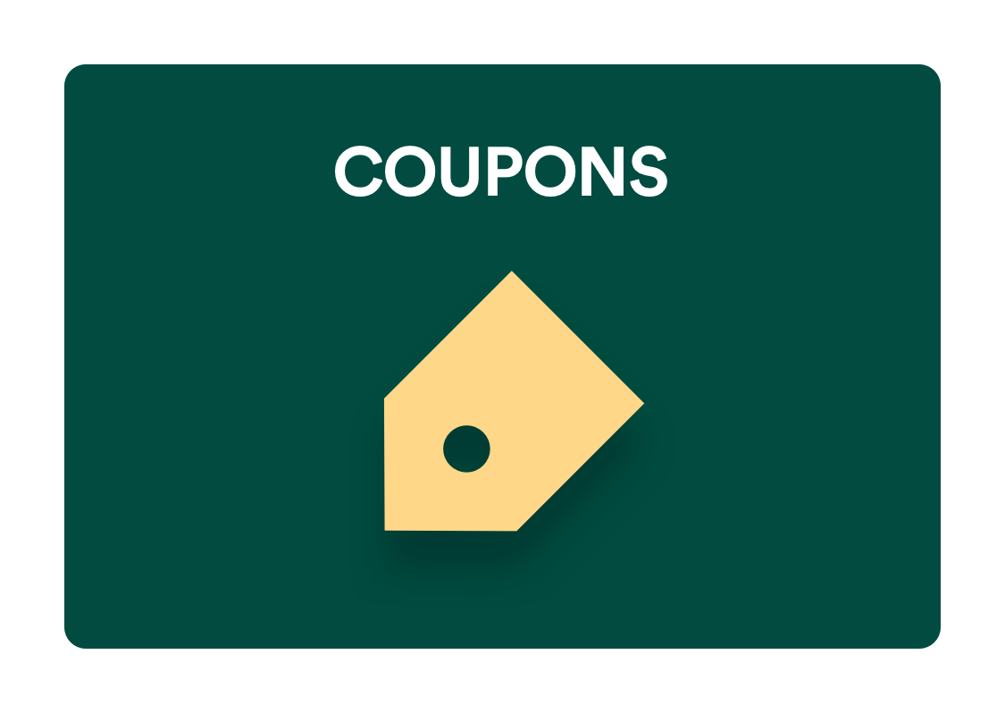
|
Header title and link are not available Image is visible Title is not visible Description is not visible Custom item with defined image and action |
|---|
Small Image List
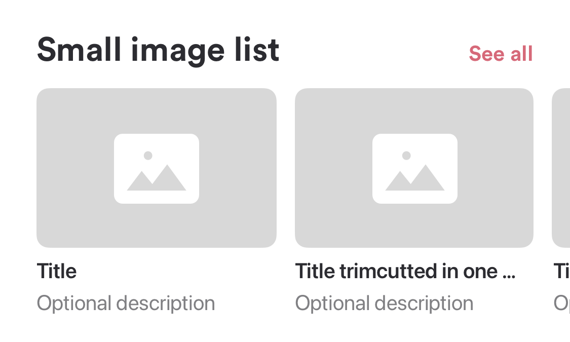
The Small Image List can be used to show different types of content (see Table below).
It includes a header and an item list.
The header can include a link if a default content type is shown in the component. The header link is not supported for custom items.
The following details are needed for this component to be added to your Home Screen:
| Attribute | Description | Type | Example Value | Localizable |
|---|---|---|---|---|
| Header title | Text shown in header. If this is empty, the header will not be shown. | Text | News | yes |
| Header link | Text shown in header link. If this is empty, the header link will not be shown. | Text | See all | yes |
| Image visible | If an image should be shown for every item in the component. | Yes/No | Yes | no |
| Title visible | If a title should be shown for every item in the component. | Yes/No | Yes | no |
| Description visible | If a description should be shown for every item in the component. | Yes/No | Yes | no |
| Content | Type of content that should be shown in the component. | Content (see Table below) | News | yes |
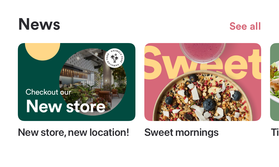
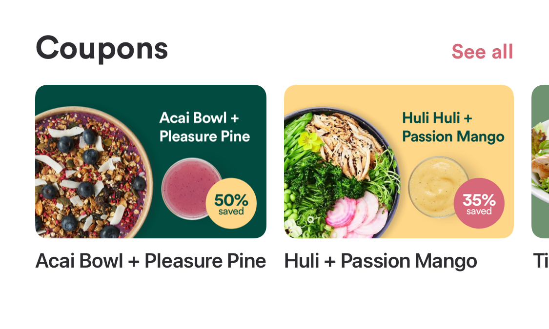
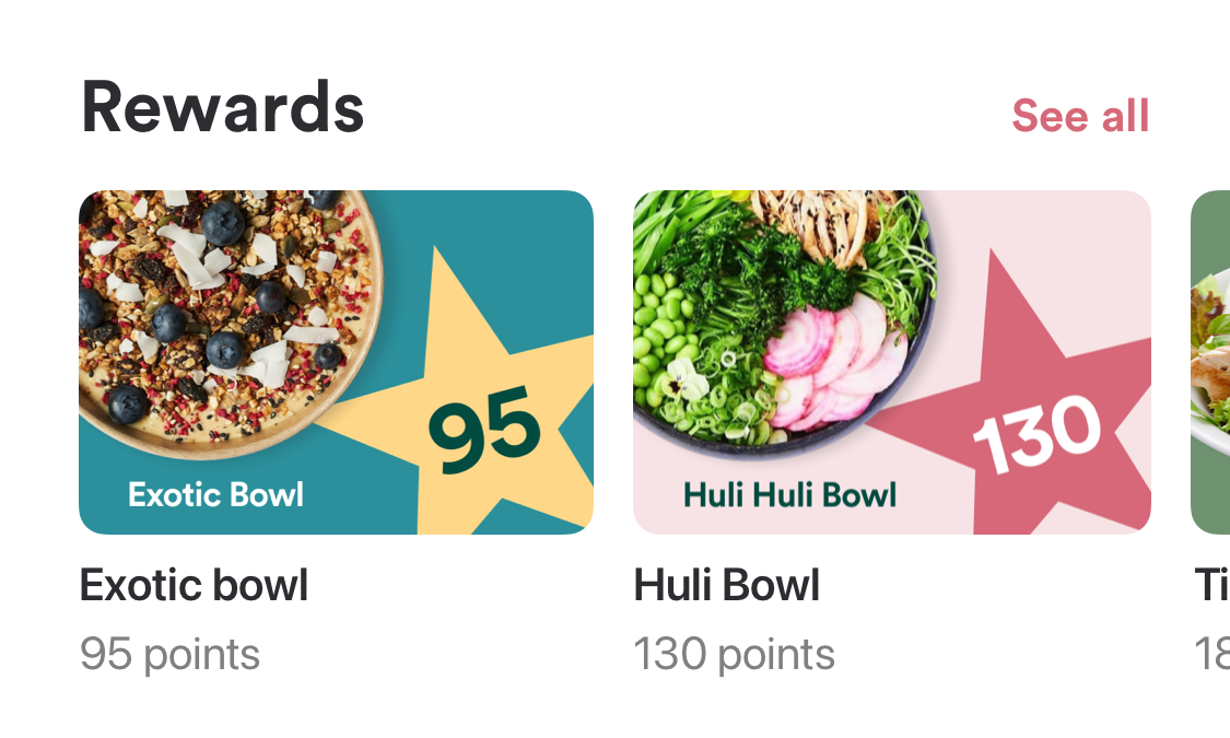
Here are some examples of this component:
|
Header title and link are set Image visible Title visible Description not visible Default content type (News / Coupons) |
|
|---|---|---|
|
Header title and link are set Image visible Title visible Description visible Default content type (Rewards / Promotions / Nearby) |
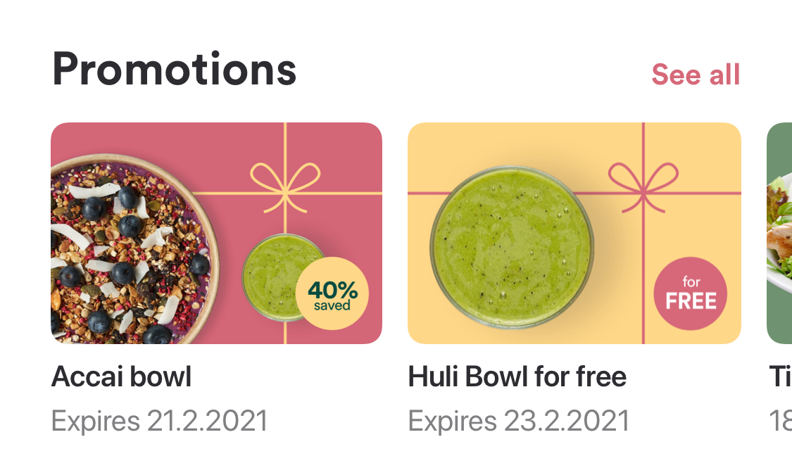
|
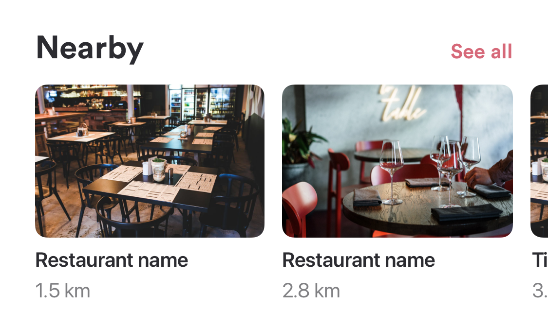
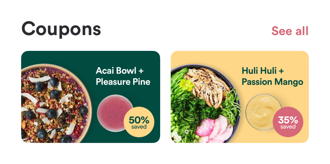
|
Header title and link are set Image is visible Title is not visible Description is not visible Coupons content type |
|---|---|
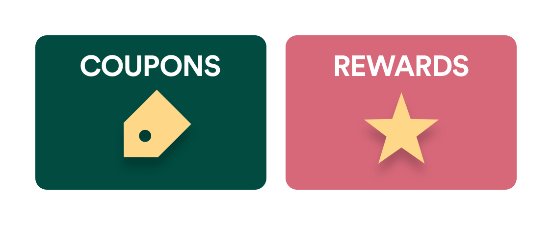
|
Header title and link are not available Image is visible Title is not visible Description is not visible Custom item with defined image and action |
Venue list
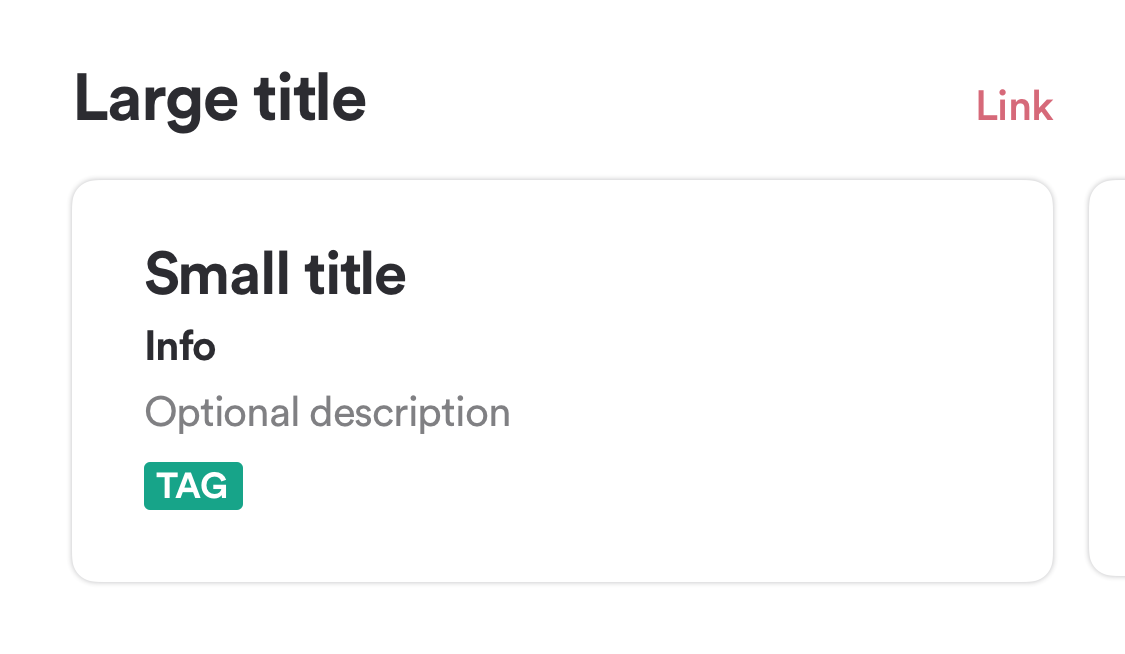
The Venue component shows the user a list of nearby venues.
The following details are needed for this component to be added to your Home Screen:
| Attribute | Description | Type | Example Value | Localizable |
|---|---|---|---|---|
| Header Title | Text shown in header. If this is empty, the header will not be shown. | Text | Nearby | yes |
| Header Link | Text shown in header link. If this is empty, the header link will not be shown. | Text | See all | yes |
| Venue Name Visible | If the Venue’s name should be shown for every Venue in the component. | Yes/No | Yes | no |
| Distance Visible | If the distance should be shown for every Venue in the component. | Yes/No | Yes | no |
| Address & Opening Hours Visible | If the the address & opening hours should be shown for every Venue in the component. | Yes/No | Yes | no |
| ORDER WITH APP Tag Visible | If the ORDER WITH APP tag is visible for every Venue in the component. | Yes/No | Yes | no |
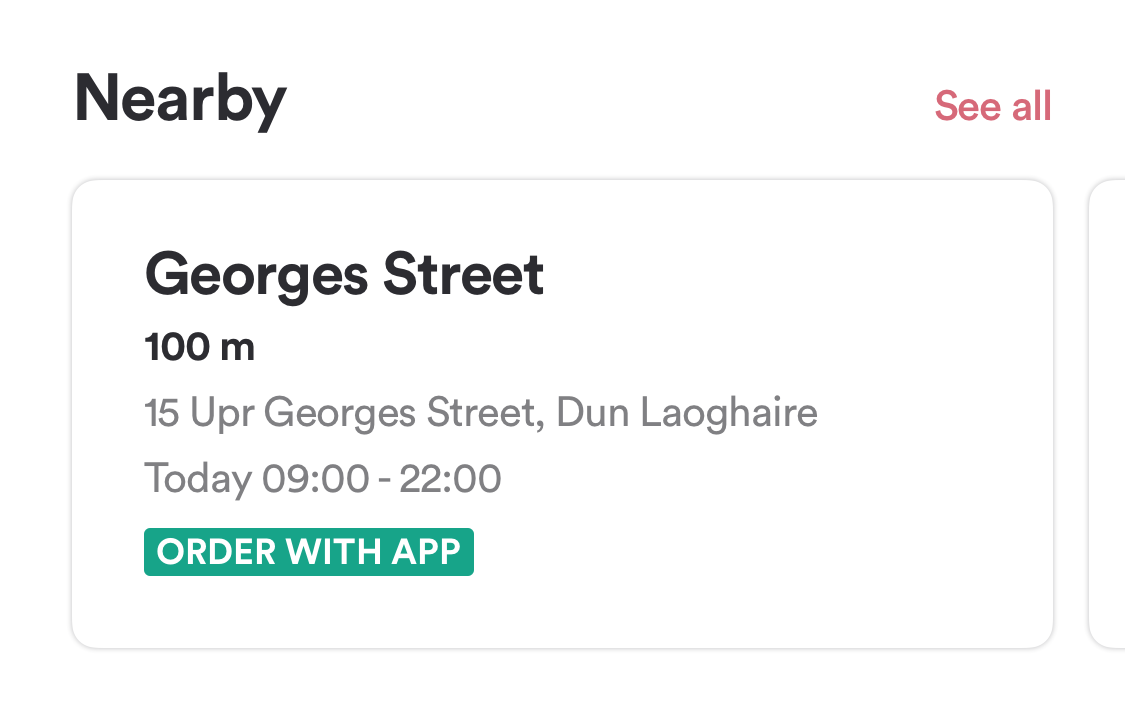
This is an example of this component:
Text View
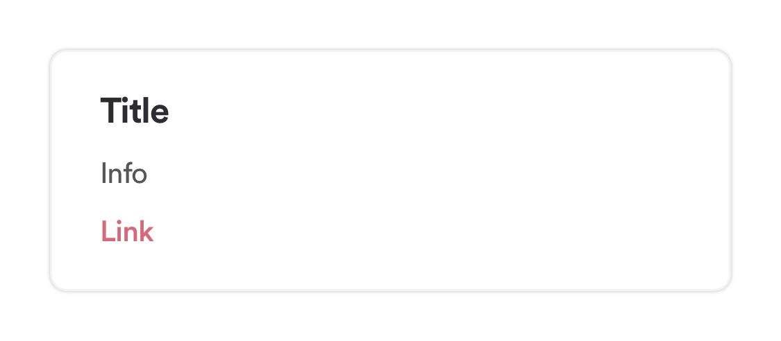
The Text View component allows you to show a title, text (info) and a link with an action.
The following details are needed for this component to be added to your Home Screen:
| Attribute | Description | Type | Example Value | Localizable |
|---|---|---|---|---|
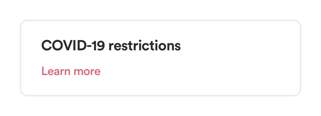
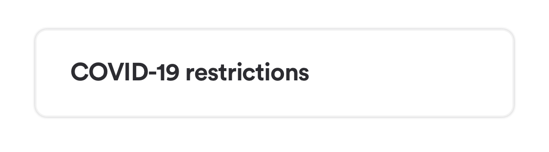
| Title | Text for title that should be shown. | Text | Covid-19 restrictions | yes |
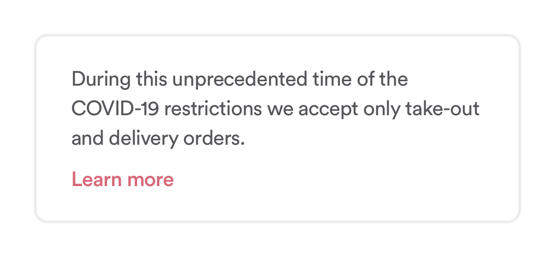
| Info | Text for info that should be shown. | Text | During this unprecedented time of the COVID-19 restrictions we accept only take-out and delivery orders. | yes |
| Link | Text that should be shown for the link. | Text | Learn more | yes |
| Link Action | Action that should be triggered when user taps on the link. | Action | URL (https://google.com) in in-app browser | yes |
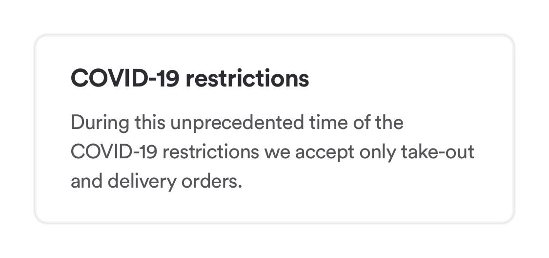
Some of the examples:
|
Title and info are set |
|---|---|
|
Title and link are set |
|
Only title is set |
|
Info and link are set |
Definitions
Actions
| Option | Description | Can be opened in | Notes |
|---|---|---|---|
| News | Opens list of News articles | N/A | |
| Order | Opens the Order tab | N/A | |
| Rewards | Opens the Rewards tab | N/A | |
| Coupons | Opens the Coupons tab | N/A | |
| Promotions | Opens the Promotions screen | N/A | |
| Venues | Opens the Store Finder list screen | N/A | Not available for Hero component |
| Custom URL | URL | External Browser (Safari / Chrome) |
Default Content Types
| Option | Description |
|---|---|
| News | List of News articles configured in the CMS |
| Coupons | List of Coupons that are available to the user |
| Rewards | List of Rewards that are configured in the CMS |
| Promotions | List of Promotions available to the user and/or device. If the user is not logged in, an item is shown to ask the user to sign-up / log-in. |
| Venues | Indicates that the user will be shown a list of nearest venues. |
Custom Content
Supported by Big Image List & Small Image List.
| Attribute | Description | Type | Example Value |
|---|---|---|---|
| Image | Desired image that will be presented inside of the item. Image needs to have 3:2 ratio |
URL or other image resource | www.google.com |
| Title | Desired title that will be presented within the item component. | Text | Welcome to the new venue! |
| Description | Desired description that will be presented within the item component. | Text | The newest venue in town. Check it out! |
| Action | Custom action that will be provided when clicked on the item. | URL | www.google.com |