Guest360 Dashboard
The Guest360 Dashboard gives you a snapshot of your full guest base, including both loyalty and non-loyalty guests. Use it to track how your guest population is growing, how often guests return, and how much value your loyalty program is driving.
To access Guest360, navigate to your Punchh Platform > Guests > All Guest Profiles > Guest360 Console
Date Range Filters
The date range selector at the top of the Dashboard controls the time period reflected in every metric. Select from the preset options or set a custom range. Dashboard data refreshes daily. Transactions from the current day may not appear until the next refresh cycle. (The Dashboard footer shows when data was last updated.)
Available presets:
- 7D: Last 7 days
- 30D: Last 30 days
- 90D: Last 90 days
- 12M: Last 12 months
- YTD: Year to date
- Custom: Set a specific start and end date
Next to the date range selector, use the compared to dropdown to choose a comparison period.
- The default is Previous period, which compares your selected range to the same length of time immediately before it.
- Select Prior year to compare to the same time frame in the previous year.
- Select None to remove any comparisons.
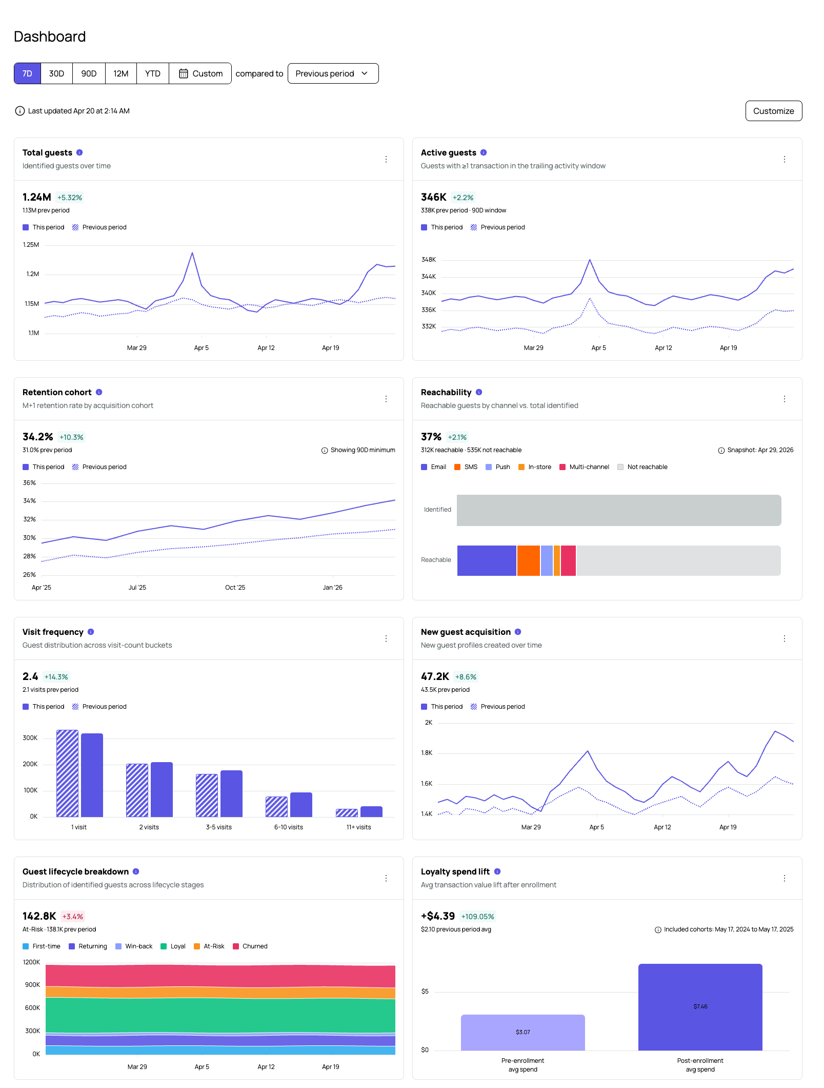
Each metric card shows the current period value, the previous period value, and the percentage change between them.
Customizing the Dashboard
Select Customize in the top-right corner of the Dashboard to adjust your metric layout. The button is visible on the main Dashboard view at all times, regardless of the date range that is active.
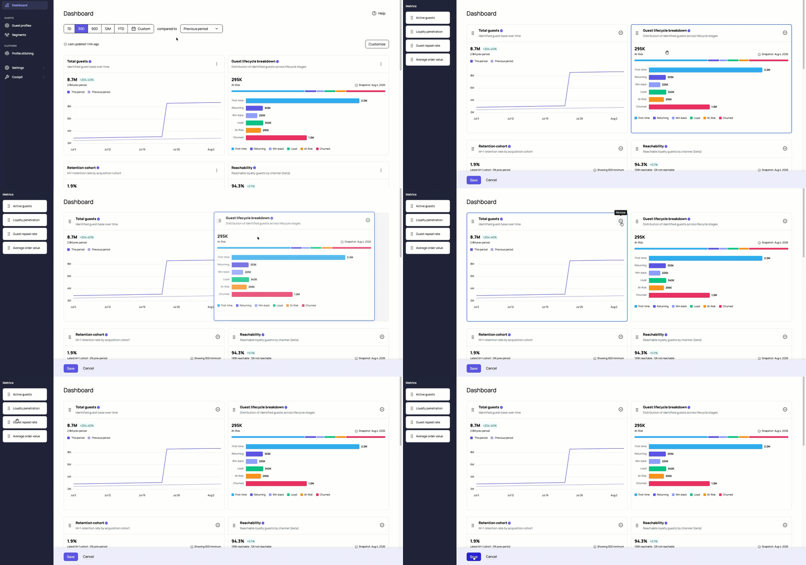
From there you can:
- Show or hide individual metric cards to focus on the data most relevant to your business.
- Reorder cards by dragging them into the position you want.
Your layout is saved to your user account and follows you across browsers and devices. It does not affect your teammates' layouts.
Note: There is no reset-to-default option. Selecting Cancel reverts to the layout as it was when you opened the panel, not to the original product default.
Metrics
The Dashboard displays 11 metrics, each in its own card. Click each metric card to open that metric's detail page. The three-dot menu on any card gives you three options:
- Export CSV: Downloads a CSV file of the underlying data for that metric.
- Download chart: Downloads a PNG image of the chart as it currently appears on the card.
- About this metric: Opens a side panel with the full definition, formula, and thresholds used to calculate that metric.
The same three-dot menu is available on each metric's detail page.
Total Guests
The cumulative count of distinct identified guests acquired on or before the last day of the selected period. This includes both loyalty and non-loyalty guests. Because the count is cumulative, it only ever rises — it will always be at least as large as your Active Guests count for the same period. Identified guests are the audience you can segment, message, and measure. Growth here tells you whether your marketing, loyalty, and channel programs are expanding your addressable base.
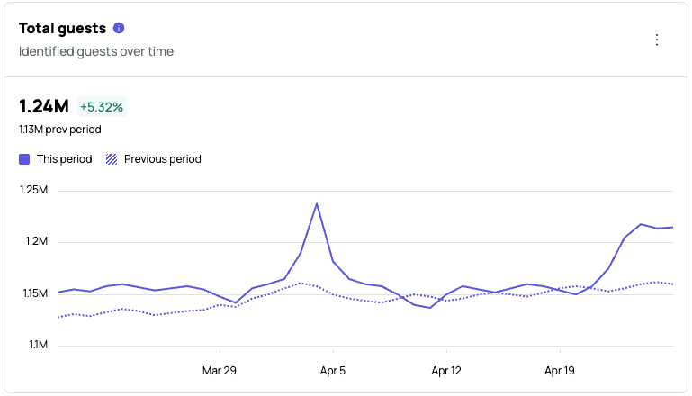
Formula: Total guests = count of distinct identified guests acquired on or before the period end; Delta % = (base at this period's end − base at previous period's end) ÷ base at previous period's end × 100
The solid line is this period; the striped line is the previous period. An upward trend means Profile Stitching is keeping pace with traffic. A flat or falling line while transactions grow points to identity capture gaps — for example, fewer guests checking in at the POS.
Total Guests Detail Page
Select the card header to open the full detail page. The detail page includes the same date range and comparison controls as the Dashboard, an expanded line chart, and a paginated data table.
The Total dropdown on the detail page filters the chart and table by data source.
| Column | Description |
|---|---|
| Date | The day the snapshot was taken |
| This period | Cumulative identified guest count as of that date |
| Prev period | Cumulative count for the equivalent date in the comparison period |
| Δ | Absolute difference between this period and the previous period |
| Δ% | Percentage change between this period and the previous period |
Active Guests
The number of distinct identified guests with at least one verified transaction in the selected date range. A guest who visits on multiple days within the range is counted once. The hero number reflects the distinct active guest count across the whole selected period, not an average of daily counts.
Active guests is your working audience for retention and per-guest metrics. The count can rise or fall as guests engage and lapse independently of how fast you identify new ones. A flat or declining active line while total guests grows means you are identifying guests faster than you are re-engaging them.
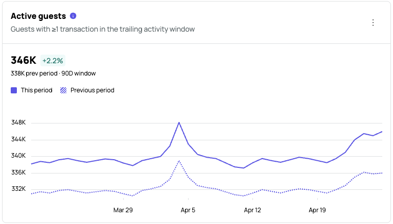
Formula: Active guests = count of distinct identified guests with ≥1 verified transaction in the selected period; Delta % = (this period − previous period) ÷ previous period × 100
The solid line is this period; the striped line is the previous period. Compare them to judge whether your active base is growing or shrinking.
Active Guests Detail Page
Select the card header to open the full detail page. From here you can change the date range and comparison period independently of the main Dashboard.
Use the Total dropdown to filter the chart and table by a specific subset.
The data table below the chart includes one row per day with the following columns:
| Column | Description |
|---|---|
| Date | The calendar day |
| This period | The active guest count for that day in the selected period |
| Previous period | The active guest count for the same relative day in the comparison period |
| Δ | The absolute difference between this period and the previous period |
| Δ% | The percentage change between this period and the previous period |
New Guest Acquisition
The count of identified guests whose first visit falls within the selected period. Each guest counts once, on the day of their first visit. The line chart plots newly acquired guests over time, with the current period as a solid line and the previous period as a dotted line for comparison.
Acquisition is the input to every downstream guest metric, including repeat rate, lifetime value, and retention. Watching the trend tells you whether your marketing and channel mix is growing your addressable base, or whether you are churning through the same customers.
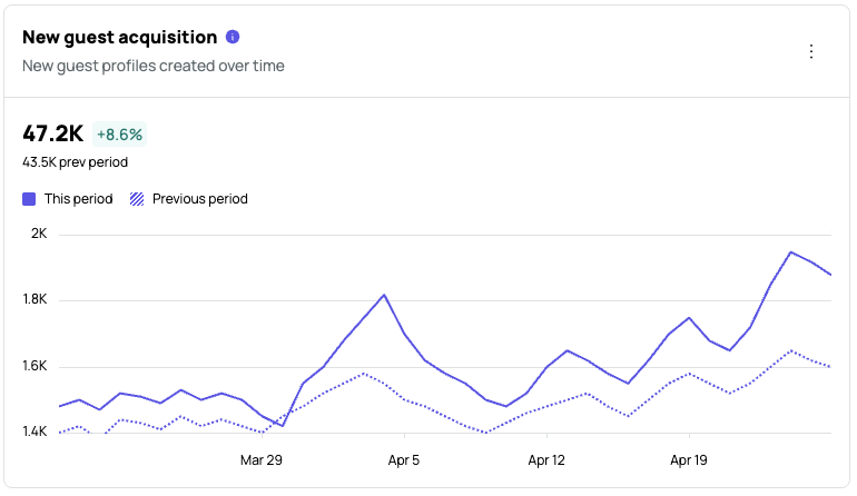
Formula: New guests = count of identified guests whose first visit falls in the period; Delta % = (this period − previous period) ÷ previous period × 100
Each point on the line represents one day of new identified guests. Sharp spikes usually map to a campaign or channel launch. Sustained dips are a signal to investigate loyalty signups, POS capture, and channel performance.
New Guest Acquisition Detail Page
Select the card header to open the detail page. The detail page shows the same date range controls, a Total dropdown filter, and an expanded line chart. Below the chart, a paginated data table lists results by day with these columns:
| Column | Description |
|---|---|
| Date | The day the new guests were first identified |
| This period | New guest count for that day in the current period |
| Previous period | New guest count for the same day in the comparison period |
| Δ | Absolute difference between the two periods |
| Δ% | Percentage change between the two periods |
Guest Lifecycle Breakdown
Shows how your identified guests split across the six lifecycle stages as of the latest snapshot date. Use it to see whether you are growing loyal guests faster than you are losing them. Watching the At-Risk and Churned stages early gives you time to act before revenue follows those guests out.
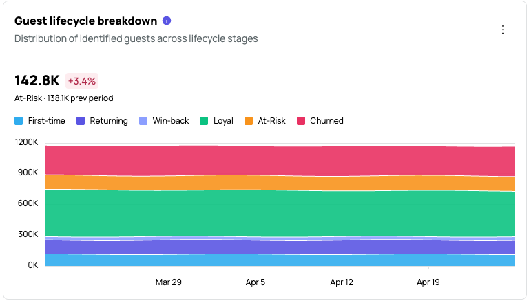
Each bar represents one lifecycle stage. The thin strip above the chart shows each stage as a share of the total. A large Loyal share is a healthy base; a large Churned bar is a signal to investigate win-back campaigns.
Formula: A visit = one distinct guest + business day (multiple same-day transactions count once). Each stage = count of distinct identified guests classified in that stage as of the snapshot date.
Stages are evaluated as of the last day of the selected date range. Rules are applied in order and the first match wins:
| Stage | Rule |
|---|---|
| Churned | More than 180 days since last visit |
| First-time | Exactly 1 visit |
| At-Risk | Days since last visit exceeds 1.5x the guest's own average gap between visits (guests with fewer than 3 visits use a 90-day assumed gap) |
| Win-back | Was At-Risk or Churned immediately before their most recent visit |
| Returning | 2 visits, most recent within 180 days |
| Loyal | 3 or more visits, not lapsed |
Note: At-Risk is relative to each guest's own visit cadence. A weekly regular is flagged after about two weeks without a visit, while a quarterly guest is not flagged until about four and a half months. All thresholds are fixed and not configurable per account.
Guest Lifecycle Detail Page
Select the card header to open the full detail page. The detail page includes the same date range and comparison controls as the Dashboard, an expanded horizontal bar chart with all six stages color-coded, and a data table with the following columns:
| Column | Description |
|---|---|
| Lifecycle stage | The stage name |
| Guests | The total number of guests in that stage for the selected period |
| Share | Each stage's percentage of the total identified guest count |
Retention Cohort
For each acquisition month, the share of new guests who came back the following month (M+1 retention). The card shows the latest M+1 cohort rate as the hero number.
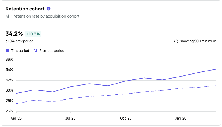
Formula: M+1 retention = guests in cohort who returned the next month ÷ guests in cohort × 100
M+1 retention is the earliest signal of new-guest stickiness. Improving it lifts downstream lifetime value. Watching the trend across cohorts tells you whether acquisition and onboarding changes are paying off month after month.
Each point on the chart represents one acquisition cohort and its M+1 retention rate. The solid line is this period; the striped line is the previous period. An upward trend means newer cohorts are sticking better than older ones. A sharp dip on a single cohort points to that month's campaign mix, channel changes, or a one-off event.
Note: The chart requires a minimum 90-day lookback window to ensure cohort data is statistically meaningful. The "Showing 90D minimum" indicator appears when your selected date range is shorter than 90 days.
Retention Cohort Detail Page
Select the card header to open the full detail page. The detail page includes:
- The same date range and comparison controls as the Dashboard.
- A full retention heatmap with rows for each acquisition month and columns for M+1 through M+12 return periods. Darker shading indicates higher retention.
- A paginated cohort table with the following columns:
| Column | Description |
|---|---|
| Cohort | The acquisition month |
| Cohort size | The total number of new guests acquired in that month |
| M+1 through M+12 | The share of that cohort who returned in each subsequent month |
Cohort rows and individual heatmap cells are not clickable. Drill-down into a single cohort is a future release.
Reachability
The percentage of your identified guests who are reachable through at least one marketing channel, plus those you can analyze but not yet contact. The stacked bar chart compares your total identified guest count against the reachable subset, broken down by channel.
Each guest counts toward exactly one channel bucket. A guest with opt-ins on more than one channel falls into the Multi-channel bucket.
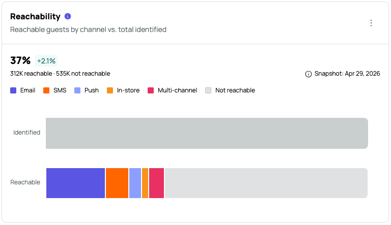
Note: Reachability currently reflects loyalty members only. Marketing consent data for non-loyalty guests is not yet included.
Formula: Reachable % = guests reachable on at least one channel ÷ identified guests × 100
Reachability channels:
- Email: Guests with a valid email address on file and marketing opt-in.
- SMS: Guests with a valid phone number on file and SMS opt-in.
- Push: Guests with push notifications enabled.
- In-store: Guests reachable through in-store messaging or offers.
- Multi-channel: Guests opted in to two or more channels.
- Not reachable: Guests with no active opt-in on any channel.
Note: Reachability reflects the most recent fully ingested day. All Dashboard metrics update nightly. The snapshot date shown on the card may lag by one to two days depending on data source sync timing.
Reachable guests are the audience you can actually market to. If reachable share falls while your identified guest count grows, you are losing marketing access faster than you are gaining audience. Use this metric to track whether identity capture, opt-in capture, and channel consent are keeping pace with acquisition.
Reachability Detail Page
Select the card header to open the full detail page. The detail page includes the same date range controls and the expanded stacked bar chart, plus a Channel snapshot table dated as of the most recent data sync.
The Channel snapshot table shows:
| Column | Description |
|---|---|
| Channel | The reachability channel (Email, SMS, Push, In-store, Multi-channel) |
| Reachable guests | The number of guests reachable on that channel |
| % of identified | That channel's share of your total identified guest base |
| vs. comparison period | The percentage point change vs. the comparison period |
The table includes a Total reachable summary row and a Not reachable row showing guests with no active opt-in on any channel.
Visit Frequency
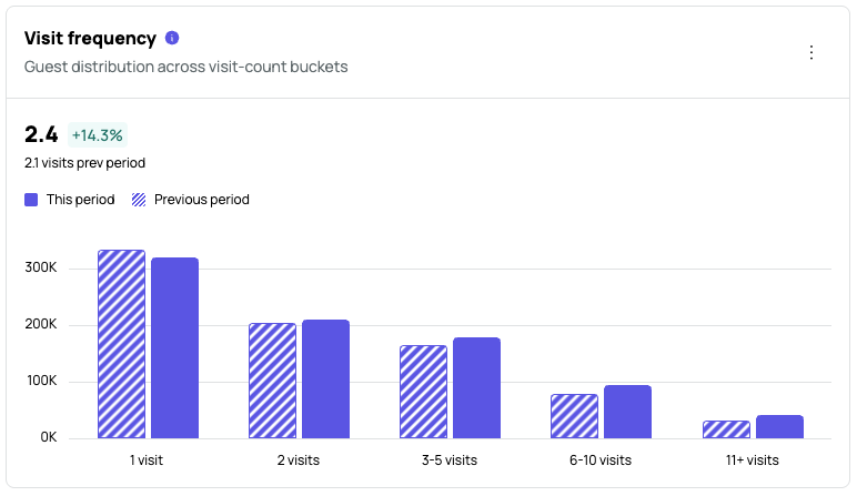
The average number of visits per guest in the selected period, along with a grouped bar chart showing how guests are distributed across visit-count buckets. The hero number is the average visits per guest across all identified guests in the selected period.
Formula:
A visit = one distinct guest + business day (multiple same-day transactions count once)Average visits = total visits in the period ÷ identified guests in the periodBucket count = identified guests with that number of visits in the periodDelta % = (this period − previous period) ÷ previous period × 100
Buckets shown:
- 1 visit
- 2 visits
- 3–5 visits
- 6–10 visits
- 11+ visits
The chart compares the current period distribution (solid bars) to the previous period (striped bars).
The shape of the distribution tells you more than the average alone. A tall single-visit bar with a thin tail means you have an acquisition machine that does not retain. A fatter middle means habitual customers. Watching how the curve shifts period over period reveals whether your loyalty, frequency, and reactivation programs are pushing guests up the frequency ladder.
Visit Frequency Detail Page
Select the card header to open the full detail page. The detail page shows the same grouped bar chart at a larger scale along with a data table.
The table lists each bucket with the following columns:
| Column | Description |
|---|---|
| Bucket | The visit-count range (1 visit, 2 visits, 3–5 visits, 6–10 visits, 11+ visits) |
| This period | The number of guests in that bucket for the selected period |
| Previous period | The number of guests in that bucket for the comparison period |
| Δ | The absolute change in guest count between periods |
| Δ% | The percentage change between periods |
Enrollment Spend Lift
The difference in average spend before and after loyalty enrollment, for the same guests, using each guest as their own baseline. The bar chart shows pre-enrollment average spend on the left and post-enrollment average spend on the right.
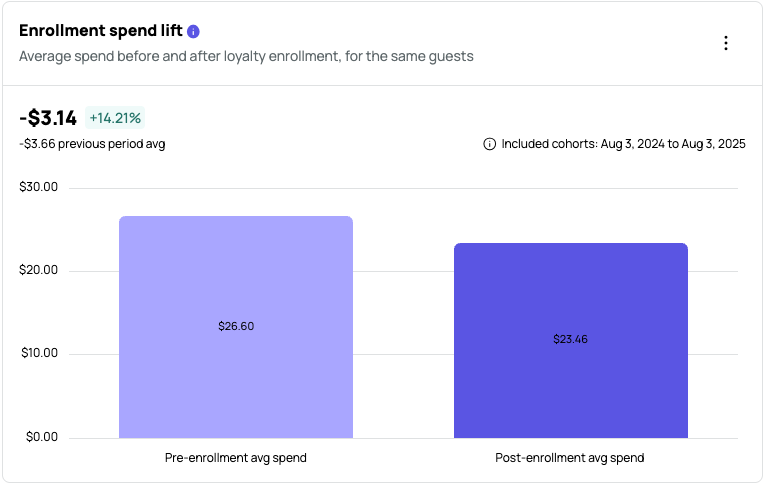
The comparison uses two equal-length calendar-day windows. The window length matches the date range you have selected: on a 30-day view, it compares the 30 days before each guest's enrollment date against the 30 days from their enrollment date forward. Guests are only included once their full post-enrollment window has completed, so recent enrollees are excluded rather than shown with partial data. Each average is transaction-weighted, calculated as total spend divided by transaction count.
Note: This metric is distinct from the QBR "Spend Lift" report, which compares loyalty guests against anonymous guests with outlier trimming. Enrollment Spend Lift uses the same guest as their own baseline, which removes the selection bias introduced by high spenders being more likely to enroll.
Formula: Lift = avg post-enrollment spend − avg pre-enrollment spend (gross check amount); Delta % = lift ÷ avg pre-enrollment spend × 100
Loyalty members often spend more — but high spenders also tend to join more. This metric removes that bias by using the same guest as their own baseline, so the lift figure reflects a behavioral change, not a selection effect.
Positive lift means members spend more per visit after joining. Negative lift is worth investigating — it could reflect redemption behavior (guests redeeming rewards and reducing net spend) or a sampling issue with recent cohorts. The cohort window shown in the card notice is the enrollment period the selected date range covers.
Enrollment Spend Lift Detail Page
Select the card header to open the full detail page. The detail page includes the same date range controls, an expanded line chart plotting daily lift over time, and an Included cohorts notice in the top right showing the enrollment date range covered by the current selection.
The paginated data table has one row per enrollment cohort date.
| Column | Description |
|---|---|
| Enrollment cohort | The enrollment date for the cohort |
| Enrolled guests | The number of guests who enrolled on that date and have a completed post-enrollment window |
| Avg pre-enrollment ticket | The average gross check amount in the pre-enrollment window for that cohort |
| Avg post-enrollment ticket | The average gross check amount in the post-enrollment window for that cohort |
| $ lift | The dollar difference between avg post-enrollment and avg pre-enrollment ticket |
| % lift | The lift expressed as a percentage of the pre-enrollment average |
Guest Repeat Rate
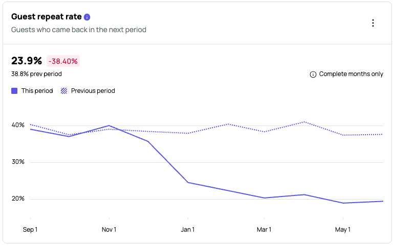
The share of base-period guests who came back for at least one transaction in the next complete period. This is a leading indicator of guest stickiness — a rising rate means guests are returning, while a falling rate means acquisition is outpacing retention.
Formula: Repeat rate = base-period guests who returned in the next period ÷ base-period guests × 100
The line chart plots repeat rate over time. The solid line is this period and the dotted line is the previous period. Each point on the chart represents one base period and the share of those guests who came back the following period. An upward trend means retention is improving. A dip on a single period can point to a campaign, channel, or operational change worth investigating.
Note: This metric only plots complete periods. The ⓘ indicator on the chart flags date ranges that fall back to the 90-day minimum window. If you see no data for your selected range, extend the date range to include at least one full prior period.
Guest Repeat Rate Detail Page
Select the card header to open the full detail page. The detail page includes the same date range controls, an expanded line chart, a Total dropdown filter, and a paginated data table with one row per base period.
| Column | Description |
|---|---|
| Base period | The starting month of the cohort used as the base |
| Repeat rate | The percentage of base-period guests who returned the following period |
| Base guests | The total number of distinct guests in the base period |
| Repeated guests | The number of base-period guests who transacted again in the next period |
| Prev period | The repeat rate for the same base period in the previous comparison period |
| Δ% | The percentage point change between this period and the previous period |
Loyalty Penetration
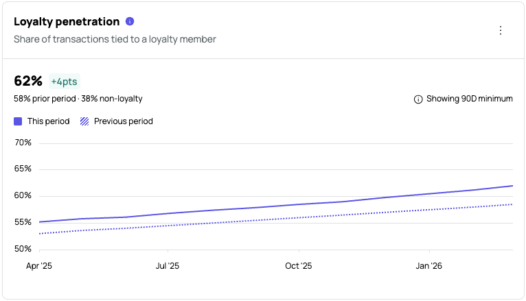
The share of identified transactions tied to a loyalty member for the selected period. The line chart plots loyalty penetration over time, with the current period shown as a solid line and the previous period as a dotted line for comparison. This metric requires a minimum of 900 transactions to display. If your selected date range does not include enough transaction volume, extend the range until the minimum is met.
Formula: Loyalty penetration = loyalty transactions ÷ identified transactions × 100
The change indicator shown on the card is expressed in additive percentage points, not relative percentage. A value of "+4pts" means penetration rose by four percentage points, not by 4% of the previous value.
A rising penetration rate means more of your identified business is being captured by your loyalty program, which means better data, better personalization, and a stronger lever for retention campaigns.
Each point on the chart represents one time interval in the selected period, showing the share of identified transactions tied to a loyalty member. The solid line is the current period and the striped line is the previous period.
Note: When you first connect Guest360, your loyalty penetration percentage may appear lower than expected. This is because the denominator now includes non-loyalty guest transactions. The rate reflects your full identified guest base, not your loyalty member base alone.
Note: The denominator currently covers POS transactions only. Online ordering and payment channel transactions will be included as their data lands.
Loyalty Penetration Detail Page
Select the card header to open the full detail page. The detail page includes the same date range and comparison controls as the Dashboard, an expanded line chart, and a paginated monthly data table.
Use the Total dropdown in the top right of the chart to filter the view by a specific guest group or segment.
| Column | Description |
|---|---|
| Period | The month represented by that row |
| Loyalty transactions | The total number of transactions tied to a loyalty member in that period |
| Identified transactions | The total number of transactions tied to any identified guest in that period |
| Penetration rate | Loyalty transactions as a percentage of identified transactions |
| Δ pts | The additive point change in penetration rate compared to the previous period |
Average Order Value
The average gross check amount per identified guest visit for the selected period, calculated before discounts are applied. The line chart plots average order value over time, with the current period shown as a solid line and the previous period as a dotted line for comparison.
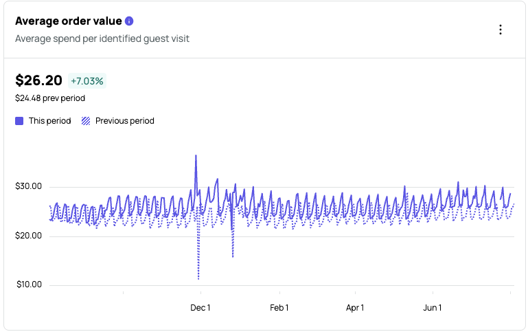
Formula: AOV = total gross check revenue ÷ total transaction count
A rising trend means guests are spending more per visit, whether through upsell, larger party sizes, or a higher-value item mix. Use the dotted previous-period line to judge whether the current trend is better or worse than your baseline.
Average Order Value Detail Page
Select the card header to open the full detail page. The detail page includes the same date range and comparison controls as the Dashboard, an expanded line chart, and a paginated daily data table.
Use the Total dropdown in the top right of the chart to filter the view by a specific guest group or segment.
| Column | Description |
|---|---|
| Date | The day the data represents |
| This period | The average order value for that date in the selected period |
| Previous period | The average order value for the same relative date in the comparison period |
| Δ | The dollar difference between this period and the previous period |
| Δ% | The percentage change between this period and the previous period |
Use the items per page control at the bottom of the table to adjust how many rows display at once. Navigate between pages using the page selector.