Web: Buttons
Context
These are, simply put, all the elements in your Web App that Users can click on to execute an action.
Button font
This defines a default font family for primary and secondary buttons. Choose a font with the font weight you prefer, although we recommend using Bold.
Tertiary button will use body font style defined in Web: Typography (fonts) article.
These are the requirements for buttons:
- File format: OTF or TTF
- Preferably a font with Bold weight
- License
Colors
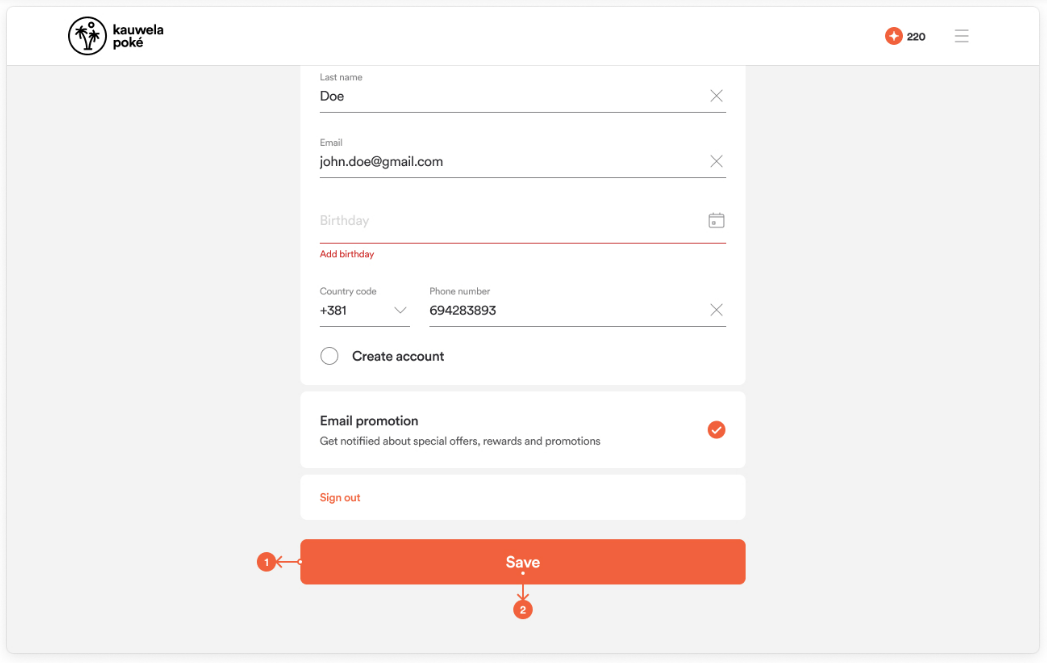
Primary Button and text color
Primary buttons are used for a primary action on the screen. Primary buttons are created from two colors: the primary button background color and the primary button text color. Create a combination in a way that makes the text readable.
- Primary button background color
- Primary button text color
Secondary Button and text color
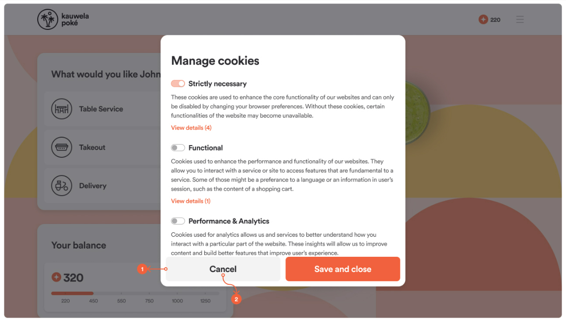
It is usually placed as an alternative action (second in importance) compared to the primary button but can work as a standalone option for some cases. Secondary buttons are also created from two colors. Secondary button background color and secondary button text color. This combination should also be created in a way that makes it easy readable.
- Secondary button background color
- Secondary button text color
Tertiary Button and text color
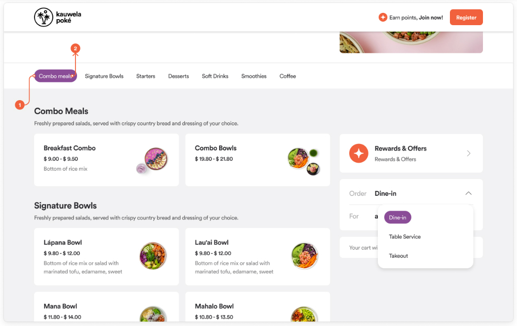
Tertiary buttons are used for an additional action on the screen. In terms of their creation: once again, background color and text color - mixed in a way that is still eye-friendly. They are used mostly for dropdown options and subcategories (item groups).
- Tertiary button background color
- Tertiary button text color
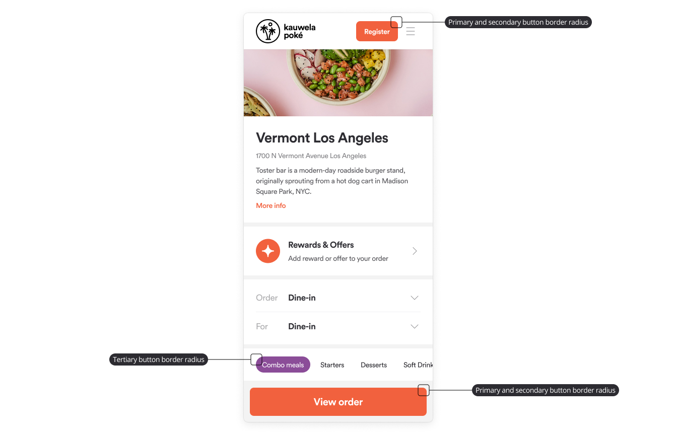
Button Border Radius
This is used to round the corners of buttons.
Primary and secondary button border radius
- Used for border radius, in primary and secondary buttons.
- Default value: 8px
Tertiary button border radius
- Applied to tertiary/pill buttons.
- Default value: 16px