Cart Functionality
Cart Button and Drawer Access
Cart 2.0 provides access to the cart drawer from multiple entry points throughout the app. This experience differs between web and mobile. Let’s take a look below at how it works.
Cart location access
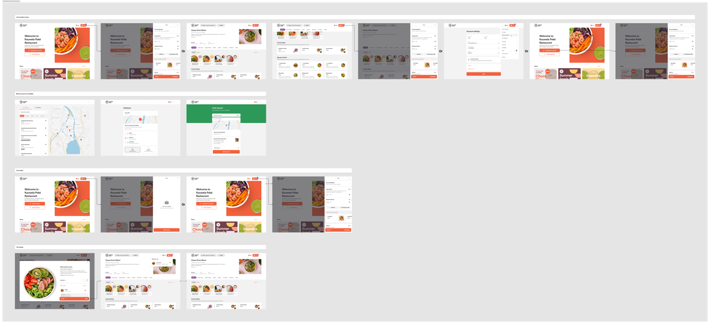
The cart button is accessible via the top navigation bar and is visible on all pages where the top navigation is present, except for a few specific pages: Store Finder, Checkout, and Order Confirmation. On all other pages—including the Home page, Menu, and any pages listed in the app's dropdown menu—the cart button is visible, allowing users to open the cart drawer at any time.
Aside from the top navigation bar, when an active cart exists, the Order Type CTAs on the Home screen change their function to reflect cart activity and provide access to the cart drawer. The behavior of each CTA depends on the order type for which the cart was created:
Dine-In, Table Service, Takeout, Curbside and Drive Thru are linked to the Order Pickup button.
Delivery and Catering are linked to their respective buttons: Order Delivery and Order Catering.
To access the cart drawer, the user must press the cart button. The drawer should slide in from the right side, and a page overlay should appear beneath it.
Dismissing the cart drawer can be done by selecting the 'X' button or by clicking outside the drawer, both of which return the user to the previous page.
On the menu page, when the category navigation scrolls to the top navigation bar, both elements become fixed at the top of the screen and stay visible as the user scrolls.
Cart states
The cart can be either active or inactive.
When active, the cart button displays a quantity indicator showing the number of items added. The cart drawer itself displays all relevant cart content and information associated with the current cart.
When inactive, the cart button quantity indicator is hidden, and the cart drawer, when opened, shows the empty state.
Pressing the ‘Start Order’ button from the empty state redirects the user to the Home screen. If the user is already on the Home page or Menu page, it simply dismisses the cart drawer.
Cart popup
When a product, offer, or reward is added to the cart, a confirmation popup appears just below the cart button to indicate the action was successful.
The popup displays the product, offer, or reward image (if available), name, any selected customizations (if available), and the price (if shown).
The popup can be closed manually by clicking the “X” button or should automatically disappear after 3 seconds.
It is only available for desktop and tablet views.
Cart details
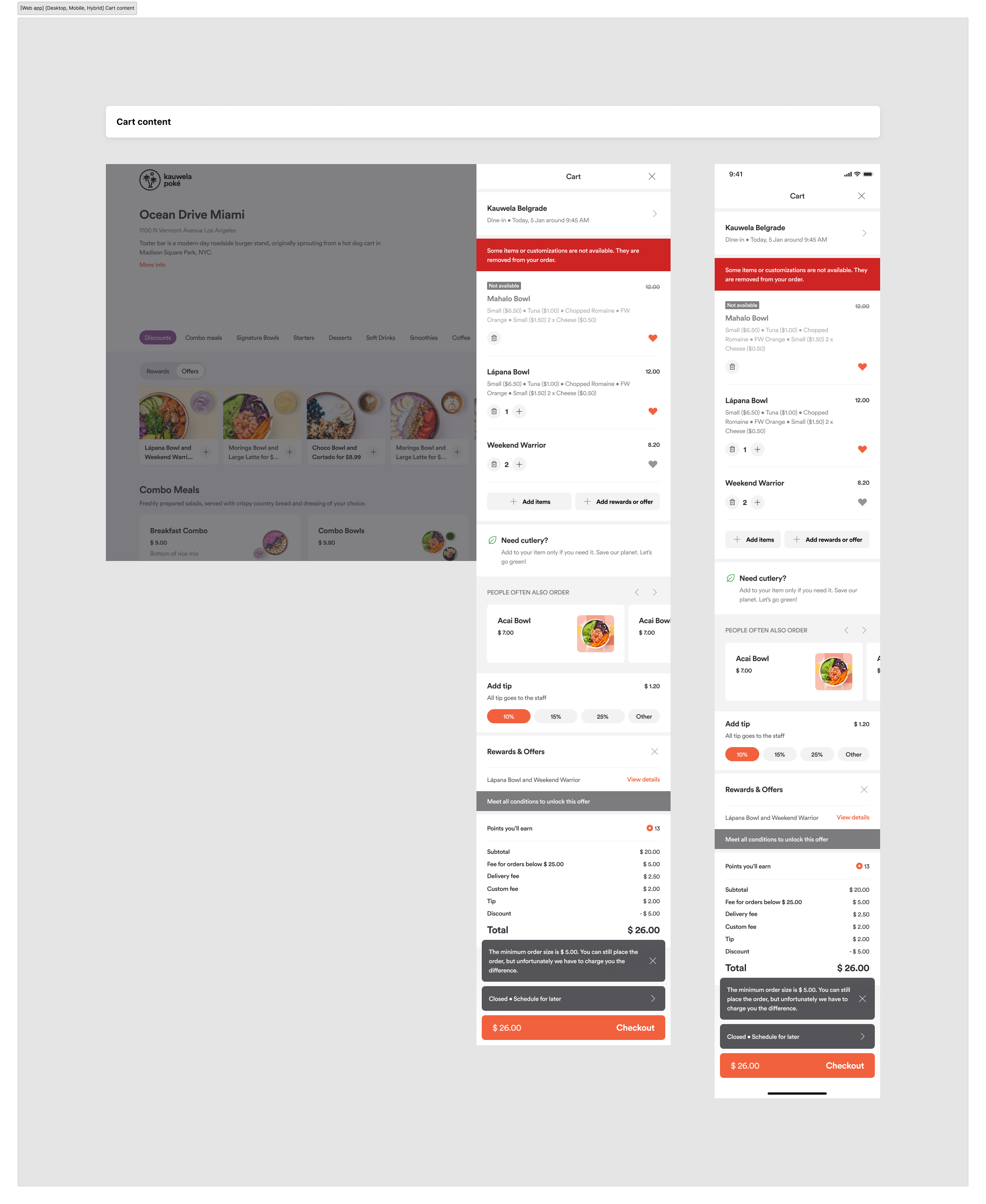
The information and functionality displayed in the cart are divided into three categories: always displayed, configurable, and conditional. Below is a breakdown of which elements fall under each category:
Always displayed
- Store - Order Details
- Products
- Add Items CTA
- Calculations
- Checkout Button
Configurable
- Add Rewards or Offers CTA
- Cutlery Component (If enabled)
- Cross-Selling (If in Cart dialogue is enabled)
- Tip
- Points you’ll earn
- Conditional
- Rewards & Offers Details + Condition message
- Error message
- Snack bars
Now that we understand where each element belongs, let’s explore the cart content in more detail…
Store - Order Details
- It displays the restaurant name associated with the active cart.
- It shows the order type associated with the active cart.
- It shows the absolute pickup date and time associated with the active cart.
- It displays a tag— ‘Closed', 'Closed · Schedule for Later’ or 'Temporarily unavailable'—to indicate the status of the restaurant when the appropriate situation occurs. (Learn more here)
- When pressed, it opens the Store Finder as a modal window, while preserving the cart drawer open in the background.
Products
- Displays all product names, customizations, special instructions, and price details listed in the cart.
- Shows exposed quantity control actions for each product:
- When the quantity is 1, a delete icon and plus icon are shown.
- When the quantity is greater than 1, the delete icon is replaced by a minus icon.
- The maximum product quantity is limited to 999.
- Selecting the delete icon opens the delete item confirmation dialog.
- Includes an action to add or remove a product from favorites.
- Products in the cart can be modified or updated from any page where the cart drawer is accessible. It opens in as a modal window, while the cart drawer remains open in the background.
- When a product is unavailable, it is grayed out and displays an 'Unavailable' tag.
- The Unavailable Product can be opened, but the product can’t be edited or updated. When in an unavailable state, it can only be deleted.
- When the user proceeds to the checkout, all the unavailable products are deleted from the cart and order, and only available products are displayed on the checkout.
Add Items CTA
- When pressed, it opens the Menu page of the restaurant associated with the active cart.
- If the user is already on the Menu page, it dismisses the cart drawer to allow access to the menu.
- When the “Add Rewards or Offers” CTA is not available on the right side, the Add Items CTA expands to take the full width of the cart UI.
Calculations
Always displayed
- Subtotal and total of the cart, excluding taxes.
- Conditionally displayed (when applicable):
- Minimum order amount surcharge (Delivery)
- Tip amount
- Discount amount
- Delivery fee (Delivery, Catering delivery)
- Custom fee
Checkout button
Represents the connection between the cart and the checkout page for registered and guest users.
It gets disabled when all items in the cart are unavailable or when the catering delivery minimum order amount is not reached.
Specific interactions
-
In some cases, the button is linked to actions that may be required to be completed before redirecting the user to the checkout page. These actions may include:
-
If the user is logged out, they are prompted to register.
-
If the table number is missing for a Table Service order type, the user is prompted to enter the table number.
-
If event details are missing for a Catering order type, the user is prompted to add the required details.
-
If a pickup time is not selected, the user is prompted to choose a pickup time.
-
If a cross-selling popup is enabled, the user is prompted to add additional items to the cart.
-
If multiple required actions are missing, they will be requested one by one, automatically, until all are fulfilled and the user is redirected to the checkout.
-
The priority order is as follows:
- Order information (e.g., pickup time, table number, event details)
- Cross-selling
- Registration modal for guest users only
Notes:
All of these interactions can occur on any page where the cart drawer is accessible.
Each action opens in a modal window, while the cart drawer remains open in the background.
Add Rewards or Offers CTA
When pressed, it opens the Menu page of the restaurant associated with the active cart and, on top of the Menu page, opens the Offers and Rewards page.
If the user is already on the Menu page, it opens the Offers and Rewards page only.
Cutlery component
When enabled through the JSON configuration file, the cutlery information component should appear just below the items in the cart view.
It should only appear for Takeout, Curbside, and Delivery order types. It should not be displayed for Dine-in QS, Dine-in FS, Catering Pickup, or Catering Delivery.
Cross selling
When in-cart dialogue cross-selling is enabled for a store and brand, it shows up as a cross-selling component in the Cart UI.
Tip
When tip is enabled for a selected order type, it shows up as a tip component in the Cart UI. (Learn more about tip here)
Points you’ll earn
When loyalty is enabled, it displays the number of points that will be earned based on the total calculation of the order.
Rewards & Offers details
When a reward or offer is added to the order, it is displayed in the Rewards and Offers details component.
It allows the user to see all the details related to the specific offer or reward, and to delete them from the order.
If the conditions for a reward or offer are not met, an informational message is displayed indicating that the requirements have not been fulfilled.
Error message
In a scenario where a product, offer, or reward becomes unavailable due to reasons such as: out of serving time, disabled, deleted, or out of stock, an error message appears at the top of the product list indicating the unavailability.
Once the reason is resolved or the unavailable item is removed from the cart, the message is hidden.
It is used to display restaurant status in situations such as:
- The restaurant is closed (does not accept orders outside working hours)
- The restaurant is closed (accepts orders outside working hours)
- The restaurant is temporarily unavailable for digital orders
- The restaurant has no drivers for delivery (Delivery promise)
- The restaurant is fully booked (Order throttling)
It is used to display minimum order amount requirements for Catering and Delivery order types.
Error Handling for Active cart
Every time we validate the cart, certain elements may be updated or no longer available in the active cart. This can occur due to a variety of reasons, such as:
- The restaurant status has changed (e.g., closed, temporarily unavailable)
- The order type is no longer available
- Menu items, offers, or rewards are no longer available
- The delivery address is outside the delivery zone
- The price of an item has changed
- The selected pickup time is no longer available
Cart lifetime
By default, the cart retains items for 15 days* to address cart abandonment and allows users to change order modes or locations without clearing the cart, providing a seamless experience.
- Cross-platform experience for logged-in users.
- Every change that affects cart information made in the web app should be reflected in the hybrid app in real-time, and vice versa.
You can configure the cart lifetime for your brand directly in the Management Center. Whatever you set applies to all venues under your brand and covers both guest and logged-in users.
To set your cart lifetime:
- Open your brand in the Management Center.
- Go to Brand > Menu Configuration.
- Find the Cart lifetime field.
- Enter a whole number between 1 and 15, then save.
Leaving the field empty keeps the default 15-day lifetime. If you previously set a custom value and want to go back to the default, just clear the field and save.
A few other things to keep in mind:
- Updating the cart lifetime only affects carts going forward; any existing in-progress carts will age out on their original schedule.
- The field only accepts whole numbers between 1 and 15. Entering 0, anything above 15, or a non-integer will show a validation error and block saving.
Guest users
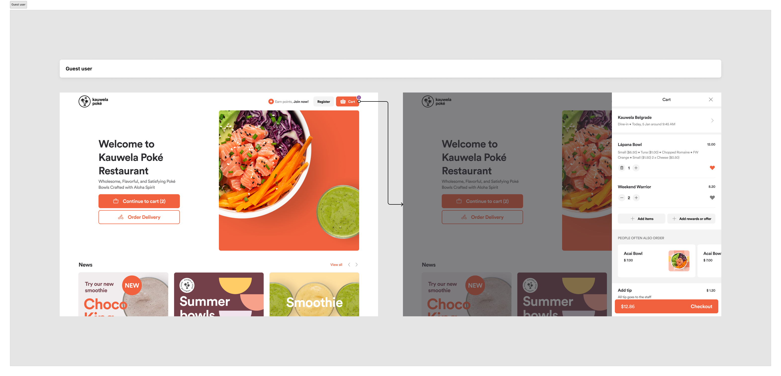
The “Register” button is styled as a secondary action to draw more attention to the cart button as the primary call-to-action.
Cross-platform cart persistence is not supported for guest users. Their cart will not carry over between web and app experiences.